
Leopard menubar, windows, and dock
November 2, 2007 at 1:39 AM by Dr. Drang
I installed Leopard on my iBook G4 yesterday. I’m not a big fan of “first impressions” when it comes to software—I think you have to live and work with programs for a while before you can fairly evaluate them—but I can say a few things about some of the more controversial aspects of Leopard’s new look.
First, I don’t have a translucent menubar, and I didn’t do any tweaking to get it opaque. Here it is.
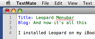
You’ll note that my desktop color (Solid Aqua Blue) isn’t leaking through, tinting the menubar the way the various reviews of Leopard led me to think it would. To further test this, I’ve changed my desktop to several of the standard pictures provided by Apple (Flowing Rock, Aurora, Bamboo Grove, etc.), and the underlying image has never leaked through. Is it possible that the video hardware on this three-year-old machine isn’t up to the translucency effect, and that Leopard has detected this and gone with an opaque menubar? Or have the updates to Leopard fixed the translucency problem? I’ve Googling around for a bit but found nothing.
Another thing you’ll note in the screenshot is that the opaque menubar isn’t white. It has a slight gradient from #F9F9F9 at the top to #D4D4D4 at the bottom. I’m guessing this is intended to fit in with the new, iTunes-like window look, but I don’t like it. Black text on a gradient gray background may be OK for youngsters, but these old eyes would like a bit more contrast—and a uniform contrast, at that.
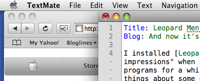
Speaking of the new window look, I wish the light gray of the inactive windows and the darker gray of the active window were switched. The active window is the one I’m focused on, and it would be much easier on my eyes if the backgrounds titlebar and tool areas provided more contrast with the black text on top of them. Here’s Safari in the background with TextMate in the foreground.
Here’s Safari in the foreground with TextMate in the background.
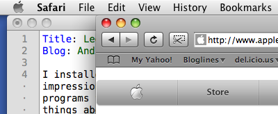
Perversely, it’s easier to read the bookmarks bar when Safari is inactive than when it’s active. Maybe I’ll adjust to this, but I don’t believe I’ll ever think it’s right.
The last thing I’ve been messing with is the Dock. As you’ve probably heard, Apple got rid of the default “3D shelf look” for the Dock when it’s positioned vertically on the left or right edges of the screen (which is where all right-thinking people have it). Here’s what the 2D side dock looks like.
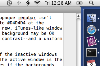
The background is darker than I’d like it to be (have you noticed a common theme to my complaints?) and there’s a light border around the edges. I’ve looked into changing the color of the background, but haven’t gotten anywhere. There are five PNG files in System/Library/CoreServices/Dock.app/Contents/Resources, named right1.png through right5.png, that can be tweaked to change the look of the border, but nothing I’ve found to change the bulk of the background. In this case, I can believe that I’ll get used to the darker look, but as long as I still have a computer running Tiger—I haven’t upgraded my work machine—it’ll look funny to me.