
Snow Leopard's new monospaced font
June 15, 2009 at 3:00 PM by Dr. Drang
Update 10/31/09
I have a more complete comparison of Menlo and Vera Sans Mono here.
You may have heard that Snow Leopard (OS X 10.6) will be shipping with a “new” monospaced font called Menlo. I’ve put “new” in quotes because Menlo is based on Bitstream Vera Sans Mono, a free font released several years ago in coordination with the Gnome Foundation. Since I’ve been using Vera Sans Mono—or DejaVu Mono, basically the same font, but with more glyphs—as my text editing font for years, I found the news of Menlo interesting and wondered how it would differ from Vera Sans Mono.
The answer is found in a comment by Jesse Burgheimer on the Typophile page.
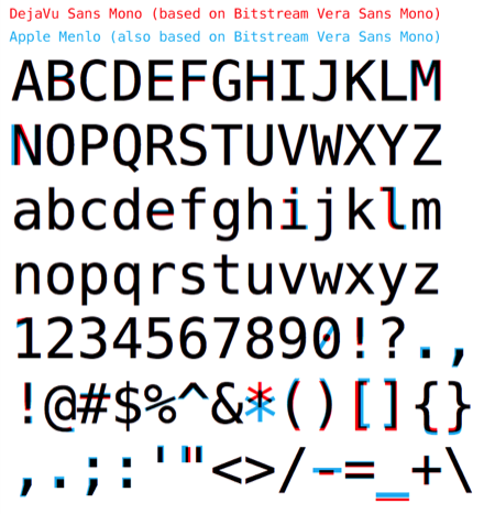
This image is somewhat reduced; go to the Typophile page to see it full-sized.
Before moving on to discuss the particulars of Menlo, I want to say how nice this comparison graphic is. The information is presented so clearly, no additional explanation is needed.
The major differences between Menlo and DejaVu are:
- Menlo’s zero has a diagonal slash instead of a dot in the center.
- Menlo’s asterisk is lower and larger.
- Menlo’s hyphen is longer, about the same width as the plus sign.
- Several of Menlo’s punctuation marks—the period and comma in particular—are larger.
I’m not sure I like the third difference; I’ll have to see what the n-dash and m-dash look like. The example seems to be restricted to the ASCII character set. DejaVu’s hyphen, n-dash, and m-dash look like this (at 64-point size)

I’ve always wondered why the n- and m-dashes are the same length—there’s certainly room between the hyphen and the m-dash to fit a distinct n-dash. In any event, Menlo’s hyphen is so wide, there isn’t any room to distinguish it from the dashes. I hope Apple changes that before Snow Leopard’s release.
The Ars Technica article says something I find hard to believe: Snow Leopard will not include the monospaced Monaco font. Longtime Mac developers have been using Monaco since the Mac came out—it was one of the original Mac fonts. The idea of buying a Mac that doesn’t have Monaco on it is probably inconceivable to them. But then, we’ve lost Chicago, New York, and most of the other World Class Cities, too. I’ll bet Monaco lovers are making backups right now.
Update 6/15/09
John Gruber says the Ars Technica article is wrong about Snow Leopard dropping Monaco. Monaco will be in Snow Leopard, it just won’t be the default font in Xcode. That makes more sense.
Further update 6/15/09
Via Gruber, this post by Jon Shea has some nice GIF animations showing the same chunk of text in Vera Sans Mono, Menlo, and Panic Sans, the Vera Sans variant that ships with Coda. To me, the biggest differences are in the asterisk and the underscore. I hadn’t given much thought to the underscore; as a CamelCase devotee, I don’t use underscores very often.
When Shea says
You can see that a lot of characters (“M”, “N”, “l”, “#”, and all the punctuation) look way too light and blurry in Vera Sans Mono, but look great in Menlo. The just look at how blurry that octothorp is in Vera Sans.
I have to disagree. The hash (OK, octothorp) looks almost exactly the same in the two fonts. I prefer the N in Menlo because it’s wider, but it’s not blurry in Vera Sans. Neither is the M or the l.
Some of Shea’s commenters really don’t like Menlo’s lower and larger asterisk. I can see it both ways. If you use monospace fonts mostly for writing code, the asterisk will be your multiplication and pointer character and a lower asterisk is probably preferable. If you use monospace fonts for writing regular text—as I’m doing now—you may want the asterisk in its normal, slightly raised position. Even though I do more text writing than coding, I think the lower asterisk is a good idea; even when writing regular text I almost never use the asterisk as a footnote marker, which is where the raised position comes in handy.
One last thing: I’m getting a sense that Mac users are coalescing around the notion that Menlo is a version of Vera Sans Mono that Apple “fixed.” That idea smells of fanboyism. I’ve been using Vera Sans Mono since it was released. It was—after my own data—the first thing I brought over to the Mac when I switched from Linux. I’ve always had the Terminal use Vera Sans (or DejaVu); same with Mail, BBEdit and, later, TextMate. In short, Vera Sans Mono is a great font and always has been. That’s why Apple chose it as the basis for Menlo. To the extent that Apple has made any improvements, they are marginal at best.