PCalc 2.0’s resolution mix
June 25, 2010 at 2:41 PM by Dr. Drang
A week ago, James Thomson sent out a beta of PCalc 2.1 for iPhone to his testers. It’s the “Retinal” version of PCalc, with the graphics redrawn to take advantage of the higher resolution of the iPhone 4’s screen. At the time, I had no use for the higher-res graphics, but I downloaded and installed it anyway, because there was another improvement I wanted to test.
Yesterday morning, I picked up my iPhone 4 and installed all my apps and music. The PCalc beta wouldn’t install, presumably because it uses the Ad Hoc distribution method and my new phone’s device ID isn’t in the beta app’s provisioning profile. I’m sure James will update the list of his testers’ device IDs soon, but in the meantime I have no calculator.1
After a PCalcless day, I went to the App Store and got the unRetinal 2.0.1 version. I had already bought PCalc back before I was a beta tester, so there was no need to cough up any more money. I fired it up to make sure the settings were right and immediately noticed two things:
- It starts up really fast on an iPhone 4.
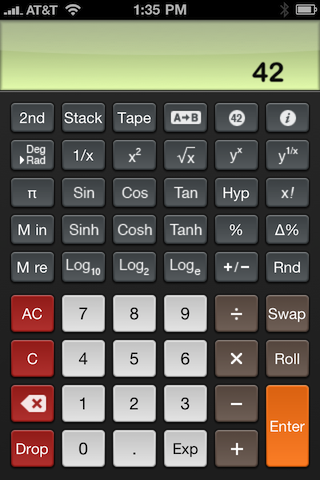
- The user interface is a hybrid of (lower-res) graphics and text, which gives it something of a split personality on the new screen.
Here’s a 320×480 view of the screen, what you would see on a 3GS or earlier:

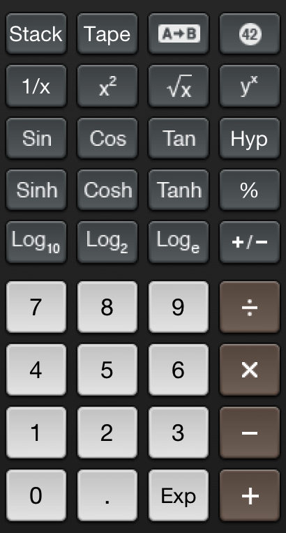
Here’s a section of it in glorious 640×960 resolution:

See how the text—most of it, anyway—is really sharp and the images are kind of fuzzy? It looks like some things you would think are text, like the trig functions, are actually images.
PCalc works fine, of course, it’s just a little funny looking.
The fuzziness will be banished in version 2.1, which is going through the approval process as I type this. I’m looking forward to going back to the future.
Update 6/26/10
I’m back in business with PCalc 2.1. See a screenshot comparison with the new Retinalized keyboard here.

