
Safari 5 Reader and images
June 10, 2010 at 10:30 AM by Dr. Drang
You’ve probably been giving Safari 5’s new Reader feature a workout over the past couple of days. So have I. I think it’s a good idea in principle, but I don’t like what it does to my site.
(If you haven’t tried Reader, you should. It extracts what it considers to be the “meat” of the page—eliminating ads and blogrolls and boilerplate like that—and presents it in a paper-like overlay in your browser window. It’s like Arc90’s Readability bookmarklet, but built into Safari itself.)
Here’s a screenshot of Reader’s rendering of my home page, scrolled down to the boundary between the Reeder post1 and the cholesterol/Simplenote post.
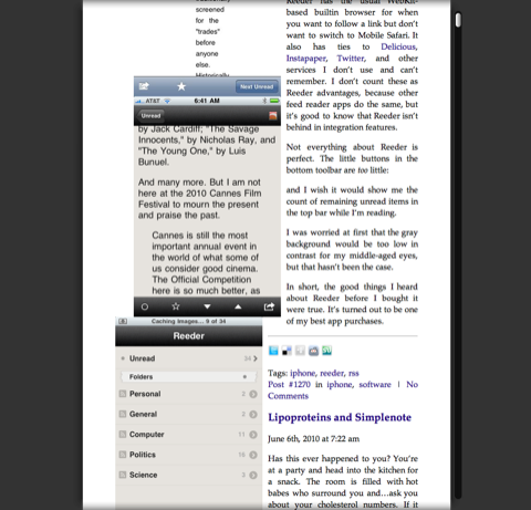
The things I dislike about Reader’s display are all a consequence of its decision to flow text around images. In fairness, if the image is something over half the width of display area, Reader won’t flow the text. But when it does:
- The text column is narrow, fully justified, and unhyphenated, a combination that leads to comically huge spacing between words.
- Very little whitespace is left between the images and the text next to it, which makes the page feel cramped. This is kind of surprising, given the decent margins Reader uses on the left and right.
- Absolutely no whitespace is left between adjacent images. This isn’t just an aesthetic problem; it can screw up your interpretation of the images by running them together.
- The images are moved to take them out of their proper place within the text. In the screenshot above, the last of the images from the Reeder post is adjacent to the cholesterol post.
People are already tweaking Reader’s configuration to give it a different look. I’m guessing that making the text ragged-right and putting some space around the images will be pretty easy to do. Keeping the images in context may be impossible. I’m not sure how you place the images correctly once you decide to reflow the text.
I typically don’t flow text around images on this site because the images aren’t just decorations; they’re part of what I’m trying to say. I know this makes the site look like it was written in MacWrite, circa 1985, but I’m willing to accept that to insure that the text and images are presented in the order I want, no matter what default font size you’ve chosen in your browser.
I like the idea of Reader. There are plenty of sites that are so filled with visual noise that a clean view of the main article is a boon. I just hope it gets a little smarter about how it displays that article.
Update 6/11/10
I’ve just noticed that Readability puts up this warning when you invoke it on a site’s home page:
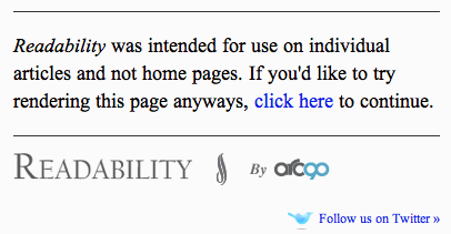
Reader could learn from this.
On the other hand, Readability reflows text around images of almost any width, making for some very narrow text columns. At least it’s smart enough to put some space between the images and to format the text as ragged right.
-
This is not a misspelling. The post is about the iPhone RSS reader with the homophonic name. ↩