
Elements, Simplenote, and iPhone fonts
August 17, 2010 at 11:18 PM by Dr. Drang
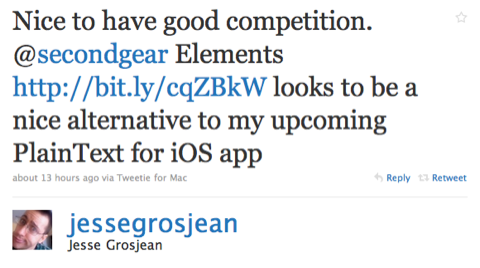
You’ve no doubt heard about Elements by now. It’s the latest iPhone plain text note-taking app. I learned about it this morning from Jesse Grosjean’s tweet.
The main features of Elements are:
- Syncing with your computer(s) via Dropbox.
- TextExpander support.
- Character/word/line counts.
- Choice of font, font size, colors in the display.
- A “scratchpad” for easy access to disparate bits of text.
As a Simplenote user, my interest in Elements was piqued by the Dropbox support and the font choice.
When it first came out, Simplenote’s big selling point was its automatic syncing to the cloud. You could create, edit, and view notes on either your iPhone or your computer. Changes made on one device were instantly synced to the other (assuming your iPhone had an internet connection). This was a big step up from the built-in Notes app, which synced to your Mail application (!?) on the Mac (and God knows what on Windows) when you connected to your computer via USB.
But as nice as Simplenote’s cloud syncing is, it isn’t especially flexible. Initially, you had to go to Simplenote’s website to access your notes on a computer. Later, when the Simplenote API came out, certain applications—most prominently Notational Velocity—began to sync with Simplenote’s cloud services. Which was fine if you were a fan of those applications, but not so fine if you weren’t. While I appreciate Notational Velocity’s design1, I already have a text editor running all the time and don’t need another one.
Dropbox support gives you the flexibility that Simplenote syncing doesn’t. When working at your computer, you can use whatever text editor you like: TextMate, BBEdit, TextEdit, Coda, Emacs, Vim, Ed—anything. This is why Jesse Grosjean is moving the Hog Bay fleet of apps to Dropbox from his SimpleText system. I wouldn’t be surprised to see the Simplenote folks add Dropbox support in a future version—it’s just so much easier for the user.
Elements does its Dropbox syncing very well. When you first launch the app, it asks you for your Dropbox login credentials2 and then puts an “Elements” folder in your Dropbox folder. All your Elements files—and they are proper named files, not just runs of text that get their name from the first line—are synced to that folder. Save a file to that folder on your computer and it will soon appear in Elements on your iPhone.
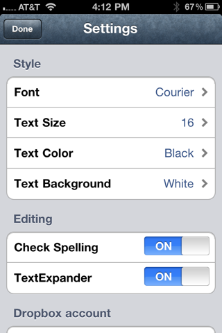
Elements’ second selling point for me was the ability to choose the font. Don’t get me wrong; I love Helvetica, but there are times when a monospaced font is the proper choice. Tabular information, for example, is much easier to deal with in a plain text document when all the characters are the same width. This is especially true if that document is also going to be edited on my computer, where I always use a monospaced font in TextMate.
This is my one disappointment with Elements. Yes, it allows me to use Courier, but it doesn’t allow me to use Courier Bold, a font whose strokes are actually thick enough to read easily. Here’s an example of a tabular document in Elements using Courier:
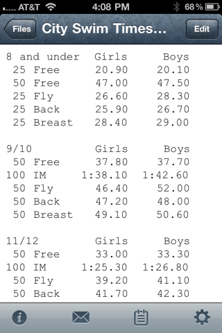
OK, sure, you can read it, but the font is really frail looking. If I could only use the bold version of Courier, the display would be much improved, but there’s no Elements setting for font style.3
Also, if you look closely at that Courier document again, you’ll see that the columns don’t line up exactly; the lines with colons are a bit shorter, suggesting that the colon character isn’t as wide as the others. I don’t understand how this can be, but it’s something I’ve pointed out before, although in that case I was looking at hyphens and question marks being wider than other characters.
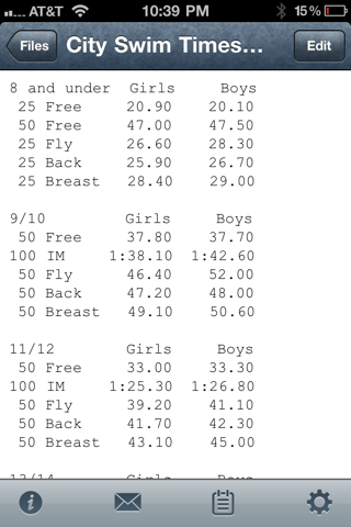
I’ve noticed that Courier’s column alignment changes with font size. The screen shot above is with the font size at 16 points. At 14 points, the alignment of the lines with colons is better, but the lines for the 50-meter breast stroke are a bit longer than the others
This is not, I believe, a problem with Elements. It’s a problem with iOS itself, either in its font display routines or in its font definitions. A further problem with iOS fonts is that its only monospaced choices are Courier and Courier New. I’ve complained about this before, but it bears repeating: Why isn’t Menlo on the iPhone? Apple seems to think monospaced fonts are only for programming, so why bother with them on a device you don’t program on? It should know better.
I seem to have gone a bit astray here. What was I talking about? Oh yes. Elements and Simplenote. Overall, I think Elements wins because of Dropbox and font choice. There are, however, two aspects of Simplenote that are superior and which the Elements people should consider adopting:
- Simplenote allows you to sort your notes by creation date, modification date, or name. Elements sorts by modification date only.
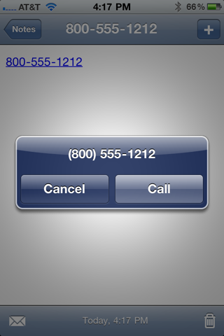
- Simplenote can recognize URLs, phone numbers, and dates and turn them into links to Safari, Phone, and Calendar, respectively. Elements can’t.
Simplenote did just announce that big changes are coming soon in a new version. Maybe that will flip the advantage back to it. Until that happens, Elements will be replacing Simplenote on my iPhone’s first screen.
-
It reminds me of Casady & Greene’s QuickDex from the olden days, a program I dearly loved. ↩
-
If you don’t already have a Dropbox account, it has a link that, I guess, sends you off to get one. But everyone uses Dropbox nowadays, don’t they? ↩
-
I’ve asked Second Gear for a way to get Courier Bold in a future version of Elements, and its answer was quick, polite, and noncommittal. ↩