Dues and don'ts
December 31, 2010 at 7:28 PM by Dr. Drang
I’ve been using Due, the iPhone reminder/timer app for a while now, and I really like it. Its main claim—that it’s really fast at setting up timers and reminders—is absolutely true. It’s much faster the Apple’s Clock app, and it’s taken the place of Clock on my first screen. But there are some user interface mistakes that I hope Due’s developers fix in a future version.
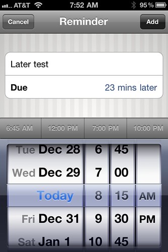
Let’s talk about the good stuff first. Due launches very quickly and presents you with one of three screens: Reminders, Timers, or Logbook. Reminders are like Clock’s alarms; you add a new reminder by tapping the + button in the upper right corner and set it for a particular date and time using the familiar spinning wheels.
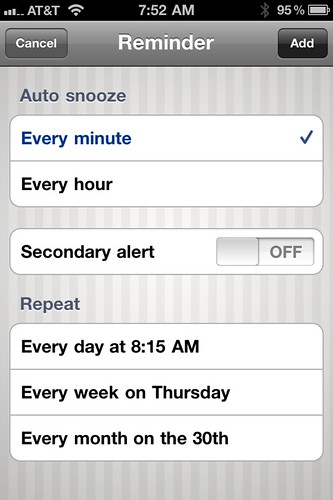
A flick from right to left takes you to another screen where you can set other options.
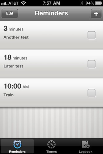
Once the reminder is set, it’s added to the list.
By default, active and overdue reminders (and timers) cause a badge to appear on Due’s icon.

If the snooze option is set, which seems to be the default, the reminder will continue to pester you at a preset interval after the initial alert. You have to turn the reminder off by tapping the little sunken rounded square to the right of the description. This is one of Due’s interface anomalies; that sunken square is supposed to be a like a checkbox. A little check mark does appear when you tap it, but only for a moment, because a checked reminder is immediately whisked away to the Logbook screen (which we’ll talk about later). A checkbox that doesn’t stick around so you can see it seems kind of worthless to me.
Due’s timers are like the Clock’s timers; the alert is set not by date and time, but for a given interval—5 minutes from now, 3 hours from now, etc. The big advantages of Due over the Clock are:
- Due allows you to set many timers instead of just one.
- Regularly used timers can be saved and turned on with a single tap.
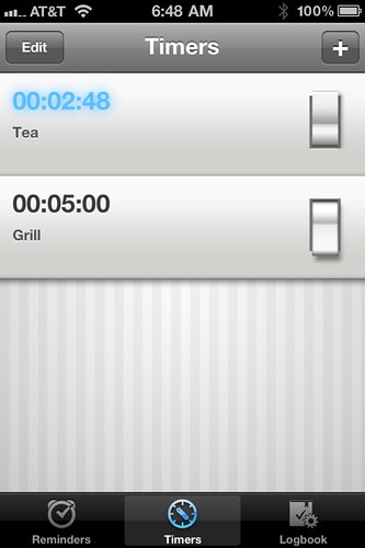
These are the features that sold me on Due. I liked the Clock’s timer feature and used it almost every day, but it was very common for me to need two timers going at once, and the Clock just couldn’t give that to me. And it’s a tremendous convenience to have common timers—for tea brewing, burger flipping, pizza getting, etc.—just one tap away.
To me, the timers themselves are worth the price of Due. They do, however, have some interface problems.
First, the aesthetics are off-putting. The blue glow of an active timer just seems childish. I know it’s active because I can see it changing every second; I don’t need the glow. And what’s with the light switch widget? The iPhone already has a standard switch widget that every user is familiar with. The only reasons to use a nonstandard widget would be if yours is
- easier to use (Due’s isn’t);
- easier to read (Due’s isn’t);
- more compact (Due’s isn’t); or
- a better physical analogy (Due’s isn’t).
Switch widgets that look like light switches may have been cool in a HyperCard stack in 1990, but we’re past that now, aren’t we? Besides, have you ever used a light switch to turn an alarm on or off?
Worse, though is the extra work needed to turn a timer off. If your iPhone is active when the timer goes off, a message pops up on the screen.
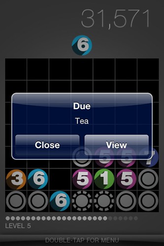
If you tap View, you’re taken to Due and the timer that just alarmed turns itself off automatically. If you tap Close, the message is dismissed, but the timer isn’t turned off (even though it’s done alerting you), which means that the badge on the Due icon doesn’t go away. You’ll have to open Due later to get rid of the badge.
I can’t see any justification for this. Timers don’t snooze—you get the alert and that’s that. It’s weird that an app that’s so very good at reducing the effort needed to set a timer has actually increased the effort needed to dismiss it. Timer alerts should be dismissed with a single tap, nothing more.
Lastly, we have the Logbook, which keeps track of your used reminders. Personally, I don’t see myself using this, but I suppose some people may treat it as a variant on the @done list in GTD. To me, the only reason to go to the Logbook is to change Due’s settings. You can change the alert sounds, the default snooze time (if any), and the Quick Access Times that appear just above the clock wheels in the Reminder setting screen.
It’s not fair that a review like this spends more time on the bad things than on the good. Good things are usually obvious in their goodness and there’s no need to go on and on about them. Bad things, though, require an explanation of why they’re bad and how they should be fixed. So let me repeat myself: while not perfect, Due is a really good app and has taken the place of the built-in Clock on my first screen.

