Options
March 23, 2014 at 9:28 PM by Dr. Drang
In my post about Tweetbot for the Mac, I complained about how its options for changing the fonts were more limited than I would have liked. Since then, I’ve been thinking about the personalization options available in the various software packages I’ve run across.
There’s been a tendency in recent years for reviewers of Mac and iOS software to heap praise on “opinionated design.” This phrase can usually be translated as “software that doesn’t allow much user customization.” For software that isn’t used often or isn’t used for long stretches at a time, a lack of customization options is no problem—it’s not worth spending a lot of time tweaking a program you spend little time with. But for bread-and-butter applications, like text editors, mail clients, calendars, and web browsers,1 tweaking the settings is as important as adjusting the driver’s seat in your car. You want to be comfortable with things you spend a lot of time with.
When you and the app designer are simpatico, the need for personalization never arises. It’s far more common, though, for you to like 90% of an app’s design but want to change two or three things. If there’s no opportunity to make those changes, you feel frustrated and using the program becomes a chore. This is why I was upset with Apple a couple of years ago when they dropped the Appearance pane from Safari’s settings. If I hadn’t learned of the defaults write commands that restored the settings that Apple had taken away from the GUI, I’d be using Chrome today. And I’d be frustrated with the design choices it doesn’t have options to change.
Of course, the 2–3 things you want to change aren’t the same as the 2–3 things I want to change, so developers have to offer a multitude of options to cover all the bases. When presented with a long list of possible customizations, the possible reactions are
- Oh boy! Look at all the customizations I can do.
- Oh shit! Look at all the customizations I have to do.
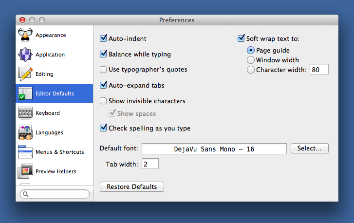
I’m generally in the first camp, but I’ve had the second reaction, too. Not so much because of the number of customizations available, but because of the combination of the number of changes I need to make and how the program organizes its preferences. Two examples of preference systems that have made me blanch are in BBEdit and Sublime Text.
During my last couple of years with TextMate, I kept looking over at BBEdit every time Bare Bones made an update to it. I’d download the trial version, fire it up, and open the preferences to start fiddling with the font, font size, tab width, and so on. And then I’d quietly quit and go back to TextMate, because before version 10, BBEdit’s preferences were a monstrosity. Ugly and disorganized, they looked to me like something that had accreted settings over the previous 20 years. When the preferences were redesigned for version 10, it became much easier to figure out what was where, and I couldn’t hand my money over fast enough.
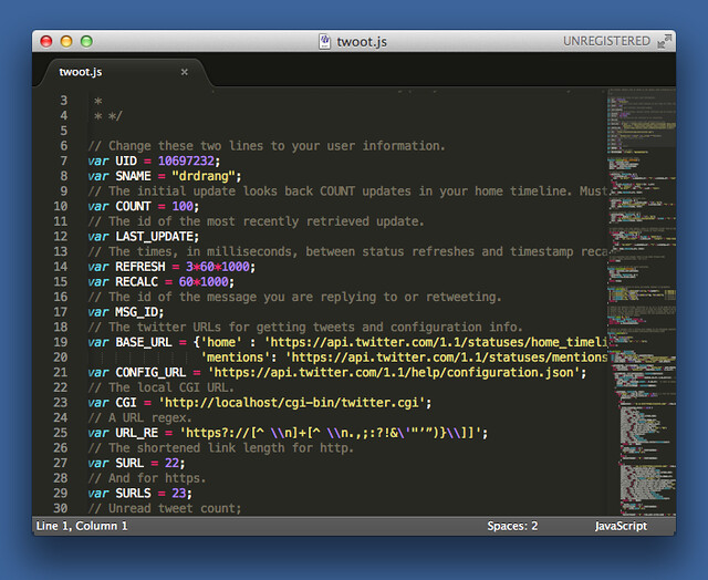
I’ve given Sublime Text a few tryouts, too, but despite the appeal of its power features and Python-based plugin system, the preference system has kept me away. I’m used to dotfiles for Unix utilities, even systems of dotfiles, but I don’t like the idea of using them with a modern GUI application. As important, though, is that Sublime’s developers and I have very different ideas about what a text editor should look like. When the defaults use brighly-colored fonts on a black background and have that thumbnail view on the right side, I know I’ve walked into the wrong party. It’s going to take a lot of customization to get things the way I like, and in making those changes, I’ll be going against the grain of the application. Not worth it.
The upshot, I guess, is that I’m not to be trusted. I say I want more options, and when I get them I say that’s not good enough. But if all I wanted was quantity, I’d be using Windows.
-
And Twitter clients. ↩


