Digital photos and me, Part II
September 17, 2006 at 1:01 PM by Dr. Drang
In yesterday’s post I mentioned that I don’t use iPhoto to organize my digital photographs, I use the directory structure of the file system. I find this way of organizing easy to understand and easy to use. An important benefit I forgot to mention yesterday is that photos stored this way are easy to share with people (e.g,, my clients) who don’t use Macs. Yes, you can burn CDs from within iPhoto to share with PC users, but they won’t be as well organized as a simple duplication of my directory structure.
But when you don’t use iPhoto, you need to come up with a way to view your photos. I have a copy of Photoshop Elements for editing photos (Photoshop itself is overkill for my needs), and it has a File Browser that works sort of like iPhoto for viewing all the images in a folder. At first, I thought this would be a good replacement for iPhoto, but Elements takes so long to boot up on my iBook and Mac mini that it was useless for doing quick reviews.
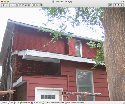
After a bit of searching, I found Xee, a wonderfully fast OpenGL-based viewer written by Dag Ågren. I keep it in my Dock, and when I want to see a photo I drag it over to the Xee icon. Because Xee launches very quickly, I’m looking at my photo in just a second or two. Here’s the Xee window (which you can click on to see at full size):
Xee not only opens the image you dragged on to it, it also lets you quickly move to any of the images in that same folder. The buttons at the upper left are for navigating among the images, although I usually use the keyboard shortcuts (see below) which are both convenient and editable via the Preferences.
The buttons in the upper right corner let you losslessly alter the orientation from landscape to portrait or vice-versa. The Finder preview icon automatically updates when you do this.
The info strip along the bottom of the window shows you the size of the image in pixels and kilobytes, the current magnification, the number of images in the folder, and the time at which the photo was taken.
Two things make Xee a pleasure to use: its rendering speed and its efficient user interface. Going from image to image in a folder usually takes less than a second. And every common command has a simple keyboard equivalent. Forward one image is the period key (because it has the > symbol on it) and backward one image is the comma key (because of <). Zoom out is -, zoom in is = (+). My favorite is Actual Size, bound to / (no, that doesn’t make sense to me either, but it’s nice because it’s close to < and >). I’ve added the binding of ? (Shift-/) to Fit On Screen, so I can bounce back and forth between it and Actual Size. (If you’re wondering why the cursor keys aren’t used for navigation, it’s because they’re used for scrolling around on zoomed-in images.)
None of these keyboard equivalents require the Command or Control keys. This is a bit outside the usual Mac rules, but since there’s no typing in Xee, there’s no reason to require keyboard combinations. Also, you can assign more than one keyboard equivalent to each command, which means you can add your own equivalents without changing Xee’s defaults.
Macupdate and Version Tracker list many image viewers. I’ve tried out most of them, but none work as well as Xee. The only feature Xee is missing is a filmstrip-like view of several images at once, a view that can speed navigation. My next post will discuss how I get around that.

