Another "best" weather webapp for the iPhone
June 3, 2008 at 2:27 PM by Dr. Drang
Before writing this post about Weather Underground’s iPhone-specific site, I looked around on AccuWeather’s site to see if it had an iPhone page. I didn’t find one then, but I did today. It’s at http://apple.accuweather.com/widget/iphone1/iphone.html, and despite some user interface problems, it’s pretty good. Weather Underground gives more detail in current conditions; AccuWeather gives more detail in today’s forecast.
When you first load the AccuWeather page, you’ll probably see something like this:
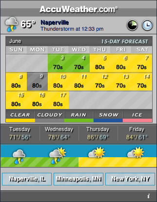
The strip at the top of the page has icon that summarizes the current conditions (sunny, cloudy, rainy, etc.), and gives the time, temperature and location. At the upper right are two circular icons that act as buttons to control what’s displayed in center of the page (more about that later).
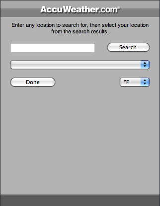
Along the bottom are rectangular buttons for quick access to three default locations. You can set these locations by first clicking on the button you want to set, then clicking the script “i” in the lower right corner. This brings up a form where you can enter the city name or zip code.
The central section of the page is where most of the information is delivered. It’s split into an upper part, which is controlled by the leftmost of the two circular buttons, and a lower part, which is controlled by the rightmost of the two circular buttons. In the image above, the top part is showing a 15-day forecast calendar and the bottom part is showing a more detailed 4-day forecast calendar.
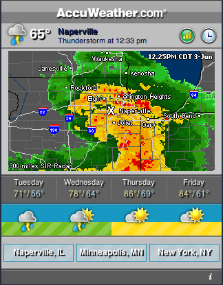
Clicking on the left circular button changes the upper part to an animated radar map.
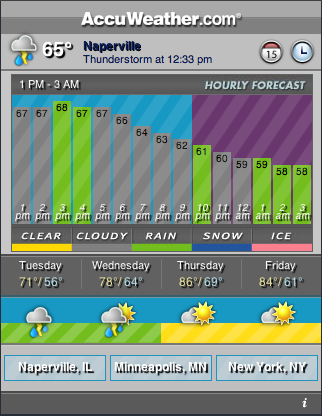
Clicking the left circular button again changes the upper part to a hour-by-hour forecast for the rest of the day.
Clicking the left circular button again returns you to the 15-day forecast calendar.
Clicking the right circular button toggles the lower part between the 4-day forecast calendar shown above and a 5-hour forecast calendar.
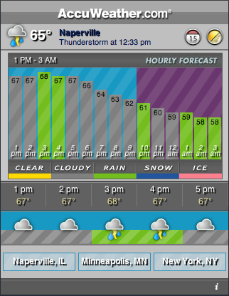
The site loads pretty quickly, even over the EDGE connection; more quickly, it seems, than the Weather Underground site. It’s certainly not as well designed as the Weather Underground site, where the buttons look like buttons and have obvious labels like “Radar” and “Forecast.” In fact, I wrote these directions because I found the AccuWeather site confusing, with cryptic icon buttons. And don’t get me started on the ugly color choices.
Despite its user interface problems, I like the AccuWeather page because it’s more detailed in giving today’s forecast and because its radar images are time stamped so you have a sense of how fast a weather system is moving. I have buttons for both it and the Weather Underground page on my iPhone home screen.
