Bloglines, NetNewsWire, and the iPhone
July 23, 2008 at 12:53 PM by Dr. Drang
In earlier posts, I’ve mentioned my preference for reading RSS feeds through Bloglines despite NetNewsWire’s position as the feedreader of choice for Mac users. It’s not that I didn’t like NetNewsWire; I just didn’t see the need for a dedicated feedreader when Bloglines worked so well. Even after NetNewsWire became free, I stuck with Bloglines. Until I got my iPhone in March.
At the time, the Bloglines webapp for the iPhone was terribly unstable, kicking me out of Safari and back to the home screen at least once a day. After a few days of this, I began looking around for something else.
I started with Google Reader, but that didn’t last long. I know a lot of people swear by Google Reader, but I find it ugly and clumsy. I’d tried it out on the desktop before and hated it, and when I tried it again in March I still hated it. Maybe its iPhone webapp is wonderful, but because my feedreading is now more diverse—I regularly read on two different Macs and on the iPhone—any reader I used must work well on all the systems I use.
I settled on a combination of NetNewsWire on the Macs and NewsGator Mobile on the iPhone. They shared information, so except for a few glitches, feeds I’d read on one platform didn’t show up on the other. NewGators Mobile’s display wasn’t the greatest—some feeds had HTML mixed in with the content—but it was usable and stable. I stayed with this combination for months.
Things changed a couple of weeks ago. The well-known change was the availability of a NewNewsWire app for the iPhone. Less well known was an improvement in the Bloglines iPhone webapp (which, for all I know, may have been released weeks earlier; but I learned about it around the same time as the App Store launch). I’ve been trying out both readers and have decided to go with NetNewsWire, but it was a near thing. Here’s what I like and dislike about both.
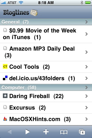
First, Bloglines. The iPhone display of both the user interface elements and the feed content is wonderful, and the response to touches is snappy. As with the desktop webapp, several articles are displayed at once, and you scroll through them.

Bloglines seems to work faster than NetNewsWire because, unlike NNW, it doesn’t download the current articles all at once; it downloads them only when you ask to read them.
The biggest downside to using Bloglines—and what lead me to go with NetNewsWire instead—is that Bloglines considers an article to be read as soon as it is displayed. So, for example, if I have 3 unread MacOSXHints articles and I touch the MacOSXHints line to display them, all three articles are marked as read before I’ve scrolled down to read them all. If I’m interrupted before I’ve read them, they won’t be there the next time I open Bloglines. The desktop Bloglines webapp works the same way, and this behavior never bothered me there, but it does bother me on the iPhone because
- I’m more likely to be interrupted when I’m reading on the iPhone.
The desktop webapp has a way of redownloading older posts that the iPhone webapp doesn’t. If there’s an article you want to go back to, you can use these controls to pull down all the feeds for the past hour, 6 hours, 12 hours, 24 hours, etc. For some reason, this feature isn’t in the iPhone webapp, and I miss it.

NetNewsWire for the iPhone, like its desktop counterpart, downloads and stores the individual feed items, so its no big deal to go back and look at an item you’ve already read. This is, for me, what tipped the scale in NetNewsWire’s favor.
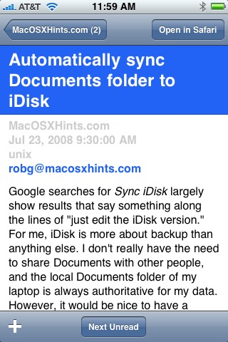
The overall look of NNW for the iPhone is comparable to that of Bloglines: clean, easy to read, with well-designed controls.

NNW is more article-focused than Bloglines; only one article is displayed at a time, and you move from one to another by touching the Next Unread button at the bottom of the screen. When you’ve read all the available articles, the button disappears.

This button is associated with the only bug I’ve found in NetNewsWire: Because NNW periodically scans for feed updates, new articles sometimes come in while you’re reading. When that happens, you may find yourself reading what was, before the update, the last unread article. Since it’s no longer the last unread article NNW rightly keeps the Next Unread button visible, but somehow the logic behind the button has been messed up, because touching does nothing. To read the newly-downloaded articles you have to go back out the feed list and drill in again.
Another feature NewNewsWire for the iPhone has borrowed from the desktop version is a builtin browser. If you click on a link in an article, that page will open in NNW, not Safari (there’s a button that will let you reopen the link in Safari if you want to). At first, this was offputting, but I soon understood why Brent Simmons did it this way. Switching from one application to another on an iPhone is a much bigger deal than doing so on a Mac. By keeping me in NNW while I read the linked pages, Simmons was saving me the effort and the delays associated with getting back to NNW after reading a page in Safari. Good thinking on his part.
I said in those earlier posts, the Bloglines v. NetNewsWire competition was close. It’s still close, but now NetNewsWire’s in the lead.

