iPhone 2.0 calculator
July 12, 2008 at 11:33 PM by Dr. Drang
In a previous post, I said I was looking forward to the 2.0 calculator because it was going beyond 4 functions to become a real scientific calculator. Now that it’s here, let’s take a look.
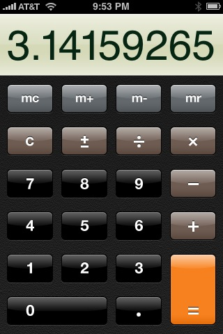
First, we see there’s a new design to the basic calculator. It no longer has the circular keys that mimic the design of the Braun ET calculators of the ’70s.

This change in key shape was presumably done to make the four-function, upright calculator match the style of the scientific, landscape calculator, which we’ll look at shortly.
The only thing I have to say about the basic calculator is I don’t like the design of the ± key. Two reasons:
- The ± symbol has a well-known mathematical meaning that doesn’t match the purpose of the key. The symbol means—and is pronounced—“plus or minus”, not “change the sign of this number.” Real calculators use “+/-” on the “change the sign” key.
- Because it uses the ± symbol and is right next to the key with the similarly-shaped ÷ symbol, it’s easy for weaker-eyed users (like your humble correspondent) to hit one when they want to hit the other.
This is Apple trying to be sophisticated and getting it wrong.
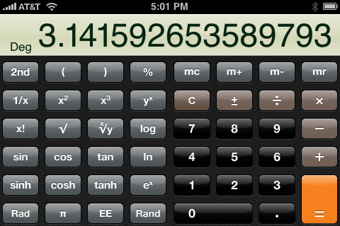
The big change is the addition of a scientific calculator, which you access by rotating the basic calculator to landscape mode. It doesn’t matter which way you rotate; the scientific calculator appears whether you turn it clockwise or counterclockwise. (Another quarter-turn to portrait mode upside-down does not bring it back the basic calculator, though.)
As you can see, the scientific calculator has all the expected functions.

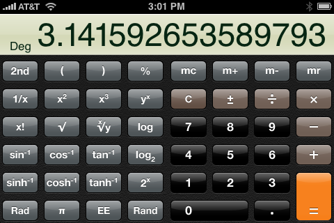
The 2nd key changes the trig and hyperbolic trig functions into their inverses. It also changes the natural log and exponential functions into base-2 log and power functions.

The inverse functions are, of course, indispensible. The base-2 functions seem gratuitous; something easy to implement, but not really important on a scientific calculator. More important would be a 10x key that would act as the inverse of the base-10 log key. The yx key is just too clumsy to act as an inverse log function.
As I suspected, the Rand key next to the zero enters a random number between zero and one. I still don’t know what value this is in a calculator that isn’t programmable.
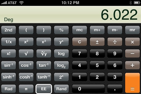
The EE key between the pi and Rand keys is for entering numbers in scientific notation, but it doesn’t work the way any EE key on a real calculator works. Let’s say we want to enter Avogodro’s number:
- Tap in 6.022. This number appears in the display.
- Hit the EE key. The EE key gets a white border.

- Tap in 23. The 6.022 disappears from the display, replaced by the 23. WTF?
- Press any function key or =. Now the display shows the number as it should: 6.022e+23.
The disappearance of the mantissa is disconcerting to people used to working on real scientific calculators. On a real calculator the exponent is, by default, not shown. Pressing the EE key (or its equivalent, however it is labeled) changes the display to show both the mantissa and the exponent, and every digit you tap after that goes into the exponent. Thirty-five years of calculator design have made this the standard, but Apple has decided to go its own way.
Apple’s way of doing it is not just nonstandard, it’s wrong. Apple seems to think that 6.022×10²³ is two different numbers separated by the multiplication function. But that’s not how scientists and engineers think of it. A number in scientific notation is a single number, and no part of it (i.e., the mantissa) should disappear from the display during entry.
The Rad key in the lower left corner changes the calculator from Degrees mode for the trig functions to Radians mode. If you press it, the name changes to Deg and pressing it again toggles back to Degrees mode. There’s a little annuciator in the lower left corner of the display to show what mode you’re in.
Most scientific calculators have a third angle mode: Gradient mode. Here I applaud Apple for going its own way; Gradient mode has nothing to do with science or engineering and is a worthless feature that keeps appearing on calculators through a self-perpetuating habit.
My verdict on the iPhone 2.0 scientific calculator: Apart from the poorly-chosen symbol on the change sign key and the weird behavior of the EE key, it’s a winner. Unless and until programmable calculators start showing up in the App Store, I don’t see any reason to pay for a third-party calculator.
