Twoot for Twitter
December 26, 2008 at 3:24 PM by Dr. Drang
I think I’ve found a Macintosh Twitter client I can live with. Twoot is a web app, but unlike Hahlo, which is hosted on a server somewhere, Twoot is just a set of HTML, CSS, and JavaScript files that sits somewhere on your hard disk. It’s turned into a site-specific browser (SSB) by Fluid.
As I said in this post, I used to use an SSB that pointed to Hahlo, but Hahlo’s server was often slow or down. An SSB that points to twitter.com worked fine, but needed to be manually refreshed. And none of the dedicated Twitter clients I tried—even the justly-praised Twitterrific—felt right to me.
It was while searching for a client at the Twitter Fan Wiki a few days ago that I ran across Twoot. The description given in the wiki
An ad-free open source minimalistic customizable twitter client for those who know HTML and CSS. Appified with Fluid.
seemed right up my alley. So I downloaded and began playing with it. Fortunately, Peter Krantz, Twoot’s creator, gave Twoot a very simple design that makes customization easy. Even an amateur web designer and programmer like me can change it around.
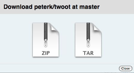
Krantz’s canonical Twoot can be found in its GitHub repository. My customized version is also at GitHub, as is another customized version by Travis Jeffery. Don’t worry if you’re not a git user (I wasn’t until today). You don’t have to learn how to “check out” or “clone” the repository, you can just download a compressed folder of all the Twoot files by clicking the download button near the top of the repository page. You’ll be given a “choice” of downloading a zip or tar archive.

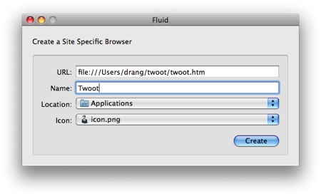
Choose the tar archive; despite all appearances, there is no zip archive. Extract the archive somewhere on your hard disk—your home directory, for example—then launch Fluid and point it at the twoot.htm file.

There’s an icon.png file in the archive to use as Twoot’s application icon.
Once the Twoot application is built, it can be customized by changing the HTML, CSS, and JavaScript in the twoot directory. Twoot uses the jQuery library, which is nice because I wanted to start learning jQuery, and there’s no better way to learn than to be forced to read and write real world code. I’m sure my jQuery isn’t especially well written, but it’s working, and I’ll smooth it out as I learn more.
The differences between my customized Twoot and Krantz’s original are:
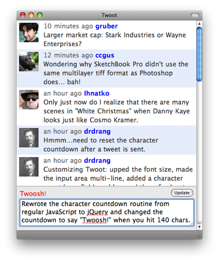
- A bigger font.
- User icons in a light-colored theme.
- A bigger area for typing tweets.
- The message area doesn’t cover the last tweet in the list.
- A counter updates as you type, telling you how many characters are left. The counter turns red when you have 20 characters left and changes to “Twoosh!” when you hit 140. Travis Jeffery’s Twoot customization also has a counter, which Peter Krantz added to the standard version two days ago.
- Clicking the screen name in a tweet starts an @Reply with properly set
in-reply-toinformation and puts the insertion point after the@somebody. Travis Jeffery’s Twoot also has proper @Replies. The standard Twoot just puts@somebodyin the message area, but doesn’t tie your reply to the original tweet. - Sending a tweet requires clicking on an Update button. I’m not sure this is an advantage, but it was necessary when I changed the message field from
<input type="text">to<textarea>to get multiple lines. The standard and Jeffery Twoots can send your update when you press the Return key, so they have the option of using an offscreen Send button to make the interface cleaner.
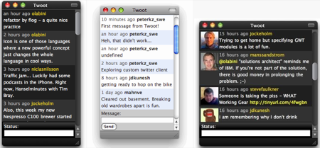
Here are screenshots of the standard Twoot, using three different CSS themes.

You can see full-sized versions at the GitHub repository. This is what my customized version looks like.

It’s a work in progress, but it’s my main desktop Twitter client now. I’m sure I’ll be making changes as I find things that annoy me.
