Jumpcut
January 28, 2009 at 1:07 PM by Dr. Drang
I’ve been trying out the public beta of LaunchBar 5 for the past several weeks, and although I like it, I probably won’t be using one of its most touted new features, the Clipboard History. Instead, I’ll be using my old standby, Jumpcut, because its user interface is just better.
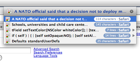
First, let’s look at LaunchBar’s Clipboard History. You press the hotkey combination (which you can set), and up pops the usual Launchbar menu, populated with your last several clipboard items.

For each item, you get the first 40 or so characters, a total character count, and the application from which it was clipped. Multiline items use spaces surrounding a vertical bar (|) to indicate the line break.
The nice thing about this menu-based history display is that it lets you see all the items in the history at once. The bad thing is that you’re forced to see all the items in the history at once. The little list shown above isn’t so bad, but when the clipboard history grows to 20 or more items the menu runs way down the screen and is hard to read because it’s so densely packed. Another problem is that the menu system forced the items to be clipped and reformatted to be put on a single line. Because the items don’t look like they did when you first clipped them, they’re hard to recognize.
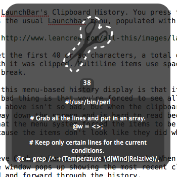
Jumpcut’s author, Steve Cook, takes a different approach. When the (user-defined) hotkey is pressed, an HUD-style window pops up showing the most recent clipboard item. The arrow keys are used to walk backward and forward through the history.

There’s no clutter, and because Jumpcut has a multiline display, multiline items can be displayed nearly as they were when you clipped them. Lines longer than the window width are wrapped as they would be in a word processor. Jumpcut doesn’t let you see all the items in the history, but after spending weeks testing Launchbar’s “show everything” approach, I think Jumpcut has the right idea.
In an earlier post, I mentioned that Jumpcut had some problems dealing with Spaces. Chris Liscio sent me a workaround, which I appended to the bottom of the post, but that workaround is no longer needed. Version 0.63 of Jumpcut, released a few days ago, handles Spaces perfectly.
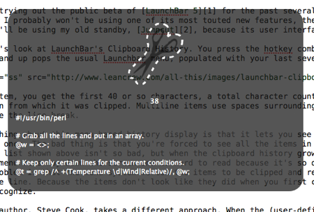
Jumpcut isn’t perfect. It’s window is too narrow to show most of what I clip without line wrapping, and I’d prefer the text to be left-aligned rather than centered so it looks more like it did when I clipped it. Fortunately, Jumpcut is open source, so I’ve been able to thrash around in Steve Cook’s carefully crafted code and get Jumpcut to better fit my needs. Here’s what my copy looks like (in reduced size):

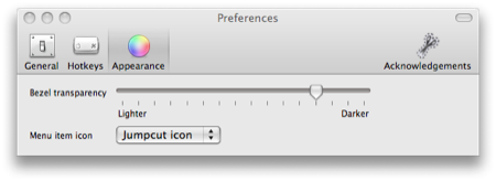
The window is now wide enough to accommodate lines of 70-80 characters without wrapping, and the lines are left-aligned. I’ve also fiddled with the window transparency (in the preferences) and the color of the text fields (in the code) to make the rounded text containers in the window disappear.

I’ve put my changes to Steve’s code in a GitHub repository if you’re interested.
As I mentioned in this post when the LaunchBar public beta was first announced, I was looking forward to dropping Jumpcut to reduce the number of constantly-running utilities. But I can’t do it. Jumpcut does its job better.
Update (1/30/09)
I’ve made some changes to my copy of Jumpcut: the scissors icon is smaller; the history counter is larger and set off to the side; more lines are visible; and, most important, the text background is the same color as the bezel regardless of the slider position in the window transparency preference.
![]()
Update 8/13/10
Depending on which version of XCode and OS X you’re running, you may need to make some changes to the source code of one of the files. The notes at the end of the repository’s README should point you in the right direction.
Or you could just download a built version that I’ve run on both Leopard and Snow Leopard.
