Making iPhone Notes look better
June 22, 2009 at 11:40 PM by Dr. Drang
The Notes application has always been the Fredo of the iPhone. No syncing, no landscape mode, a childish and nearly unreadable font—just a terribly weak app. However many Springboard screens I had, Notes was always kept on the last one.
No more. With version 3 of the iPhone system software, Notes has turned into a decent app. It syncs with the Notes section of Apple Mail, and it works in landscape mode, too. There’s still the unfortunate problem of the font, but it turns out that can be fixed with a little work.
The default font for Notes is Marker Felt, a handwriting-like font with bold strokes and a horizontally-condensed look.
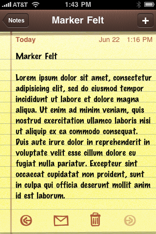
There’s no official way to change the font, although this suggestion from Mac OSX Hints gives a multi-step process for changing the font in a particular note. It was discovered in earlier versions of the iPhone OS and still works in version 3. Now there are simpler ways :
- To change the font in an individual note, select the text of the note in Mail and change the font there. The change will be made on the iPhone after your next sync.
- To change the default font, go to the Fonts & Colors preference in Mail and change the Notes font to something else.1 (See the update below.)
Of course, you can’t choose just any font on your Mac, you have to choose a font that’s also on the iPhone. I don’t know of a definitive list of fonts for the new iPhone OS; until then, this list by John Gruber for the original iPhone will have to do:
- American Typewriter
- American Typewriter Condensed
- Arial
- Arial Rounded MT Bold
- Courier New
- Georgia
- Helvetica
- Marker Felt
- Times New Roman
- Trebuchet MS
- Verdana
- Zapfino
As it turns out, several of these fonts don’t work well in Notes because their metrics don’t match the spacing of the lines on the background legal pad graphic. Here they are (excluding American Typewriter Condensed and Zapfino, neither of which I would consider using for a notes font).
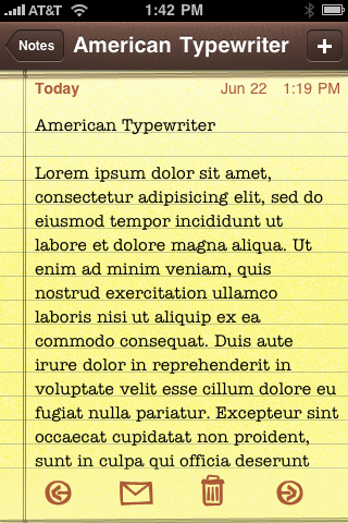
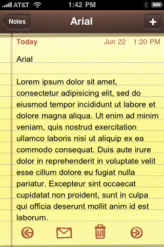
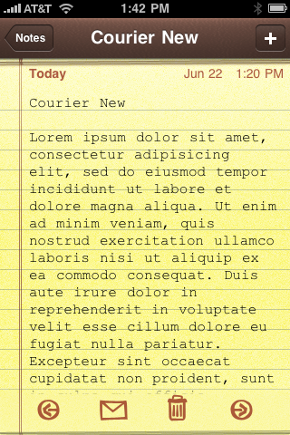
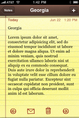
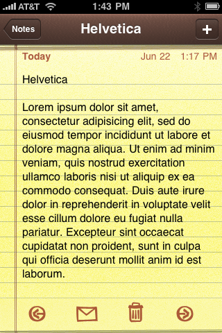
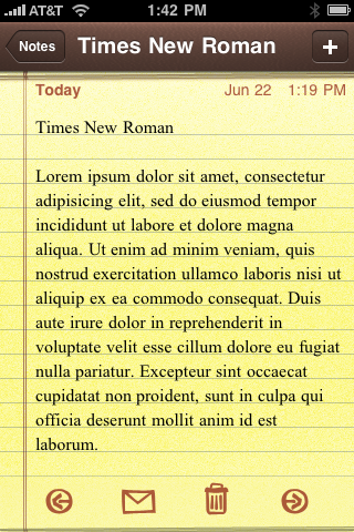
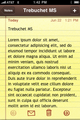
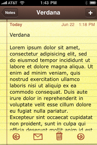
As you can see, Courier New, Georgia, Helvetica, and Verdana don’t work because of the vertical spacing problem. Courier New is no great loss, but it’s unfortunate that Helvetica and Verdana don’t line up. Among the fonts that fit the background line spacing, I think Trebuchet MS looks the best. It may be a bit big for you, but it works well with my middle-aged eyes.
Update 6/23/09
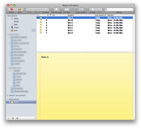
OK, now I’ve checked: Changing the default Notes font in Mail doesn’t change the default Notes font on the iPhone; new notes created on the iPhone will still be in Marker Felt. My suggestion in the footnote to preload your iPhone with several notes in the font you like does work. I’m keeping 5–10 “blank” notes on my iPhone with the font set to Trebuchet MS.
Update 6/30/09
For some reason, now I can get notes in Helvetica to match the line spacing of the background image. A discussion and a screenshot can be found here.
-
I haven’t had a chance to test this (I’m away from my “syncing Mac” for a day or two—I will check and update the post when I get back to it), so I’m not sure if the default propagates to the iPhone when you sync (it doesn’t; see the update). That is, I’m not sure if new notes created on the iPhone will use the desired font instead of Marker Felt. If setting the default in Mail doesn’t work, you can “preload” your iPhone with several nearly blank notes from Mail. Just make a bunch of notes in Mail with the font you want. Put “Note A,” “Note B,” etc. in their first lines and sync. You can edit these notes instead of creating new ones on your iPhone. ↩
