
Some CSS changes
August 13, 2009 at 6:33 PM by Dr. Drang
I’ve made a few more style changes to the blog since adding the update <div> style last month. I usually write a short post about these changes because it’s better documentation than long comments in the CSS file.
The first change was to narrow the content area and widen the sidebar. I was looking over some of my more text-heavy posts and decided the lines were just too long for easy reading. This has been a concern of mine for years; there’s always been a tension between making the lines shorter for better readability and making them longer to accommodate images and code snippets. Horizontal scroll bars, although not ideal, are a reasonable way to handle long lines of code, and I’ll discuss how I handle wide images a little later in the post.
So now the content area is 33 ems wide. I use ems as my width measure for two reasons, both associated with readability:
- The lines of text should have approximately the same number of characters, regardless of the user’s font size. Rules of thumb for line length have been around for ages in print typography, and they are usually written in terms of average words per line or characters per line.
- I refuse to set an absolute font size in my style sheet. I have no problem with relative font sizes—e.g., x% bigger for headers, y% smaller for footnotes—but the main text size should be set by the user, not the web designer.
The latter point is a particular sore spot of mine as a reader. As I’ve aged, my eyes have weakened, and I need a larger font to read comfortably. And I really hate it when some young designer overrides my decision.
This article, which showed up on delicious.com/popular today, is a perfect example of the typical web designer’s attitude. The author, “a sophmore [sic] at UCLA majoring in computer science,” recommends paragraph fonts of 12-14px as “a good and comfortable size” for readability. He thinks this is “sufficiently large.” Well, thanks for your consideration, you little shit. When I was your age, I could read agate box scores with no strain (and I could spell sophomore, too, even without a spell-checker). Come back to me in a quarter-century and tell me 12-14px is “sufficiently large.”
Anyway, the obvious problem with using ems to define sizes on the page is that images don’t come in ems, they come in pixels. An image that fits easily within the 33 em width in my browser may not fit the 33 em of your browser. I tend to scale larger images down to 450 pixels before uploading them; they’ll fit the 33 em width for any default font size of 14px or larger. Since browsers come with the default size at 16px, most people should have no trouble with the images I use. But to accommodate those hawk-eyed showoffs who like to run their default font size down even further (and to handle the 500px wide “Medium” images from Flickr), I recently added this line to my <img> styles:
max-width: 33em;
With this, the browser will scale the image down if it doesn’t fit. I suspect this won’t work with IE 6, but people who are still using IE 6 aren’t exactly what you’d call “web savvy.” They’re unlikely to have changed their default font size from 16px because they’re unlikely to even know that such an option exists. With a 16-pixel em, images up to 528 pixels wide will fit in the content area.
Finally, to handle a “spoiler” in my last post, I added a spoiler class that sets the text and background colors to the same value so the text can’t be read normally. The text can be read when highlighted. The CSS that does this is
 1:  #content .spoiler {
 2:    background: #898;
 3:    color: #898;
 4:  }
 5:
 6:  #content .spoiler::selection {
 7:    background: #ded;
 8:    color: black;
 9:  }
10:
11:  #content .spoiler::-moz-selection {
12:    background: #ded;
13:    color: black;
14:  }
Lines 1–4 work on all browsers. Unless your browser’s highlight color is #898, the spoiler text will become readable when you drag through to select it. Lines 6–9 and Lines 11–14 make the selected spoiler text even easier to read in Safari and Firefox, respectively.
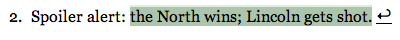
After adding the spoiler class, I noticed that Safari and Firefox render the selected spoiler text a little differently. Here’s Safari
and here’s Firefox
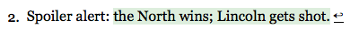
Firefox’s background color is exactly what’s specified in the CSS, which is the background color of the sidebar. Safari’s is darker, and I’m not sure why. Maybe it’s mixing the specified background color with the normal blue selection color.