The compleat Menlo/Vera Sans comparison
October 27, 2009 at 7:04 PM by Dr. Drang
This post of mine on the then-upcoming Menlo monospaced font for Snow Leopard is still getting hits, even though
- it was written before Snow Leopard was released,
- it’s mostly a recapitulation of information on a Typophile page, and
- it speculates on some things that are now known.
So I decided to write a new post with up-to-date information.
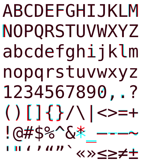
Here’s my expanded version of Jesse Burgheimer’s comparison graphic, first shown in a comment on the Typophile page, comparing DejaVu Sans Mono (which is Vera Sans Mono with a few more glyphs) with Menlo. DejaVu is red, Menlo is cyan, and the overlap is black.

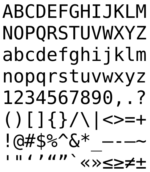
For another comparison, here’s that same DejaVu Sans Mono alphabet in black. Roll your mouse over the image and it will turn to Menlo. Jittering the mouse in and out of the image will cause it to bounce back an forth between the two fonts. This is like Jon Shea’s GIF animation, but at a larger size.
The big differences are:
- Menlo’s asterisk is bigger and lower.
- Menlo’s underscore is higher and thicker.
- Menlo’s zero is slashed instead of dotted in the center.
- Menlo’s hyphen is longer. (The dashes in the penultimate line are in this order: en-dash, hyphen, em-dash.)
The smaller differences are:
- Menlo’s comma and period are bigger.
- Menlo’s tilde is wavier.
- Menlo’s brackets, braces, and parentheses are higher.
- Menlo’s straight double quote marks are bigger and spread farther apart.
- Menlo’s capital N is wider.
The miniscule differences are:
- Menlo’s capital M is shifted to the left.
- The middle horizontal stroke of Menlo’s B, E, F, H, and e are higher.
- Menlo’s i and l and vertical bar are shifted to the right.
- The nose on Menlo’s 1 is more tilted.
- Menlo’s en- and em-dashes are a bit higher.
- Menlo’s exclamation point, single quote, and caret are slightly bigger.
- Parts of Menlo’s plus, plusminus, equals, and octothorp are shifted.
- The tail of Menlo’s @ is flat instead of curled up.
- The stroke in Menlo’s percent sign is thicker.
I don’t know why Apple bothered with the miniscule changes; they don’t improve the legibility or the aesthetics of the font.
The two things I don’t like about Menlo—and the reasons I haven’t switched from DejaVu—are the hyphen and the slashed zero. I actually use both hyphens and em-dashes regularly, and I prefer them to be distinct; Menlo’s is too close to the length of its em-dash. My dislike of the zero is stylistic rather than utilitarian; the slashed zero is a cliché, and I’ve always thought the Vera/DejaVu dot was a neat alternative. I kind of like Menlo’s big centered asterisk, but not enough to make up for the hyphen and the zero.
I’ll end with what I said in the earlier post:
I’m getting a sense that Mac users are coalescing around the notion that Menlo is a version of Vera Sans Mono that Apple “fixed.” That idea smells of fanboyism. I’ve been using Vera Sans Mono since it was released. It was—after my own data—the first thing I brought over to the Mac when I switched from Linux. I’ve always had the Terminal use Vera Sans (or DejaVu); same with Mail, BBEdit and, later, TextMate. In short, Vera Sans Mono is a great font and always has been. That’s why Apple chose it as the basis for Menlo. To the extent that Apple has made any improvements, they are marginal at best.

