Some Simplenote stuff
November 12, 2009 at 10:14 AM by Dr. Drang
Last week I had a business trip to Hartford, Connecticut and decided to try a new way of keeping the flight/hotel/etc. details. I’ve written on the past about how I keep my travel information handy. For a few years, I had all the info printed on a 3×5 card, which I kept in my Hipster PDA. After getting an iPhone, I switched to creating a PDF that looked good on the iPhone’s screen and could be moved to it via email or one of the many wifi file transfer utilities. This trip, I put the information in Simplenote. It worked out so well I moved some other information from PDF to Simplenote.
Let me start by saying that for pure information retrieval speed, nothing beats a 3×5 card in your back pocket. But when I got the iPhone I wanted to consolidate as much as I could into it, and small inefficiencies seemed like a small price to pay for that consolidation. But Files, the file transfer/viewing app I use, does take a while to open, probably because it tries to establish a WebDAV server on whatever local wifi network it can connect to. Simplenote has a much faster startup time and would be preferable if I could get the formatting right.
Here’s the OmniOutliner template I was using to create the trip card PDF.
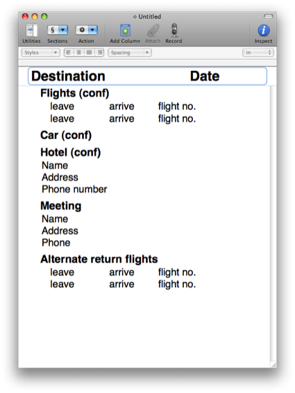
Obviously, Simplenote, which works with plain text only, isn’t going to give me the font size and style changes that I can get in a PDF, but I’d be satisfied if I could get the flight numbers and times to line up reasonably well. This isn’t a given. Simplenote uses Helvetica, a proportional font, and doesn’t allow tabs; therefore characters will not automatically line up in columns. Luckily, two features of Helvetica allowed me to get columns that were close enough to alignment to make the trip info well structured and readable:
- All the numerals are of the same width. As far as I know, this is a feature of every proportional font.
- The space character is almost exactly half the width of a numeral.
By putting two spaces in place of every “missing” numeral, I could get times with one-digit hours to align with times having two-digit hours. And by putting the flight numbers at the ends of the lines, their unavoidable misalignment wouldn’t matter.
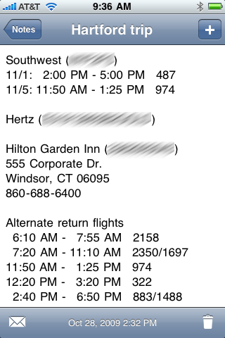
As you can see, the alignment isn’t perfect, but it’s good enough to quickly scan through the list down any of the columns.
In addition to launch speed, the other advantage of using Simplenote instead of a PDF is editablity. If my plans change, I can edit the note directly on my phone, something I can’t do with a PDF.
I was so pleased with the ability to align columns of numbers that I converted my Metra commuter train schedule from a set of HTML files to a set of Simplenote notes. Here’s what it looks like in the web app
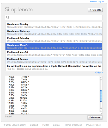
and here’s what it looks like on my phone
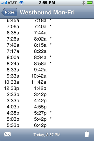
Not as nice as the HTML version
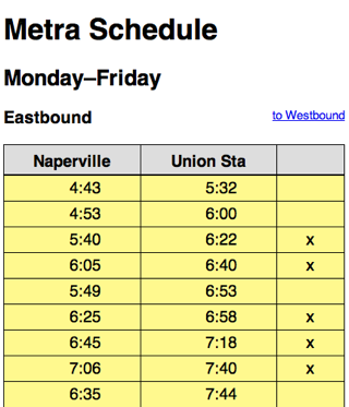
but, like the trip info, easily readable and much faster to access.
Now that I’m using Simplenote more, and collecting more notes, I’m glad to see that its developers are adding new options for organizing notes and making its launch time even shorter. It would be nice if Simplenote had a note-by-note option for displaying the text in a monospace font; this would allow perfect column alignment for all kinds of data. I can understand why the Simplenote people haven’t done this; the only monospace font on the phone is the ugly and excessively-serifed Courier. Maybe if Apple moves Menlo to the iPhone, we’ll get a monospace option in Simplenote.
One last thing. I started writing this post in Simplenote in the Hartford airport. As I was juggling the phone and some things I shouldn’t have been eating the phone’s orientation kept shifting between portrait and landscape (something the upcoming options will be able to prevent). The transitions didn’t always go smoothly, and I ended up with a screen that looked like this:
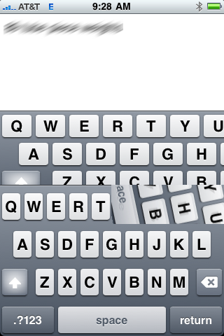
Three keyboards for the price of one!
