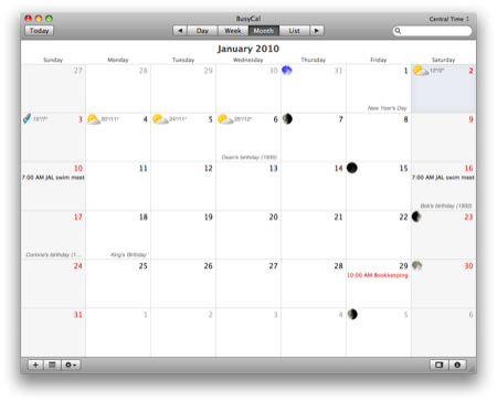
Why I won't be switching to BusyCal
January 2, 2010 at 8:04 PM by Dr. Drang
After reading Wolf Rentzsch’s review of BusyCal (which I was led to my this Daring Fireball link), I decided to download it and give it quick test run. My initial impression is that its improvements over iCal aren’t enough to justify a switch.
Let me start by saying that BusyCal’s greatest strength—the ease with which it syncs with Google Calendar and with other BusyCals on your local network—are of little value to me. Apart from some very basic information, I don’t share calendars with co-workers (who run Windows, anyway), and my wife uses a paper calendar. Keeping my iPhone up-to-date is about all the syncing I need, so I’m not exactly a prime target for BusyCal.
But one thing in Rentzsch’s review caught my eye:
Simple text box for entering times. You can actually type out “4:23p” into a new event’s start time instead of navigating iCal’s awkward segregated time field.
Entering events in iCal has always been a pain because the hours and minutes are in different fields, forcing you to tab from one to the other. Simpler time entry would be a significant improvement.
What I learned from playing with BusyCal is that time entry is even better than Rentzsch’s description. Yes, you can type “4:23p” directly, but you can also type just “423p” and get the same result. And for an appointment at 3:00 PM, you can get by with typing just “3p.” This is so good it makes the multi-step procedure in iCal seem criminal.
Another nice thing about BusyCal is how it displays holidays in month view—with gray italic text down at the bottom of the day box.

Just like a nicely printed paper calendar. And you can designate any set of events as holidays, so family birthdays and anniversaries will get the same treatment as Christmas and New Year’s Day.
BusyCal also has preferences for showing weather forecasts and the phases of the moon. I particularly liked the way the full moon on New Year’s Eve was displayed in blue.
But there are some downsides. I agree with Rentzsch that weekends are kind of crappy looking. I don’t mind the red date numerals so much, but I really dislike the gray background; it makes reading the text on those days a bit harder and it diminishes the distinctiveness of the blue-gray “Today” background.
I was also disappointed to learn that, like iCal, BusyCal has only one preference setting for the starting day of the week. When I’m looking at a monthly view, I like seeing Sunday as the first day of the week, but when I’m looking at a weekly view, I prefer to start with Monday. This is the way most, if not all, paper calendars are laid out, and I can’t understand why this wouldn’t be an option in any professionally made calendar software. If BusyCal had that option, they might have made the sale.
I say “might” rather than “would” because it’s not clear to me how well BusyCal syncs with the iPhone. According to the BusyCal Configuration Guide, the syncing would have to be done through either MobileMe or Google Calendars. I have no interest in buying a MobileMe account, and my experiments with Google Sync in the past have been disasters. So I have to say that the lack of a direct sync with the iPhone is another mark against BusyCal.1
Update 1/3/10
I’m now pretty sure BusyCal will sync with the iPhone when the phone is docked. I added a test event via BusyCal, closed it, and launched iCal. The test event appeared in iCal, which suggests BusyCal is saving to iCal’s files, which will be synced when the iPhone is docked.
Because I’m not at my office computer (the one I sync my phone to), I can’t take the last step and see if the test event added in BusyCal gets put on the iPhone. I’ll give it a try tomorrow.
This test is more to satisfy my curiosity than anything else. Whatever the outcome, I won’t be switching to this version of BusyCal.
Update 1/4/10
OK, now I’ve run a sync test with my iPhone, and it’s clear that:
- BusyCal reads from and writes to the same calendar data files as iCal.
- Syncing my iPhone via the USB dock and iTunes works perfectly.
My syncing concerns in the paragraph above were, therefore, unfounded, and I’ve struck them out.
So it looks like I’ll be sticking with iCal and wearing out my tab key as I enter events. Too bad. There’s room for a high-end Mac calendar application.
-
I recognize that it isn’t BusyCal’s fault that it can’t sync directly to a docked iPhone; Apple keeps that syncing option to itself. But that recognition doesn’t make BusyCal’s syncing with my iPhone any easier.↩
