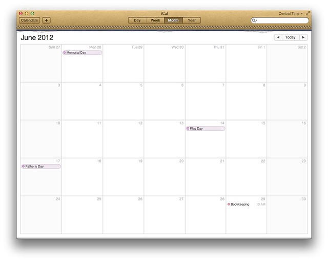
Another reason to hate iCal in Lion
October 24, 2011 at 8:52 PM by Dr. Drang
I’ve been using Lion on my MacBook Air for quite a while, but I didn’t switch my office iMac to Lion until a couple of weeks ago. Normally, I don’t spend much time looking at my calendar on the Air, so I haven’t had much experience with the new iCal until recently. Like everyone, I hate the faux leather window dressing and the oh-so-cute bit of “torn paper” along the top edge, but those are simply evidence of bad taste, not a decline in functionality.
Putting the list of calendars in a popup list instead of a sidebar seemed at first to be a decline in functionality, but I’ve had enough experience with the new layout now that it doesn’t bother me anymore.
One thing I don’t think I’ll ever get used to, though, is the really pale date numbers, especially in the Month View.
Today I was on the phone and needed to check the date of next Thursday. I had turned away from my computer to flip through a stack of papers, and when I turned my head to glance at the calendar to confirm the date, I realized that a casual glance wouldn’t do. I had to stare at the screen to make out the light gray date numbers.
As I see it, there are two essential features of any calendar, paper or electronic:
- Show your appointments.
- Show the dates.
iCal’s designers have spent so much effort in trying to make it look classy, they’ve messed up the second one. (It doesn’t look classy, either, but that argument’s already been beaten to death.)
Update 10/31/11
I have the Month View set to display the times of events and the times, like the dates, are in a gray text that’s hard to read in a quick glance. So Apple’s messed up the first essential feature, too.
There’s a thread on this topic at Apple Support but no solution. There are things I could do in Universal Access, but they would affect every application, and I really just want to fix iCal. iCal’s preferences have no settings that affect its look. I’ve opened up com.apple.iCal.plist, but I didn’t see any obvious settings that would address the color of the dates. Opening the Package Contents of the iCal application itself was also a dead end.
I tried out BusyCal for a while back in late ’09/early ’10. At the time, I decided its advantages over iCal weren’t big enough to justify the switch. Now I’m thinking I should revisit that decision.

