I hate stacked area charts
November 22, 2011 at 10:53 PM by Dr. Drang
I keep seeing stacked area charts in my travels around the ’net. Horace Dediu at Asymco, for example, seems particularly fond of them.
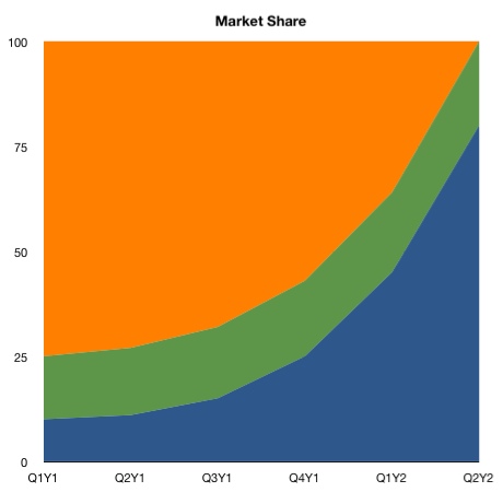
Here’s a fictitious example to show what I’m talking about. It’s a timeline of the change in market share, in percent, of three companies that are the only manufacturers of a particular device. We’ll call the companies Orange, Green, and Blue and use those colors in our charts. Let’s look at this chart.
Obviously, Orange started out dominating the market, but Blue expanded rapidly and took over. But here’s the harder question: How did Green do over this period?
To the unwary, it looks like Green lost a bit of market share. Not nearly as much as Orange, of course, but the green swath certainly gets thinner as we move to the right end of the chart.
Here’s the data on which the chart is based.
| Company | Q1Y1 | Q2Y1 | Q3Y1 | Q4Y1 | Q1Y2 | Q2Y2 |
|---|---|---|---|---|---|---|
| Blue | 10 | 11 | 15 | 25 | 45 | 80 |
| Green | 15 | 16 | 17 | 18 | 19 | 20 |
| Orange | 75 | 73 | 68 | 57 | 36 | 0 |
Oh, dear. Green’s market share has been increasing, not decreasing.
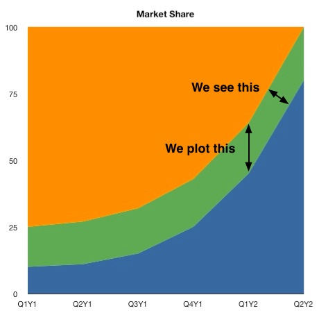
The discrepancy arises because the chart plots the market share vertically, but we perceive the thickness of a stream at right angles to its general direction.
Obviously, a chart in which the market shares stayed relatively stable wouldn’t have this perception problem, but it wouldn’t be interesting enough to make a chart of, either.
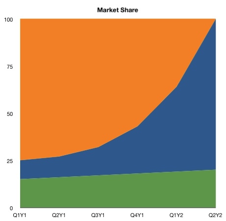
There is a way to make the perception of Green’s market share match up with the data: put it at the top or bottom of the chart.
Rearranging works pretty well in this case, because we have only three companies, and Green’s slope is gentle enough that it doesn’t distort our view of Blue. If, however, we had more companies to track, it’s a good bet that at least one of them would look worse than it is because of the tilted baseline problem.
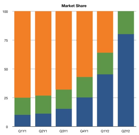
The solution to this problem is to avoid the sexy stacked area chart and use the duller stacked column chart. No cool jagged boundaries in this chart, but it does give a true picture of all three companies regardless of how they’re ordered because it keeps your eye focused on the vertical.
-
Didn’t I once say I was tired of reading about the finances of Apple and its peers? Yes, I did. So why am I reading Asymco, which is all about finances? Well, I read people who link to Asymco, so it’s hard to avoid. And it’s not like I’m averse to a taste of financial blogging; I just don’t want it as a steady diet. ↩


