Baseball as an excuse for programming
October 5, 2012 at 12:51 AM by Dr. Drang
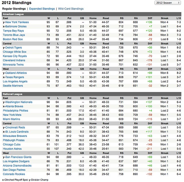
I find it really hard to watch baseball nowadays because the game moves so slowly, but I do still like to look at statistics and standings. The standings in Yahoo! Sports include a figure that was uncommon when I was a kid: the teams’ run differential, the difference their runs scored and runs given up.
What jumped out at me this year was how small the Orioles’ run differential was for a playoff-bound team. They ended up 24 games above .500 but outscored their opponents by only 7 runs over the course of the year. Contrast that with Tampa Bay, who had the third highest run differential in the majors but will be watching the playoffs on TV.
I decided to see how well a team’s run differential predicts its final record. I copied the standings to a text file and deleted most of the columns, ending up with a file that looked like this:
NYY 95  67  .586  +136
BAL 93  69  .574  +7
TAM 90  72  .556  +120
TOR 73  89  .451  -68
BOS 69  93  .426  -72
DET 88  74  .543  +56
CHS 85  77  .525  +72
KAN 72  90  .444  -70
CLE 68  94  .420  -178
MIN 66  96  .407  -131
OAK 94  68  .580  +99
TEX 93  69  .574  +101
LAA 89  73  .549  +68
SEA 75  87  .463  -32
WAS 98  64  .605  +137
ATL 94  68  .580  +100
PHI 81  81  .500  +4
NYM 74  88  .457  -59
MIA 69  93  .426  -115
CIN 97  65  .599  +81
STL 88  74  .543  +117
MIL 83  79  .512  +43
PIT 79  83  .488  -23
CHC 61  101 .377  -146
HOU 55  107 .340  -211
SFG 94  68  .580  +69
LAD 86  76  .531  +40
ARI 81  81  .500  +46
SDP 76  86  .469  -59
COL 64  98  .395  -132
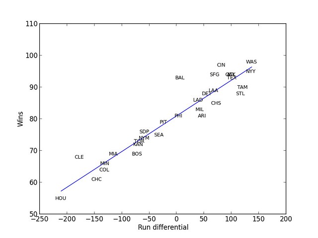
Because every team had a 162-game season I was able to use wins as a proxy for a team’s record. Here’s the plot of wins vs. run differential for all the teams, along with the regression line.
As expected, the Orioles are way above the regression line, but so are the Reds and the Indians (this is cold comfort for Cleveland fans). The plot also shows how Tampa Bay’s wins are indeed fewer than expected for its run differential, but the Cardinals and Diamondbacks got even less out of their run differentials. St. Louis, at least, got into the playoffs.
This graph was, as much as anything, an excuse for me to practice using the NumPy and Matplotlib Python packages. Here’s the code that generated the plot:
python:
 1:  #!/usr/bin/python
 2:
 3:  from scipy import stats
 4:  from pylab import *
 5:
 6:  # Read in the data.
 7:  mlb = loadtxt('mlb.txt', dtype=[('team', 'S3'), ('w', 'i'), ('l', 'i'),
 8:                                   ('pct', 'f'),  ('rdiff', 'i')])
 9:
10:  # Plot the data with invisible points.
11:  scatter(mlb['rdiff'], mlb['w'], s=0)
12:  xlabel('Run differential')
13:  ylabel('Wins')
14:
15:  # Put team names at the data points.
16:  for (t, w, rd) in zip(mlb['team'], mlb['w'], mlb['rdiff']):
17:    text(rd, w, t, size=9,
18:         horizontalalignment='center', verticalalignment='center')
19:
20:  # Perform the linear regression
21:  m, b, r, p, stderr = stats.linregress(mlb['rdiff'], mlb['w'])
22:
23:  # Get endpoints of regression line and plot it.
24:  rdMin = min(mlb['rdiff'])
25:  wMin = m*rdMin + b
26:  rdMax = max(mlb['rdiff'])
27:  wMax = m*rdMax + b
28:  plot([rdMin, rdMax], [wMin, wMax])
29:
30:  show()
As you can see in Line 4, I’m using the PyLab package, which is supposed to provide a combination of NumPy, SciPy, and Matplotlib. And as you can see in Line 3, I was still forced to import the stats library from NumPy to do the regression analysis in Line 21. I’m afraid I’m not experienced enough with these libraries to understand why that’s the case.
Overall, I think the script is pretty easy to understand, with only a couple of things that may need additional explanation.
Because the input file has a mix of string, integer, and floating point values, I had to specify on Line 7 how the loadtxt function was to interpret the fields.
The s=0 parameter in the scatter call on Line 11 sets the size of the markers to zero, rendering them invisible. I did this so I could then plot the team names at their respective points in Lines 16-18. I had hopes that the scatter function could be instructed to set the markers to the team names directly, but I couldn’t find a way to do that. Consider this two-part solution a workaround.
I could have spent more time formatting the axes and doing other beautification, but the defaults seemed decent enough. At this point in the learning curve, I’m more interested in plotting than formatting.


