Fixing screenshot status bars with PIL
November 3, 2013 at 10:10 PM by Dr. Drang
On last week’s episode of The Prompt, Federico went off on a rant about ugly iOS screenshots. He wasn’t complaining about the apps themselves being ugly, he was chastising those of us who post screenshots with status bars showing inconsistent times, signal strengths, and battery levels. And Lord help you if your battery icon is in the red.
His recommendation was Status Magic, a Mac app that cleans up the status bars in your iOS screenshots and makes them uniform. It looks like a nice app, but my thoughts gravitated toward a script using the Python Imaging Library. Why would I write a script when an inexpensive app is available?
- Writing scripts is fun—when the script works, anyway—and you learn things you can use later.
- Apps sometimes get abandoned and eventually stop working. I’m not saying the folks at Shiny Development are going to drop Status Magic, but it’s been known to happen.
- It’s usually easier to incorporate your own script into other scripts and workflows.
- In this case, there’s also the possibility of using the script (or a variation of the script) on iOS. Pythonista includes PIL, so there’s a decent chance you could get your screenshots cleaned up directly on your iOS device and bypass the Mac entirely. I suspect this would be pretty appealing to Federico.
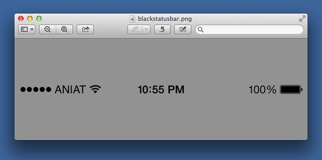
Let’s scope out the problem. First, I have no intention of supporting iOS 6, because I don’t use iOS 6 anymore. So all I have to worry about is iOS 7 status bars. There are two types: one with black text and images for overlaying on light backgrounds, and one with white text and images for overlaying on dark backgrounds. I created mine using screenshots that I cleaned up and turned into PNGs with alpha channels. Here’s my status bar for light backgrounds.
I’m not going to explain how I made it—most of my readers are much better at that sort of design work than I am. I will, however, mention that it’s important that the image be almost entirely transparent and that the color of the text and graphics be black. In order to look good on many different background colors, the antialiasing at the the edges must be achieved through an alpha channel, not with grey pixels.
The script that replaces the original status bar with a clean one is quite simple:
1 #!/usr/bin/python
2
3 from __future__ import division
4 import Image
5 import sys, os
6
7 # Bounds of the status bar.
8 bar = (0, 0, 640, 40)
9
10 # Open the screenshot and fill its statusbar with the background color.
11 screenshot = Image.open(sys.argv[1])
12 barcolor = screenshot.getpixel((0, 0))
13 screenshot.paste(barcolor, bar)
14
15 # Decide whether it's light or dark and choose the appropriate overlay.
16 if sum(barcolor)/3 > 127:
17 statusbarfile = os.environ['HOME'] + '/graphics/blackstatusbar.png'
18 else:
19 statusbarfile = os.environ['HOME'] + '/graphics/whitestatusbar.png'
20 statusbar = Image.open(statusbarfile)
21
22 # Paste the overlay and save.
23 screenshot.paste(statusbar, bar, statusbar)
24 screenshot.save(sys.argv[1])
The status bar is a 640×40 strip, the boundaries of which are defined in Line 8. To avoid the mess of the clean status bar sitting on top of the original, we first cover up the original status bar with the background color, which is assumed to be in the upper left corner—coordinate (0, 0)—of the screenshot.
We then look at the background color we just laid down and decide whether it’s light or dark based on the average of the red, green, and blue values of the background color. I admit the heuristic for this, in Line 16, is pretty damned simple and is based on looking at only a half-dozen or so apps. It might give the wrong answer for many apps. I’m sure I’ll be tweaking that heuristic as I get more experience with the script.
After deciding which type of background we have, the script opens up the appropriate clean status bar file and pastes it in place. The altered screenshot is then saved, overwriting the original.
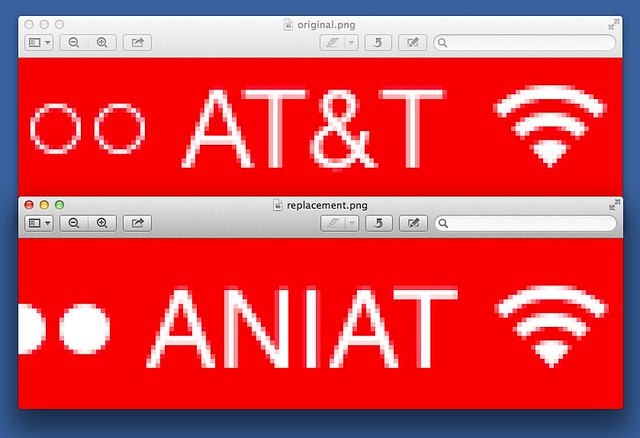
The altered status bar matches the style of the original quite well. Here’s a zoomed-in look at an original screenshot of Downcast along with the replacement.
The replacement carrier font isn’t exactly right, but it’s close. The reproduction of the antialiasing at the edges of the wifi graphic is nearly perfect.
There’s a lot of room for improvement in the script. First, there’s no provision for landscape screenshots, nor for iPad screenshots. I’ll add an if/then to handle the former, but you’re on your own for the latter, as I don’t have an iPad and don’t need to clean up iPad screenshots. Both the device type and the orientation of a screenshot can be determined through PIL’s screenshot.size attribute.
Another problem with the script is that the background color overlay done in Line 14 will cover up some of the transparency effects in apps like Mail and Messages. I don’t know of a good way to get around this problem but am open to suggestions.
I don’t yet have an adaptation of the script for Pythonista, but making one shouldn’t be too hard. iOS doesn’t let you specify a path to a file, so the assignment of the statusbarfile variable in Lines 17 and 19 will have to go. Luckily, Pythonista has a special-purpose module for accessing photos. I’d like to be able to specify the clean status bar files by index using the get_image method, but I suspect an image’s index is subject to change as photos are deleted from the Camera Roll. That leaves the pick_image method, which requires user interaction and will slow the script down. Even so, it’ll still be faster than moving the file to a Mac.
This script is in its infancy, and I suspect I’ll be messing with it over the next few days. I’ll spare you the sausage-making details until I get it in a more generalized form.
Update 11/12/13
The final (as of today) version of this script, with Pythonista compatibility and other improvements suggested by readers, can be in this later post.


