Car UI
April 27, 2014 at 8:25 AM by Dr. Drang
Apple’s recent announcements about CarPlay have revived the intermittent discussion on blogs and podcasts of the poor quality of user interface design in automobiles. Most of the talk has been about the phone and music player controls, but the UI problems go way beyond that. Yesterday, I came across a particularly bad example.
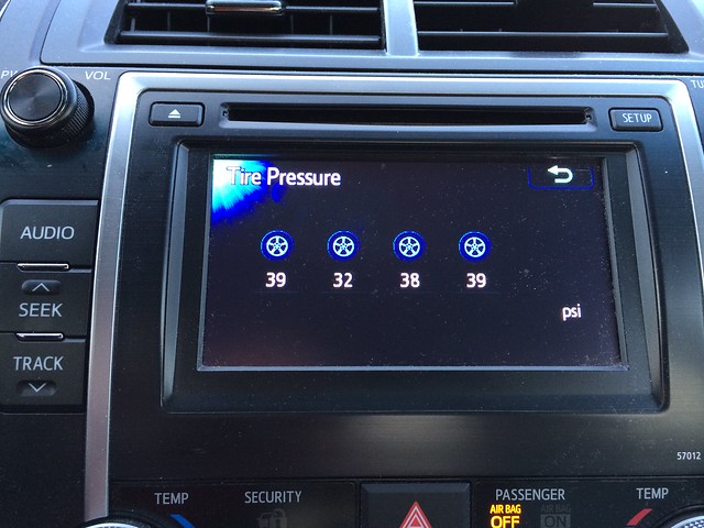
I have a Toyota Camry. Like many cars today, it has sensors that track the air pressure in the tires. When a tire gets low, a warning light on the dash comes to life, and you can use the touchscreen in the center console to see which of the tires triggered the warning. When you do, as I learned yesterday, you get a screen that looks something like this:
It’s all well and good to have little pictures of the tires on the display, but this is completely worthless as a means of conveying information. The tire that was low, below 25 psi at the time, was the second from the left in the display. Which tire does that correspond to? I had to use a gauge to figure out which one was low—exactly what I would have done if all I’d had was the warning light on the dash.
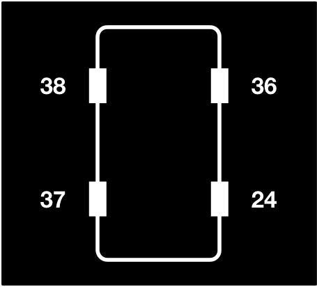
The obvious solution is a simple top view of the car. It wouldn’t be nearly as cute but would tell you immediately which one was low.
I would argue that the orientation of the car is implicit, but an arrow could be added if you wanted to be certain of the distinction between front and rear.
If Toyota insists on showing cute tire pictures in side view, it could at least have added labels like LF, LR, RF, and RR. That would require different labels for different languages, but given that the words “Tire Pressure” are in the upper left of the screen, Toyota has already committed to that.
By the way, the low tire was the right rear, which was the last one I would have guessed. Also, there’s no description of the display in the Owner’s Manual or the Quick Reference Guide. I found it in the Display Audio System Owner’s Manual, which shows you what the display looks like, but doesn’t tell you which tire is which. So even if you go to the correct section of the correct manual immediately, you’ve wasted your time; you still have to use a gauge to figure out which tire is low.
Update 4/27/14
Folks on Twitter have suggested that the display doesn’t show position because the pressure sensors aren’t tied to any particular wheel location, and I think that’s probably right. Assuming that’s the case, the hardware in my car isn’t sophisticated enough for the kind of display I’d like to see, and what Toyota shows on the screen is the best it can do.
So should Toyota bother with anything beyond the low pressure warning light on the dashboard? That was all I had that on my previous car, and I was happy with it; it was the first car I owned with any such indicator, and it seemed really cool. But now that I have a hint of something better, I want the full package: tire pressure and position.
It’s not that pressure without position can’t be helpful. Now that I know which tire on the display corresponds to the right rear, I can monitor it for slow leakage. Still, I think the lesson is that half measures are inherently unsatisfying. If Toyota’s going to put a display in the car that shows tire pressure, it should add all the hardware needed to monitor position, too.


