PCalc construction set
September 16, 2014 at 8:31 AM by Dr. Drang
One of the many great stories at Andy Herzfeld’s folklore.org site is about Chris Espinosa’s creation of the Mac’s original calculator desk accessory.
We all gathered around as Chris showed the calculator to Steve and then held his breath, waiting for Steve’s reaction. “Well, it’s a start”, Steve said, “but basically, it stinks. The background color is too dark, some lines are the wrong thickness, and the buttons are too big.” Chris told Steve he’ll keep changing it, until Steve thought he got it right.
So, for a couple of days, Chris would incorporate Steve’s suggestions from the previous day, but Steve would continue to find new faults each time he was shown it. Finally, Chris got a flash of inspiration.
The next afternoon, instead of a new iteration of the calculator, Chris unveiled his new approach, which he called “the Steve Jobs Roll Your Own Calculator Construction Set”. Every decision regarding graphical attributes of the calculator were parameterized by pull-down menus. You could select line thicknesses, button sizes, background patterns, etc.
Steve took a look at the new program, and immediately started fiddling with the parameters. After trying out alternatives for ten minutes or so, he settled on something that he liked.
With version 3.3 of PCalc, James Thomson has gone Espinosa one better: he’s not only built a customizable PCalc, he’s given all of us the power of Steve Jobs.
(Oh, yeah. A lot of the new stuff in PCalc 3.3 has to do with iOS 8. I know nothing about these features because I don’t install beta operating systems on my workaday devices and I don’t have any spare iPhones lying around. It’s the customizable layouts I’ve been lusting after.)
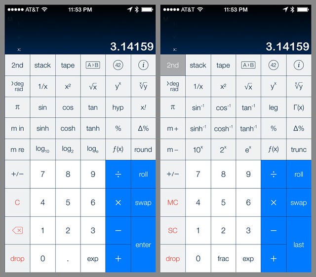
Here’s the Engineering layout I’ve been using for ages, both the normal and 2nd configuration:
It’s perfectly functional, but it isn’t exactly what I want. For example, I almost never need the log2 and 2x functions. With 3.3, I don’t have to see anything I don’t want.
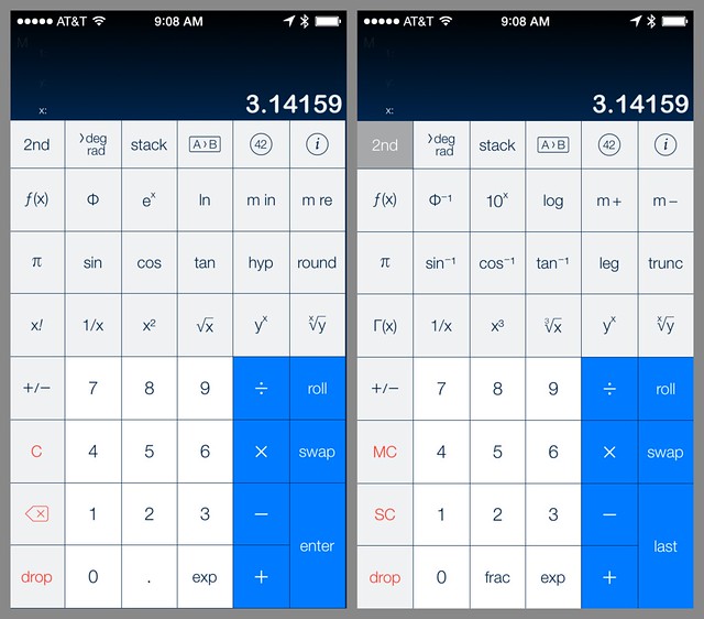
Here’s the new Drang layout:
The first thing you should notice is that all the buttons (apart from the top row) are now the same size, so my fingers have bigger targets to hit. By getting rid of the log2 and 2x keys, the percentage keys, and the hyperbolic trig keys,
You might also notice that I have both the natural log and exponential functions on the normal layout. I use both of these functions a lot, and even though it would have been more consistent to have one as the 2nd key of the other, it was more practical to have them side-by-side.
A foolish consistency is the hobgoblin of little minds, adored by little statesmen and philosophers and divines.
— Ralph Waldo Emerson
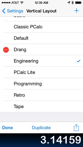
To make your own layout, it’s best to start with the built-in layout that most closely resembles what you want to end up with. Go into the Settings, open the list of layouts (vertical in this case), and tap the Edit button. You’ll get a chance to duplicate one of the built-ins and give it its own name.
Then go back to the regular calculator view and start editing the buttons.
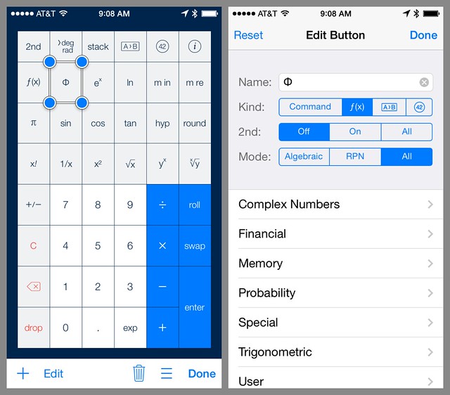
To edit a button, press and hold on it until the display shifts and handles appear at the corners of the button. You can use the handles to resize the button, and you can drag it around to any place you like.
To change what the button does, tap the Edit button along the bottom, and a screen will appear that’ll let you change the name and the behavior of the button. You can have it work like any of the regular commands, run a user function, perform a unit conversion, or insert a constant. You can have the button appear in the normal view, the 2nd view, or both.
Because I often do calculations involving the standard normal distribution, I added buttons that calculate its cumulative distribution function (CDF) and inverse CDF. I’ve had these user-defined functions available since PCalc 2.8, but until now I’ve had to dig my way through the f(x) button to get at them.
The Drang layout isn’t particularly imaginative, but with a little thought and a little programming, you could turn PCalc into a whole series of special-purpose calculators. A financial calculator layout like the HP 12C would be a snap. You could also make a cooking layout with buttons for all the conversions between cups, ounces, teaspoons, tablespoons, etc. Metallurgists could create a layout that converts between the many hardness values.
You could, of course, use Numbers or Pythonista to perform these calculations and conversions. But there’s something very efficient about calculator model of tapping in a number and hitting a single button to get your answer. And with the new PCalc Construction Set, you can build a calculator that has buttons for everything you need and nothing you don’t.
-
I asked James to add the hyperbolic trig keys a few years ago because they are necessary for some engineering and scientific calculations, but I don’t use them enough to have them on my everyday layout. When I need them, I can always switch to the Engineering layout. ↩


