App Store bitching
August 28, 2015 at 10:10 PM by Dr. Drang
The internet is filled with complaints about the iOS App Store. Most of the complaints are about its infrastructure, the behind-the-scenes stuff that controls features like search results and the top charts. Developers—and users who are sympathetic to developers—complain about the review process, glitches in iTunes Connect, and the race to the bottom in pricing that the App Store encourages. These are all valid complaints, but I want to focus on the App Store app itself, which has a couple of longstanding bugs that I find inexplicable.
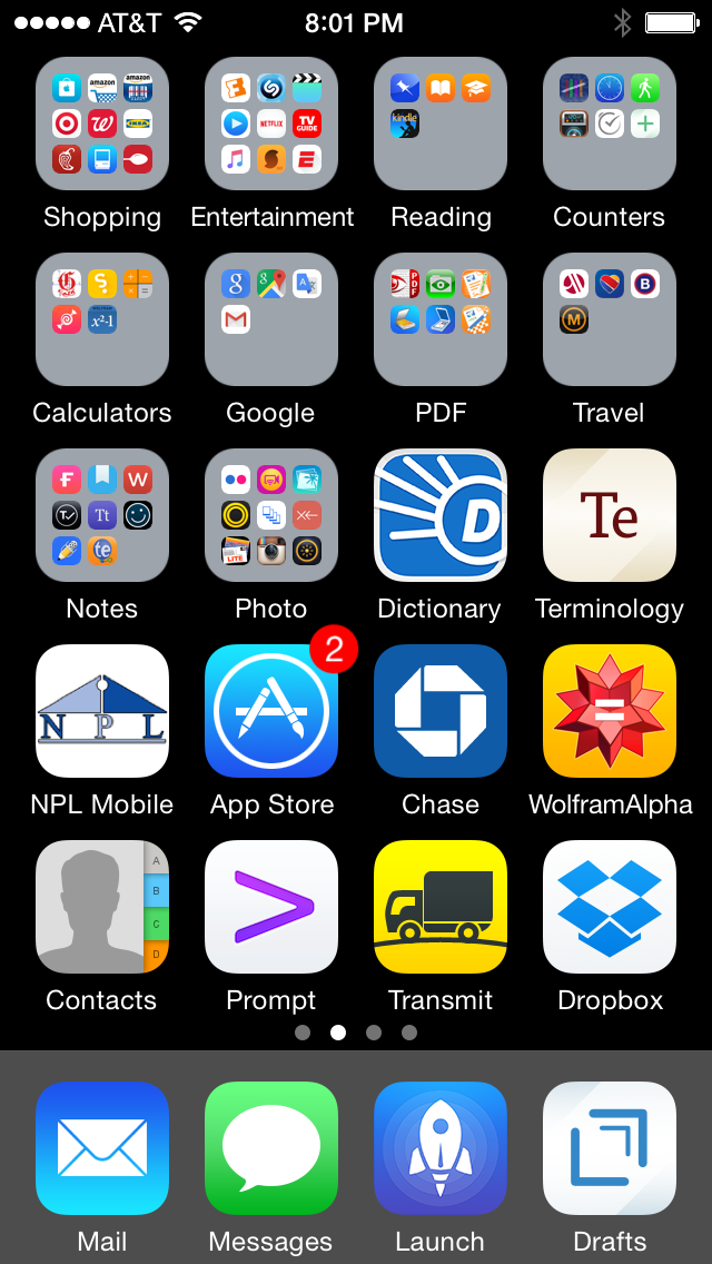
The first is the updates badge. I don’t have my phone automatically update apps as new versions are released,1 so every few days I see a red badge on the App Store icon.

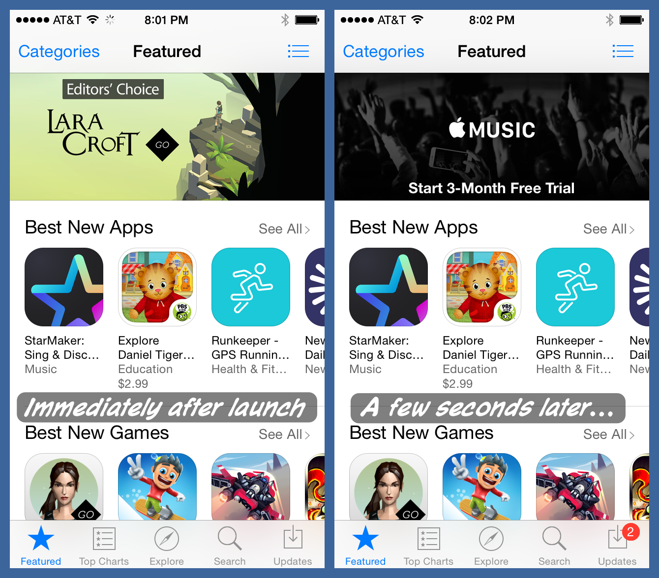
When the number in the badge gets large enough, or if I know of a particular update I want to install, I launch the App Store app to do the updates. The app usually starts up in the Featured screen, which I don’t like but accept as a sales gimmick. What bothers me is the state of the button for the Updates screen. It should have the same badge as the icon, a red circle with the number of available updates. But the badge doesn’t appear until 5–10 seconds later.

I understand what’s going on during those 5–10 seconds. The badge on the app’s icon might have been out of date because it isn’t updated continuously, so now the app is communicating with Apple to get the correct number of updates that are available. What I don’t understand is why they can’t just use the same number that was showing on the icon as a placeholder until the new information has been retrieved. It’s disconcerting to launch the App Store because I see that two updates are waiting, only to see—initially, at least—that there are no updates waiting. Apple’s apps should be more polished than that.
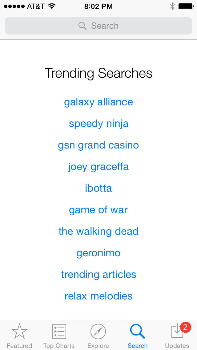
More annoying is what happens when I tap the Search button. I get a lot of whitespace, a list of suggestions I have absolutely no interest in,2 and a search field at the top of the screen that I have to tap on before I can start typing.

In the seven years since the App Store was established, I have never tapped on the Search button without wanting to immediately type in a search term. And yet for seven years, the App Store has forced me to stare stupidly at my phone for a second as I wonder why there’s no keyboard for me to type on. Then I think, “Oh, right. This is the stupid app,” and reach up to tap in the field that brings up the keyboard.
I get the feeling that the App Store app, like many of Apple’s “small” apps, has no champion, no one who’s spent time thinking about and testing how people use the app and how it should respond to them. It shows.
Update 8/29/15 7:36 AM
Interesting feedback on this one. A few people pointed out that Spotlight used to have the same “no focus on the field” problem (and that it might be returning in iOS 9).
Greg Pierce said, correctly, that losing the last search would be a bad thing. True enough, but if that’s the motivation for the Search behavior, it wasn’t thought through. You put focus on the field without deleting the last search terms.
Via email, Dylan Ryan mentioned that he hits the Search tab by mistake often enough to be thankful that he can back out without first having to dismiss the keyboard. He’d prefer to have the Search button on the top of the screen. Even though I’m a big wrong-button-hitter, I don’t like the idea of having app behavior so strongly influenced by response to mistaken input.
To me, the only real justification for not putting the focus on the search field immediately is if there were other reasonable things to do on that screen. Recent search history would be legitimate, but the silly suggestions I see aren’t.
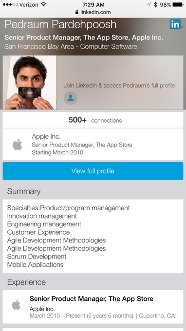
The most disturbing feedback came from David Barnard,
@drdrang 5 years, 6 months
— David Barnard (@drbarnard) Aug 29 2015 7:29 AM
which pretty much destroys my “no champion” speculation in the final paragraph. Oh, well. Being a tech pundit means never having to say you’re sorry.

