Too wise
January 20, 2016 at 11:01 PM by Dr. Drang
Over the weekend, Kieran Healy posted another article with advice on making good charts. In this case, it was more on how to avoid making bad charts—specifically, the evils of plotting data with two y axes. I felt a little uncomfortable reading it, as I immediately remembered a report I wrote a few years ago in which I created a whole series of charts with two y axes. I think I can defend what I did, but I’m not sure I’d do it again.
The impetus for Kieran’s post was this tweet from Liz Ann Sonders of Charles Schwab:
DailyShot: Here is a comparison of the monetary base with the S&P500 … Coincidence?
— Liz Ann Sonders (@LizAnnSonders) Jan 15 2016 6:52 AM
The S&P 500 is in red and the monetary base is in blue, and presumably Sonders is trying to tell us that the former follows the latter. This is pretty bad reasoning on the face of it, as they are both trending generally upward and could be well fitted with straight lines. You really should have both ups and downs—or at least long runs at significantly different slopes—if you want to argue for causality.
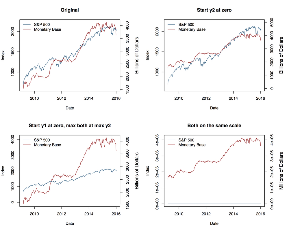
In his post, Kieran makes the more general point that using two y axes gives the graph maker the freedom to show this same data in several ways:1

Source: Kieran Healy.
The chart in the lower right corner is, I think, not an especially good example of the slippery slope argument. No one would ever plot the two sets of data on the same scale, and there’s no reason a cause and an effect can’t be orders of magnitude apart. But the other plots are a devastatingly effective demonstration of how small and seemingly reasonable tweaks in the scales and origins of the two y axes can make the chart look very different. Who’s to say which is the “right” presentation?
Here’s Kieran’s parting advice:
Two y-axes give you an extra degree of freedom to mess about that, in almost all cases, you really shouldn’t take. Guidelines like this won’t stop people who want to fool you with charts from trying, of course. But they might help you not fool yourself.
And here’s a plot from a report I wrote a few years ago:

You can see why I squirmed a bit while reading Kieran’s post.
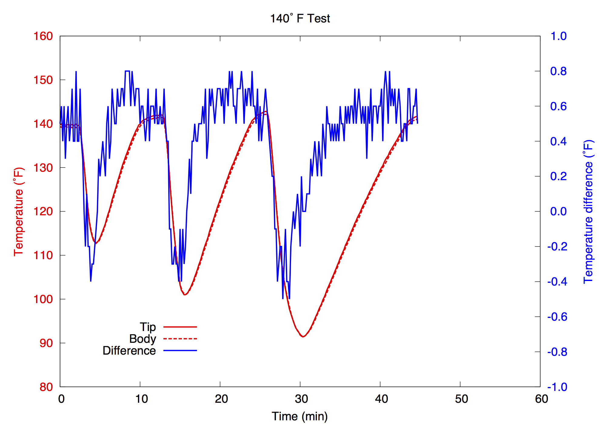
Let me give you some background and we can discuss whether I was justified in using two y axes. This graph was one of a series that presented the results of some testing I did on a piece of thermostatically controlled equipment. When not in active use, the equipment would normally stay at or near a set temperature (140° F in this test). When in use, the temperature would plunge as heat was extracted from it (that’s the purpose of the device). When usage stopped, the heater, which had kicked in when the temperature dropped, would start to warm things back up until the set temperature was reached.
Part of the reason for testing the equipment was to track the temperature at two locations, the “tip” and the “body” of a component part, and to study the temperature difference or gradient across that part. In the graph, the two red lines display the tip and body temperatures and the blue line displays the difference between the two.
The scales of the x, left y, and right y axes were chosen to encompass the range of data across all the tests, and they were the same for all the charts in the report. These choices allowed the reader to compare the graphs from all the tests at a glance—there was no need to recalibrate one’s eyes to account for different scales. That’s why, for example, the x axis of the 140° chart runs from 0 to 60 minutes even though that particular test lasted only 45 minutes.
In my experience, the first hurdle to jump when constructing a chart with two y axes is to get the reader to understand which axis goes with which data set.2 In early versions of this chart, my client simply threw up his hands and declared it impenetrable. It was only after I colored the tick marks and labels to match the data series that he understood what I was presenting.
And what I’m presenting is multifaceted. First, there’s the overall temperature change as the equipment is operated three different times in three different ways. This is shown by the two red lines, solid for the tip and dashed for the body, which track each other closely. But it’s also showing that the tip-to-body temperature gradient (in blue) changes in both magnitude and sign during use and recovery. The difference between the two was slight, less than 1° F in all the tests, but the way it changed signs during use and back during recovery was consistent throughout all the tests at every thermostat setting.
My goal in plotting the temperature gradient on the same chart as the temperatures themselves was to allow the reader to see all of this without flipping between one chart and another. I am definitely trying to show a correlation between the overall temperature in red and the temperature difference in blue, where both of their variations are caused by the usage of the equipment. I don’t believe this presentation distorts the behavior. Unlike the situation with Sonders’s chart, choosing different scales—something I wouldn’t have thought much about before reading Kieran’s post—wouldn’t change the interpretation.
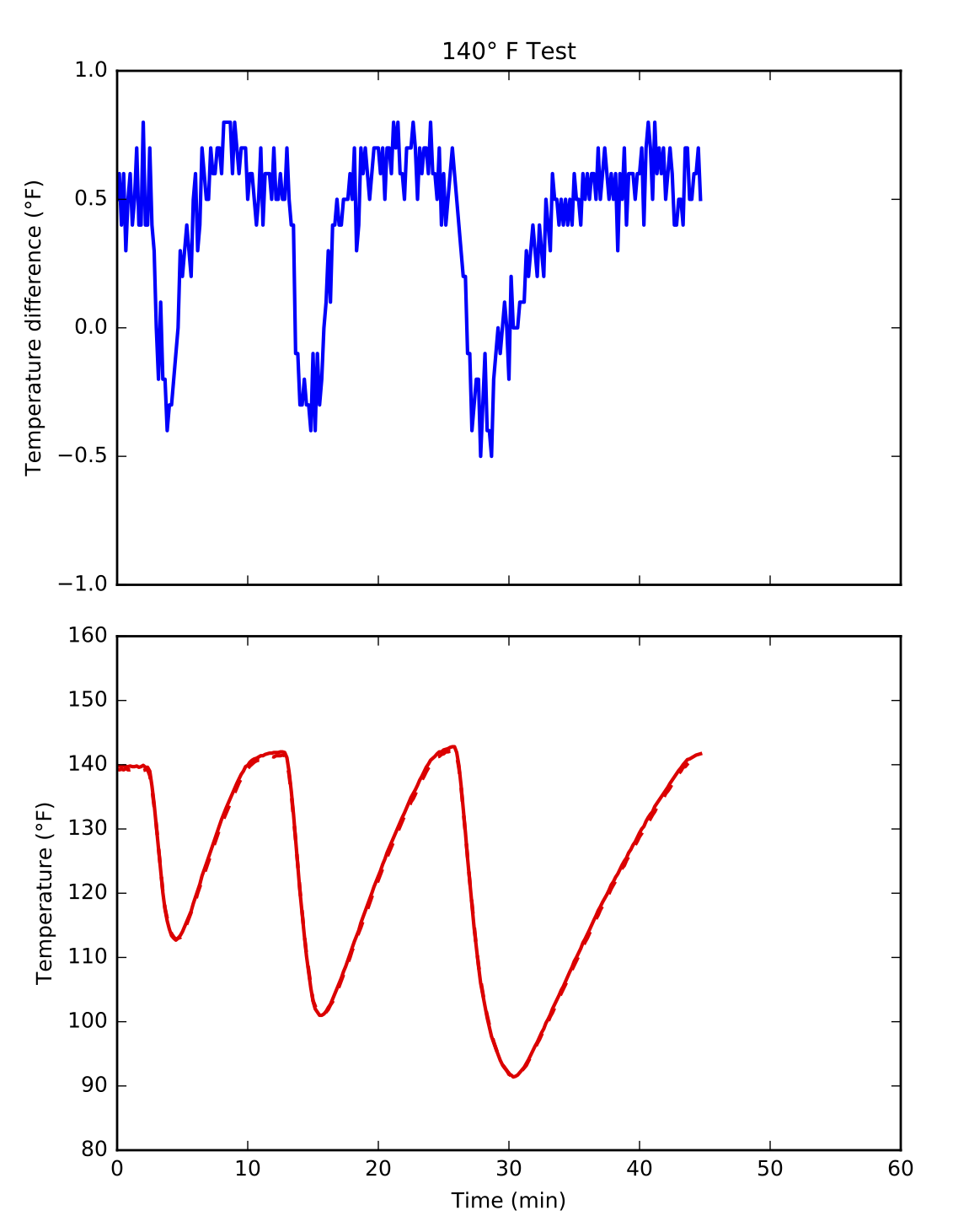
But maybe there’s a better way. Here I’ve replotted the data into a two-plot chart with the gradient shown separately from the temperatures:

I’ve kept the colors just to make it absolutely clear how I’ve split up the original single-plot chart. If I had used this chart in my report, I wouldn’t have bothered with color at all. With the plots separated like this, color is an unnecessary distraction. Also, I haven’t bothered to put in a legend or other labels that I would in a finished product.
The problem with this two-plot presentation is that the timing is less clear. The change in gradient certainly happens around the time when the overall temperature drops, but the exact synchronization is lost. Adding gridlines would help, but they wouldn’t be precise enough.
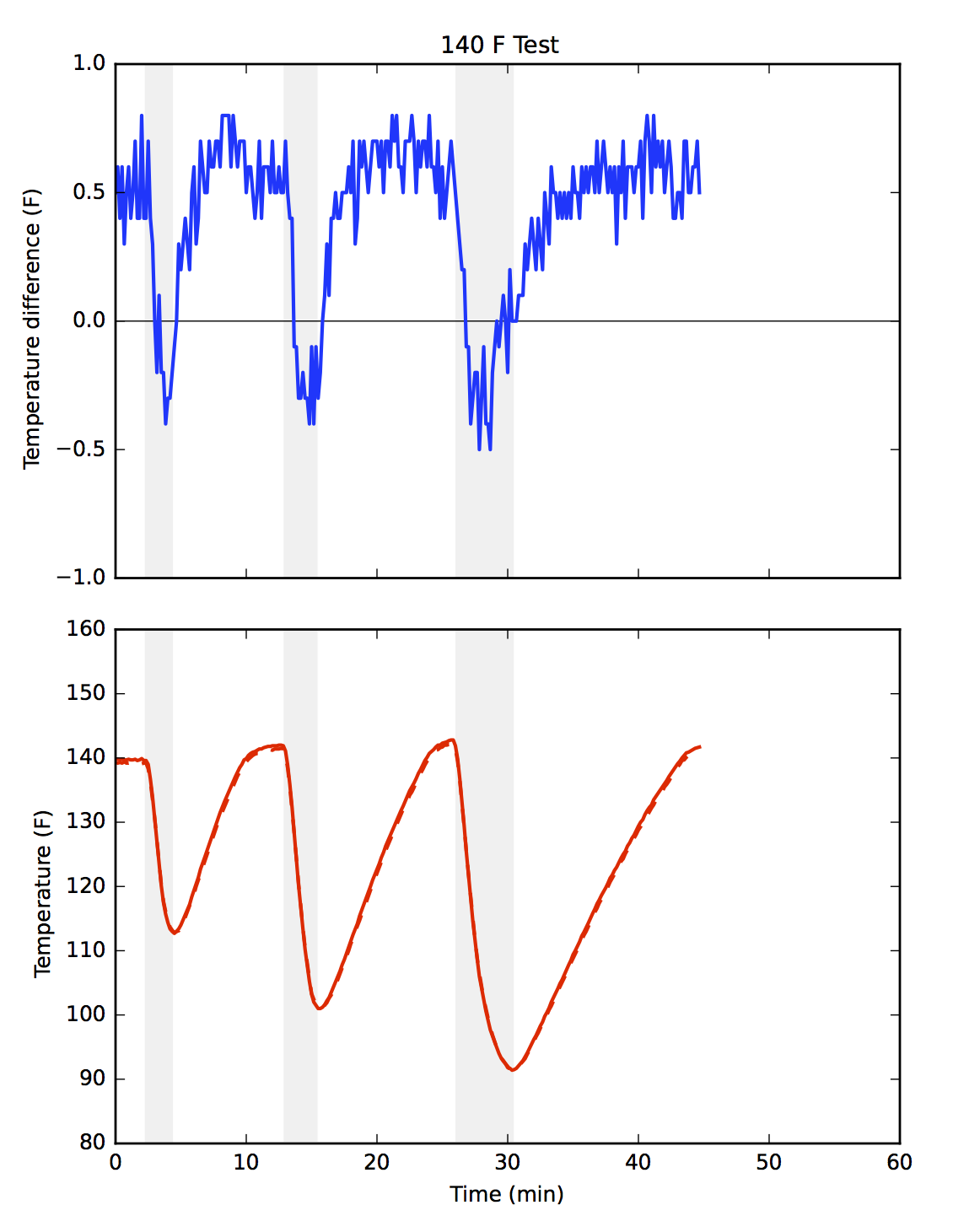
A solution to this problem is to add shading to both plots to cover the usage periods.

Unlike gridlines, which software always aligns with tick marks, the shading is free to be placed wherever we like.3 By having the shading span the duration of each temperature plunge, we can see how the change in gradient is timed to match that plunge.
Note also that I’ve added a horizontal grid line to the gradient plot to make it easier to see when the temperature difference changes signs—when the body becomes warmer than the tip. I didn’t feel comfortable adding a horizontal gridline to the original chart because it would have suggested an importance to the 120° temperature level, an importance that temperature doesn’t have.
I confess I still like the compactness of the original chart. On the other hand, I always found the colored tick and axis labels aesthetically displeasing, despite their improvement to the chart’s readability. If I were to write that report today, I’d probably go with the two-plot charts, but it’s not a slam dunk.
-
Yes, Kieran flipped the colors in his charts, but it’s not as bad as you might think. He never showed Sonders’s chart and was always consistent with the colors in his charts. ↩
-
In this study at the French research institute INRIA, superimposed charts were found to be the most difficult to interpret. While I don’t find the study especially compelling—they studied charts with two x axes instead of two y axes, and their example plotted different parts of the same data series twice on the same chart instead of plotting two different data series, both of which are seem to be contrived to be baffling—I do agree with its fundamental conclusion that superimposed charts like this are more difficult to interpret than other layouts. ↩
-
In fact, I added it by hand using Graphic, the application that used to be called iDraw before Autodesk bought it. Niceties like this are often easier to do by hand than by fiddling around with plot commands, and their placement, while not as precise as we would get with plot commands, is certainly as precise as we need it to be. ↩


