Math without LaTeX
July 2, 2017 at 7:19 AM by Dr. Drang
The mathematical typesetting rules I mentioned in my last post aren’t the dictates of Don Knuth. Although TeX’s aesthetic dominates technical publishing today—we tend to see it as correct because we’ve seen so much of it—the rules codified (literally) in TeX are based on ideas developed over decades. The goal of all mathematical typesetting is to present the equations with clarity and grace, the same goals as the math itself. Knuth studied the state of the art so he could make that same clarity and grace available to everyone.
I have a small collection of old structural mechanics textbooks. Yes, some of them are the texts I used in college, but most are items I’ve picked up in used bookstores over the years. The equations in some of them are pretty poorly laid out, but those from the top technical publishers have a consistent and elegant house style that persists across their catalogs. While Knuth certainly wasn’t looking at any of these books when creating TeX, he was looking at other works from these publishers, and it shows.
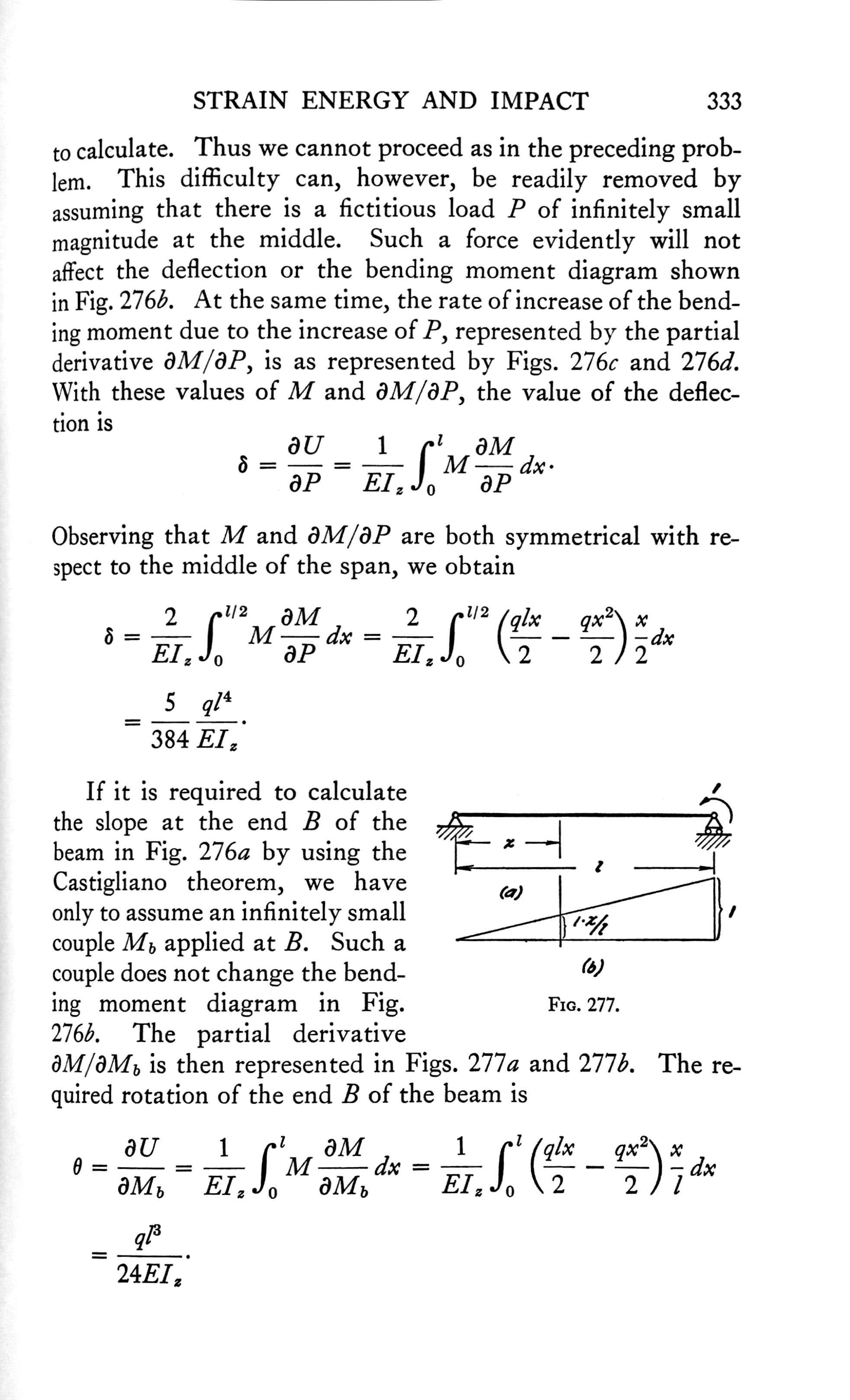
Here’s a page from Stephen Timoshenko’s two-volume Strength of Materials from Van Nostrand. My copy is the third edition from 1955 (the first edition came out in 1930).

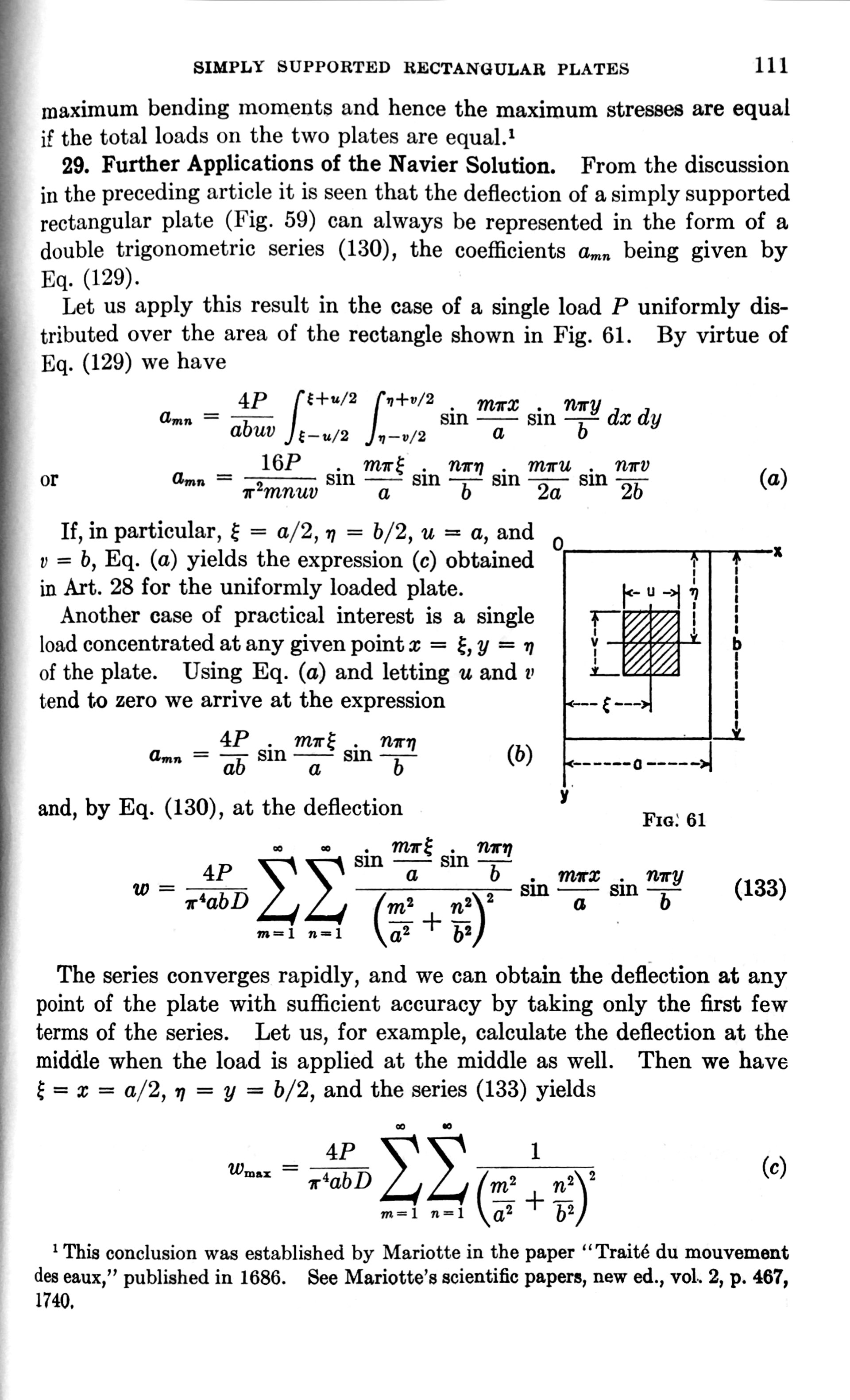
McGraw-Hill was something of a step up from Van Nostrand. Here’s a page from Timoshenko and Woinowski-Kreiger’s Theory of Plates and Shells, the second edition from 1959 (based on a first edition from 1940).

To my eye, McGraw-Hill’s thinner integral signs are nicer, although I do prefer Van Norstrand’s placement of the limits. One of my favorite things about this page is the fearless use of huge summation signs. Some publishers stick with smaller summation signs, even when what’s being summed is tall. The large signs give you a better sense of the structure of the equation.
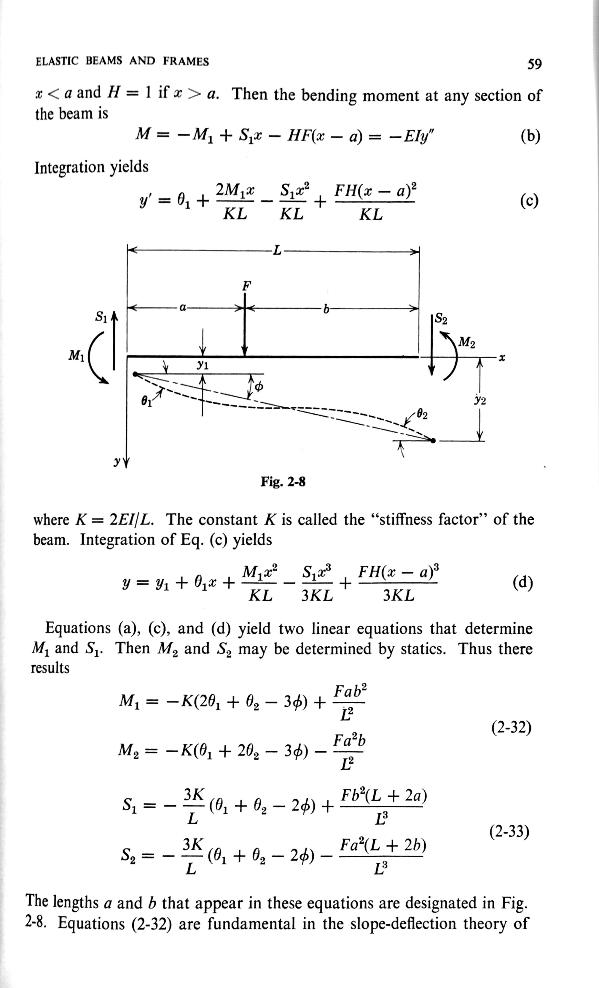
My favorite technical publisher is Wiley. Here’s a page from Henry Langhaar’s 1962 Energy Methods in Applied Mechanics.

There is a rhythm to those last four equations—the basis of the finite element stiffness matrix for beam bending—that’s reflected in the rhythm of their layout.
(And look at that figure of the bent beam. So much information packed into a small space, but with every force, moment, dimension, and angle depicted with absolute clarity. The differences in line thickness, arrowhead style,1 and dash spacing all contribute to your understanding of the equations below.)
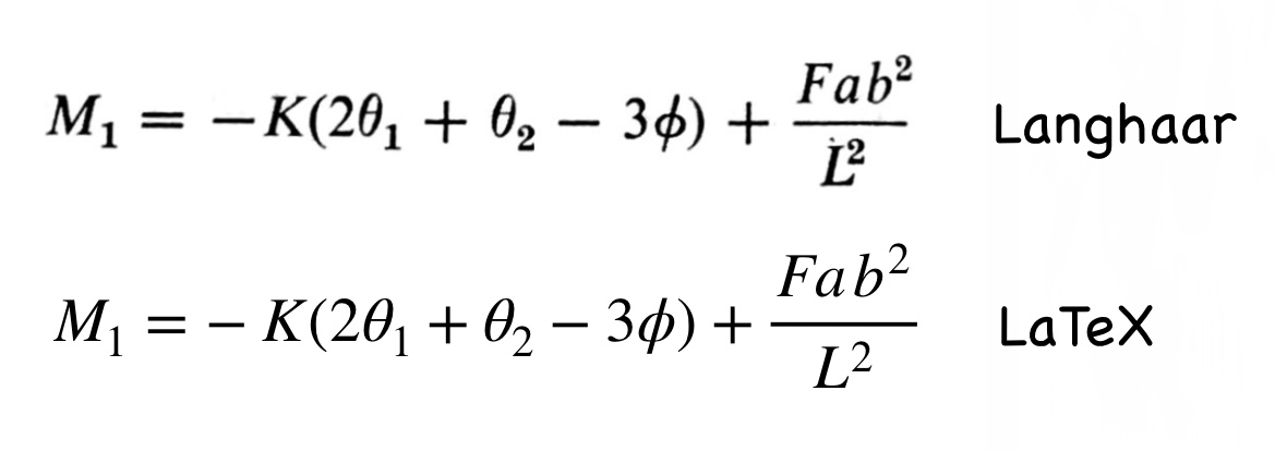
Here’s a quick comparison of the Wiley and LaTeX renderings of the same equation:

Font differences aside, they’re pretty darn close. I prefer how Wiley puts the minus sign a little closer to the K, and I’ve always thought TeX’s sub- and superscripts were a bit too big. On the other hand, Wiley went overboard on kerning the superscript in the denominator of the last term.
FYI, the images in this post were, for the first time in the history of this blog, done entirely in iOS. The page images were shot, straightened, and cropped in Scanner Pro, the LaTeX formula was rendered in Pages, and the equation comparison was assembled in Pixelmator.
-
One day I’ll write a post about arrowheads. ↩

