Chart consistency
February 25, 2018 at 11:49 AM by Dr. Drang
This is another in my irregular series on graphs that could be improved with a little work. It’s me being a grammar Nazi but with charts.
The article of interest is “How much better are today’s Winter Olympians than the first? The answer, in eight charts.” Words and graphics by Jacob Borage, published in the Washington Post a couple of days ago. The title tells you what to expect: a comparison over several events of this year’s results (or sometimes the 2014 results if the 2018 results weren’t available yet) to the first Winter Olympics results of 1924. The comparison is limited to sports in which the scoring is determined by a tape measure or a stopwatch.
The article starts with ski jumping:

I like how Borage uses light and dark versions of the same basic color to do his comparison. We’ll see shortly that he uses a different color for each sport, which is also helpful. What I don’t understand about this graph is putting the two bars end-to-end. It suggests there’s some total amount being divvied up between 1924 and 2018, which certainly isn’t the case. A better chart would be a standard bar chart, with each bar starting at the same spot and the 2018 bar extending over twice as far. Such a chart is not only standard for this type of comparison, it would evoke the event itself—starting at the same point and heading off for whatever distance is achieved.
The 500-meter speed skating chart, which comes next in the article, is just what the doctor ordered:

Note the change in color for a new event, but still with 1924 being the lighter version and 2018 the darker. Strictly speaking, this isn’t necessary because the bars are labeled, but its the kind of thing that helps the reader and shows some actual design thought. I do think that putting the city names in the chart is unnecessary clutter—the emphasis in the article is improvement with time, not venue—but otherwise I like this chart a lot.
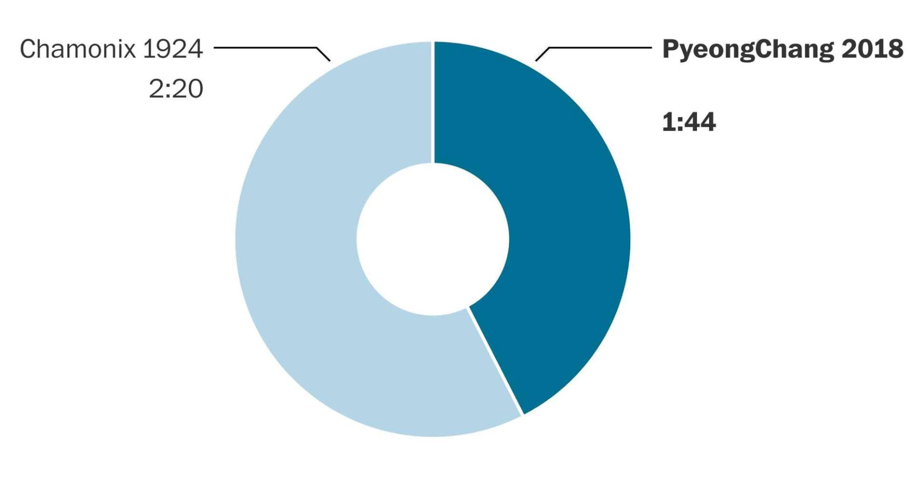
The next chart is still in speed skating, but has shifted to the 1500-meter race:

What the hell is this? Why the switch to a donut chart within the same category? And why a donut chart at all? This, even more than the ski jumping chart, suggests a whole amount that’s being shared between two items. That’s not an apt comparison. I get that a donut chart looks sort of like a clock, and we are comparing times, but that’s not sufficient reason to use one here.
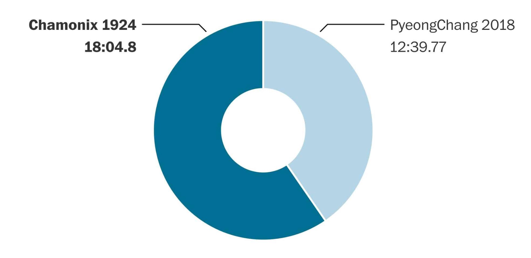
There are a couple of other speed skating comparisons, both of which use donut charts and continue the blue theme. I want to show the 10,000-meter chart:

Do you see what’s wrong with this? The light and dark have been flipped, breaking the pleasing consistency established in the preceding graphs.
The next set of graphs cover cross-country skiing. Here’s a chart that covers the 18 km (from 1924) and 15 km (from 2018) races. Because the distances have changed, a direct comparison of the event times can’t be made, so Borage has plotted the average time per kilometer.

We’re back to a standard bar chart, which I like, but we have the light and dark colors flipped, which I don’t. Then comes the 50 km event,

where the colors have been flipped back to what they should be1 (and the modern time is from 2014 because the 50 km race hadn’t been skied when the article was published).
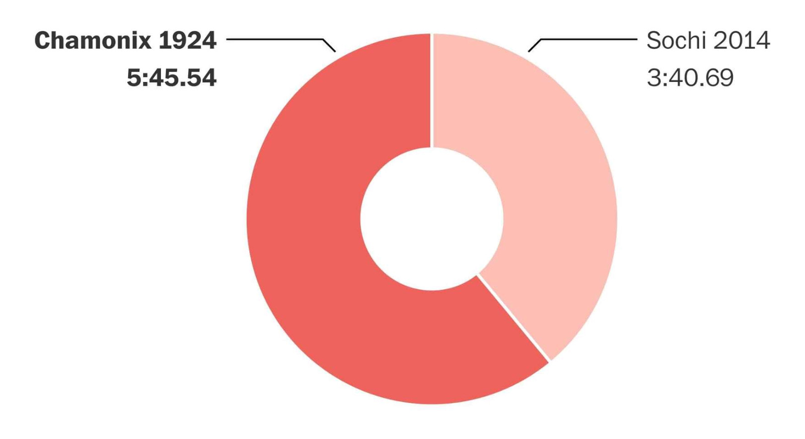
Finally, we have the four-man bobsled time:

Sigh. We’re back to the donut and we’ve switched the light/dark signalling again.
In the end, all of these graphs make the comparisons they’re supposed to, but the lack of consistency and the poor choice of graph type undercut the meaning. The decision to use different color themes for the different category events was a great idea made less great by flipping the light/dark representation. And using three different chart types for essentially the same type of comparison is just weird.
Consistency of design in graphing helps the reader as much as consistency of tense (to choose something I struggle with) in writing. Yes, the reader can figure it out, but you’ve lost some of the power and elegance of your message.
-
By “should be,” I mean consistent with most of the other charts. There’s no particular reason the old events should be light and the new events dark, but once you choose a system, stick with it. ↩
