Apple Health trends
November 1, 2024 at 2:30 PM by Dr. Drang
There are some odd things about the way Apple tracks your progress in the Health app. These oddities aren’t new with the recent OS updates. They’ve been a part of the app for as long as I can remember; I’ve just finally gotten around to talking about them.
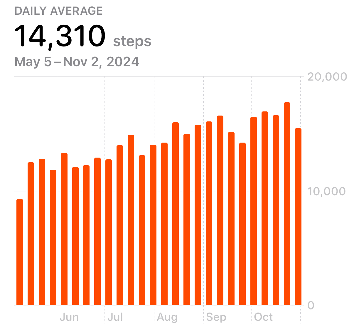
The oddities are centered around what Apple calls trends. Here, for example, are my last six months of step counts:

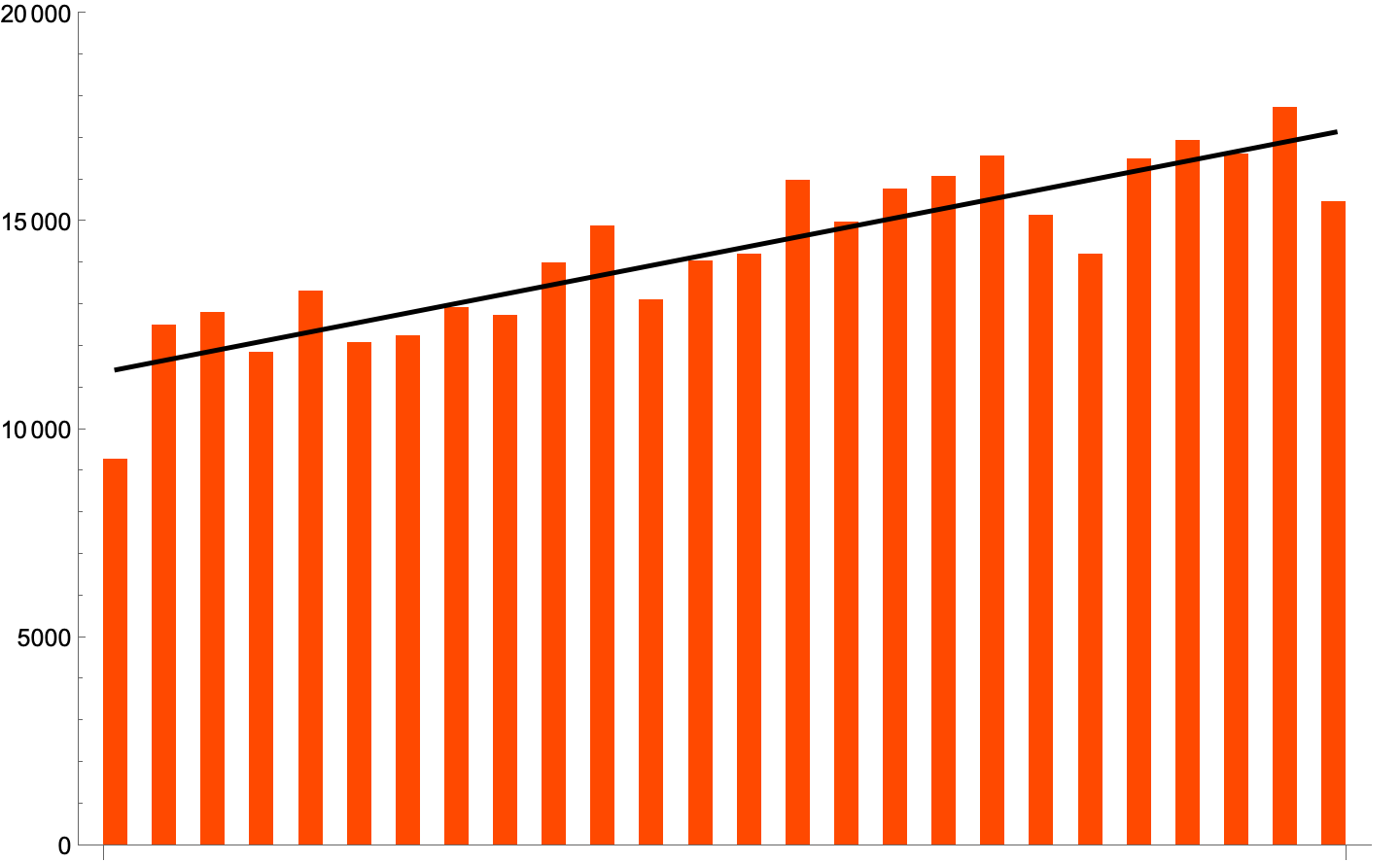
If you asked me about the trend of this data, I’d say it’s going up roughly linearly with some scatter. I’d probably try to estimate the slope, which would have the unusual units of “average daily steps per week.” Better than estimation would be to do a linear least squares fit, which could be plotted on top of the bar chart:

I did this in Mathematica Wolfram, but you could do it in any number of apps. Most people would probably use a spreadsheet.
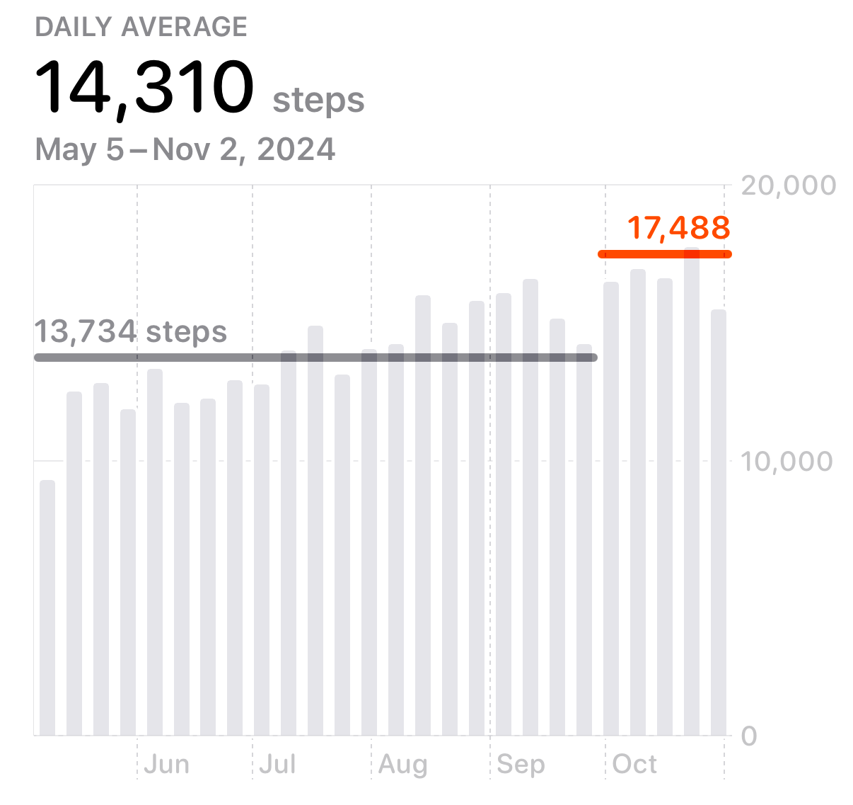
But in Health, Apple shows my step trend this way:

It doesn’t try to fit the best straight line to the data, it fits a step function. It’s idea of a trend is discrete rather than continuous: You used to average this many steps per day, now you average this many steps per day.
Apple would probably say this is just as valid a definition of trend as mine, but it sure doesn’t feel that way, especially when the data look like this. There’s no sudden jump in the data anywhere in the period covered by the graph. Whatever ups and downs we see are just scatter.
You may have noticed something funny about the daily average of 17,488 shown in red: it’s higher than all but one of the five weeks it covers. How can that be the daily average of those five weeks? I’m not sure, but I suspect the answer has something to do with how Health defines a week, which runs from Sunday through Saturday. Since I took this screenshot this morning (Friday, November 1), the current week is missing the better part of two days of steps. My guess is that Apple doing two inconsistent estimations:
- The plotted value for the average of the current week, 15,488 steps per day, is based on my total steps for the week so far divided by 6.
- The trend value, 17,488 steps per day, is based on a projection of what my average daily step count will be at the end of Saturday.
Inconsistency doesn’t bother Apple. You’ve probably noticed that the Fitness app, which is closely allied with Health, defines weeks as going from Monday through Sunday. Whatever.
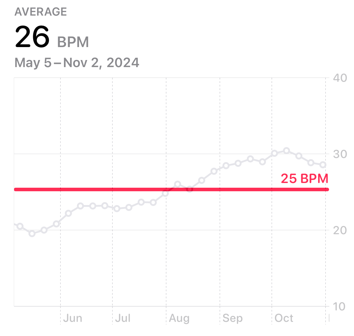
Getting back to trends, I was surprised to see that the Health app considered my cardio recovery data1 to have no trend. What do you think?

A variation from 11,000 to 17,000 steps is a trend, but a variation from 20 bpm to 30 bpm is not. Got it. And I’m sure Apple has a very sound reason for plotting the data in this graph as dots while the steps data are plotted as bars. As sound as the reason Fitness and Health use different definitions of a week.
-
That’s the drop in your heart rate in the first minute after exercise. ↩

