Watchin' the ships roll in
July 13, 2007 at 12:28 AM by Dr. Drang
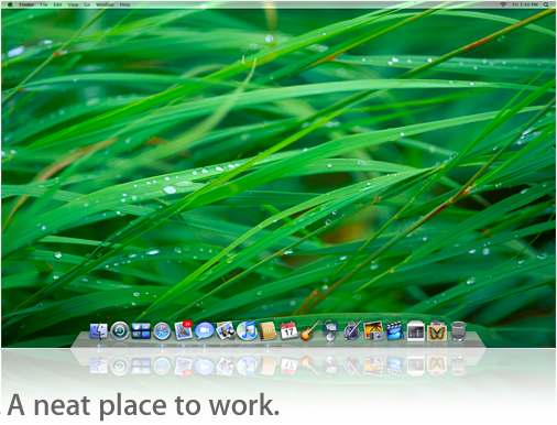
I have to say, I’m a bit surprised at the recent talk about the upcoming 3D Dock in OS X Leopard. If you haven’t seen it, here and here and here, the to-do concerns the perspective angle of the new Dock not matching that of existing icons—icons designed according to Apple’s own perspective rules.
I’m not surprised that people are upset by this change in the rules, nor am I surprised that people care about such seemingly small graphical details. I’m surprised that so many Mac users actually keep the Dock along the bottom of the screen. Even before Apple went to widescreen displays, vertical screen space was rarer than horizontal space, and it made no sense for the Dock to consume some of it. As soon as I got my iBook I learned how to put the Dock over on the right side. And that was with a 4:3 aspect ratio; with the 8:5 aspect ratios common now, it makes even less sense to keep the Dock at the bottom.
(Yes, I know you can reclaim that vertical space by having the Dock autohide. But that’s a cure worse than the disease. The problems with an autohiding Dock are: (1) you have nothing to aim at until your cursor hits the edge of the screen and the Dock pops up, so you usually have to move the cursor twice to get to the icon you’re interested in; (2) the Dock often pops up over something you want to see; and (3) inadvertent cursor movements to the edge of the screen—especially easy when using a trackpad—cause the Dock to pop up when you don’t want it to.)
God knows what the 3D Dock will look like when it’s positioned along the left or right edge of the screen; the Apple previews I’ve seen show it only along the bottom. By the way, have you looked at Apple’s preview of the Leopard Desktop? They’re reflecting the picture of the Desktop, including the 3D Dock, which itself includes a reflection of each icon on the Dock. Who decided that a reflection of a reflection looked good?

Whatever they have planned for the vertical Dock, I hope they include an option to eliminate the 3D look altogether. I don’t think it’s a particularly good metaphor even when the Dock is horizontal, and I think it’s a design that will look dated very quickly. Umm, Apple? 2007 just called. They want their reflections back.
If Apple doesn’t give us the option to flatten the Dock, I’ll bet there are some clever developers outside of Apple who will step into the breach and give us a tool that will do it. Like these guys, who are solving that other bad Leopard idea: the transparent menu bar.
