Twittering
March 17, 2008 at 10:12 AM by Dr. Drang
Until a week ago, I had used Twitterrific for all my Twittering because everyone said it was the Twitter client. So, apart from signup and adjusting the list of people I’m following, I’d never spent any time with the Twitter web app. But I think those days are over. It’s not that Twitterrific isn’t a fine program—it is, and I understand why so many people sing its praises. But some of its design choices just don’t work for me.
First, Twitterrific has a black background displays the stream of tweets in either white text (for the selected tweet)or gray text (for all the other tweets). This is in keeping with Twitterrific’s “heads up display” aesthetic, but I don’t like reading white-on-black, and gray-on-black is a strain on my old eyes.
Second, Twitterrific doesn’t give me the opportunity to increase the font size to overcome the low-contrast problem. Yes, there’s a preference for using a larger font, but the larger font is barely big enough and it only applies to the list of tweets, not to the text entry box.
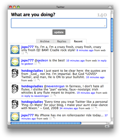
What to do? I could, of course, just dedicate a browser tab to Twitter, something I suspect a lot of Twitter users do. But I do like the idea of a dedicated client, and the Twitter stream doesn’t require a full browser window. So I used Fluid to create a site-specific browser (SSB) dedicated to Twitter and grabbed seyDoggy’s Twitter icon from the Fluid Flickr pool. Now I have a reasonably small window with a reasonably large font that I can keep tucked away on a secondary Spaces desktop. And because it’s a real browser, I can use it to do all the administrative things that can’t be done in Twitterrific.

I’ve been using this setup for about a week now and it’s worked out well. I’ve been pleased with how nice the Twitter web app is and how well it runs in the SSB. The SSB does tend to use more memory than Twitterrific; they start out at about the same level but the SSB’s share of memory increases at a faster rate. Not a dealbreaker.
