PCalc for iPhone, part 3—other preferences
December 12, 2008 at 2:44 PM by Dr. Drang
It’s been a week and a half since the last entry in my Definitive Series of Posts on PCalc for the iPhone; a longer interval than I wanted, but work got in the way. In the first post I gave my reasons for switching to PCalc from the iPhone’s built-in calculator. In the second post, I went through the preferences that control the look of PCalc. Today I’ll finish up the rest of the preferences. This will be the last of the throat clearing; the next post in the Series will actually discuss using PCalc.
Here again is a composite screenshot of PCalc’s configuration screen.

You get to this screen by tapping the circled i on PCalc’s main screen. As I mentioned last time, although the screenshot above shows the calculator display at the bottom of the list of settings, that’s not how it looks on the phone. When you’re fiddling with the settings, the calculator display is always visible at the bottom of the iPhone screen, and the list of settings scrolls behind it. Any changes you make to the settings are immediately visible in the display.
For me, the top setting is the most important. I’m not an RPN absolutist, but I do prefer it to algebraic entry, and since my main physical calculator (an HP 35s) is RPN, I’d rather have my virtual calculator be RPN, too. Switching back and forth between the two entry systems always leads to mistakes.
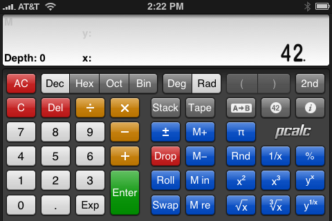
The setting immediately below the RPN mode setting is new with PCalc 1.2. Two-line mode lets you see both the x and y registers of the stack. Here’s what it looks like in portrait mode

and in landscape mode

The height of the display area is slightly larger with the two-line display, but not large enough to use the same size font as with the single-line display. The smaller font size means the numbers take up less horizontal space; the landscape display takes advantage of this by including labels for the x and y registers and an indication of the total depth of the RPN stack.
I still haven’t decided whether I prefer the two-line display to the single-line display. It’s nice to see both registers before activated a two-argument operation, but its also nice to have those big digits in the single-line display. I’ve been going back and forth since version 1.2 came out.
You can activate the two-line display if you’re in algebraic entry mode, but I don’t see much point in it. You might think that in a calculation like 42 + 12, the 42 would go up into the y register after you tap the + key. But you’d be wrong. In my limited testing of the two-line display with algebraic entry, the only way to get a number into the y register is by tapping the x~y key—a key that doesn’t even appear in most of the layouts. In algebraic mode, the y register acts sort of like an undocumented extra memory location.
The next setting that wasn’t already covered in the second post of this Definitive Series is the Clear On Open setting down in the last group of options. With this setting switched to On, PCalc always starts up in a pristine state: nothing in the memory location, nothing on the stack (if you’re in RPN mode), and zero in the display. With this setting switched to Off, PCalc retains the memory location, the stack, and the display between uses. If I remember correctly, PCalc has this setting switched to Off by default, and I highly recommend you leave it there. If Clear On Open is On, and you get a phone call in the middle of a calculation, that calculation will be wiped out when the call is done and you return to PCalc. I really don’t even like the existence of this option.
I have similar concerns about the Shake To Clear option. PCalc has this On by default, but I have it switched to Off. In principle, this is a cute idea: you can clear everything by giving your iPhone a good shake like an Etch-a-Sketch1. My worry is that in practice I’ll inadvertently wiggle the phone too much in the middle of a calculation and wipe out all my work. My sense is that James Thomson, PCalc’s developer, wanted to use the iPhone accelerometer, hit upon this clever idea, and just couldn’t stop himself from adding it to the feature list.
The Thousands Separator option was covered last time, so we’ll move on to the HP Style RPN option. This option is On by default and I can’t see why anyone would want to change it. Switching it to Off changes the way certain stack operations work, and while there is a certain logic to those changes, I wouldn’t want a calculator that operates that way because of the differences between these two examples:
- Tap in a number and hit Enter. Tap in another number. What happens when you tap the Drop key at this point? If HP Style is On, the second number is erased from the x register, the first number drops from the y register into the x register, and any numbers in the stack above the y register drop down one position. If HP Style is Off, however, the first number is erased from the y register and any numbers in the stack above it drop down one position; the second number remains in the x register.
- Tap in a number and hit Enter. Tap in another number and hit Enter again. Now tap in a third number and hit the + key. You now have a the first number in the y register and the sum of the second two numbers in the x register. What happens when you tap the Drop key at this point? In this case, the number in the x register will be erased and the numbers above it will drop down one stack position regardless of the HP Style setting.
I prefer HP Style to be On because I know that the Drop key will always erase the x register and drop everything above it down one place in the stack. When HP Style is Off, the Drop key will sometimes erase the x register and sometimes erase the y register. I understand the logic behind this behavior—in the first case, the second number isn’t really entered yet because you could keep adding digits to it; therefore, it can’t be dropped—but I don’t like it. To me, it’s better to know that the x register will always be erased and not have to think about whether the number in that register is truly “entered.”
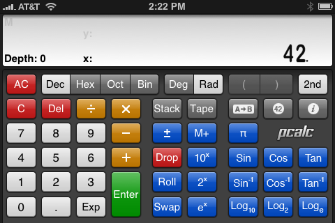
The Momentary 2nd option affects the behavior of the calculator in landscape mode only. The 2nd key toggles a block of keys between one set of functions and another.


If Momentary 2nd is Off, tapping the 2nd key will toggle the keys to their secondary functions and keep them there. If Momentary 2nd is On, tapping the 2nd key will still toggle the keys to their secondary functions, but those keys will revert to their primary functions after the next key tap—which is more like the behavior of a physical calculator. I prefer to have this option Off.
The Key Click option was covered in the second post of the Series, so we’re done. As I said in the introductory paragraph, I’ll start discussing the actual use of PCalc in the next post.
-
There seems to be a variable sensitivity in this feature. Light shaking will just clear the current entry; strong shaking will also clear the stack and memory. I haven’t done much testing with this because I just don’t like the feature, but I can’t see anyone trusting his shaking skills enough to try clearing current entry while maintaining important data in the stack and memory. ↩
