PCalc for iPhone, part 4—short update
December 23, 2008 at 10:11 AM by Dr. Drang
This is an unplanned post in my Definitive Series on PCalc. James Thomson recently released PCalc 1.3 (App Store link), and there are changes in the new version that I want to address before continuing the series. The biggest changes are visual, so you can consider this post as an addendum to the post on PCalc’s themes and layouts.
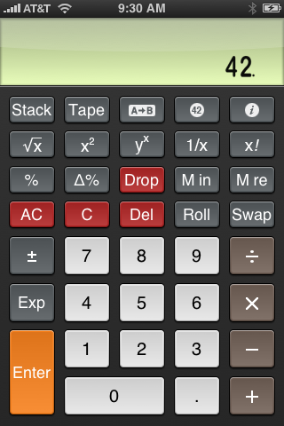
My favorite addition is the Twilight theme, which has a color scheme very much like that of Apple’s built-in calculator.

The keys are white instead of black, and the destructive keys are red instead of brown, both of which I consider improvements over the Apple colors. Note also the display area can now be set to that greenish background you see on physical calculators.
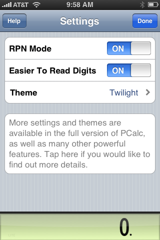
The other changes in version 1.3 have to do with functionality that hasn’t yet been covered in the Definitive Series, so I won’t discuss them here. I will, however, mention that there is now a free PCalc Lite (App Store link). The lite version is, of course, missing several features of the full version. Compare the settings of the PCalc Lite

to those of the full PCalc

Still, PCalc Lite is perfectly functional calculator with most of the features you would expect. Try it out, and you’ll get a good sense of how PCalc works.
With my work schedule slowing down a bit over the holidays, I hope to finish the Definitive Series1 in the next couple of days. With any luck, James Thomson will be too full of mince pie, figgy pudding, haggis, or whatever it is they eat at Christmas in Glasgow to release another version before I get the last posts written.
-
I’m going to keep pushing this name until it sticks. ↩
