Graphic criticism
May 6, 2009 at 9:57 PM by Dr. Drang
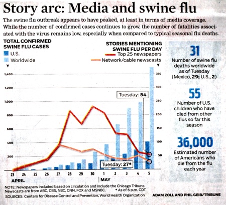
Today the Chicago Tribune published this graph comparing the media coverage of swine flu to confirmed cases of infection.
(I had to take a photo of the damned graph because I couldn’t find it anywhere on the Tribune’s web site.)
The point of the graph, I guess, is to show that in the early days of the outbreak, the media coverage (the lines) was way out of proportion to the problem itself (the columns). And now that the coverage has died down, the problem is worse than ever1. But the graph is dishonest. Media coverage is plotted by rate, in stories per day; actual swine flu cases are plotted by cumulative total. So while the lines can rise and fall as the media coverage waxes and wanes, the columns can only rise. This type of plot comparison will, regardless of the numbers, inevitably lead to a divergence between the two parts of the graph. The two things cannot be compared2.
Helpfully, the caption says
While the number of confirmed cases continues to grow …
Totals have a funny way of doing that.
The best way to do this graph, and the honest way to do it, would be to compare the rate of media coverage to the rate of confirmed incidents. It still would have showed a difference, but I guess the difference wouldn’t have dramatic enough for the tastes of the Tribune editors.
So what do we have here? A news agency using exaggeration to tell us the story that news agencies use exaggeration when telling us stories.
-
Well, actually, the point of the graph is to show how wonderfully self-critical the Tribune can be, but we’ll consider just the overt purpose. ↩
-
If the phrase “apples and oranges” is floating around in your head, try to suppress it. In fact, you’d be better off eliminating that phrase from your bromide library entirely. There are all sorts of legitimate ways to compare apples and oranges (cost, nutritional value, percentage of total fruit crop, etc.), but there is no legitimate way to compare a rate with a cumulative total. ↩

