What I like about Tweetie 2
October 10, 2009 at 10:25 PM by Dr. Drang
If you’re a Twitter and iPhone user, you surely know that the new version of the popular Twitter client, Tweetie 2, appeared in the App Store yesterday. I don’t claim to be familiar yet with all its new features, but I have found a few new things that are delightful.
First, the cut/copy/paste system now works as it should. In Tweetie 1, when looking at a posted tweet, you could select a word or the entire tweet, but nothing in between—the selection handles could not be moved. Now you can move the selection handles wherever you want, just like every other app that supports cut/copy/paste. Strictly speaking, I don’t consider this feature delightful, I consider it minimally competent and something that Tweetie 1 should have been updated to correct. But still, it’s very nice to be able to copy just what I want from a tweet.
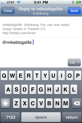
Next is the ability to review the original tweet as you reply to it. This is a feature that Twitterrific had some time ago and was perhaps the only advantage Twitterrific had over Tweetie. Tweetie’s implementation is especially clever. To see the original tweet, put your finger in the editing area and drag down; the original tweet will appear just above your reply. When you lift your finger, the editing area will spring back up to where it was.

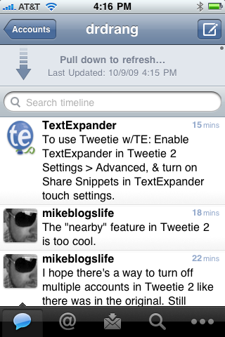
You’ve probably noticed that refreshing is done the same way. In the timeline view, drag down to see the refresh arrow and release to have Tweetie look for updates.

This feature works well with Tweetie’s new ability to maintain your old view between launches. In Tweetie 1, each launch of the app started with a blank screen as Tweetie polled Twitter for the 20 most recent updates of your friends. Tweetie 2 starts with what your were looking at the last time you were running it. If there are new updates or @mentions or direct messages, a little blue dot appears by the appropriate icon in the bottom toolbar.

It looks like searching has been improved, but since I almost never search (as a former educator, I find reading the tweets of the Average Twitterer really depressing) I’m not qualified to pass judgement.
I miss the chat-like balloons of Tweetie 1, but I suspect I’m one of the few who does.
The last thing I want to mention is the scrolling. Tweetie 1 was famous for its fast, smooth scrolling, and I was worried that Tweetie 2’s new features would weigh it down and make its interface a bit clunkier. No need to have worried. The scrolling is as fast and as smooth as ever, making Tweetie 2 a pleasure to use.
