Long Bayes journey into night
April 28, 2010 at 7:58 AM by Dr. Drang
After reading this Science News article by Tom Siegfried last month, I planned to write a post on Bayes’ Theorem, which is mentioned in the article but not presented mathematically. Planned is the operative word; I never actually wrote the post. Then I saw this article by Steven Strogatz in the Sunday New York Times, which is entirely about Bayes’ Theorem. Time to regather my thoughts and write the damned post.
The thesis of the Strogatz article (which you really should read—it’s both short and straightforward, qualities I make no guarantee of for this post) is that Bayes’ Theorem, which is a way of combining probabilities to calculate other probabilities, is very difficult to understand as it is usually presented, and is better taught using a frequency approach. Interestingly, Siegfried used a frequency approach in his article, too, and it was this unusual presentation that first made me think of writing my own Bayes article.
Let me start by recommending that you download and install the TeX fonts for viewing the equations. The equations should appear even if you don’t have those fonts installed, but the page will load faster and look better if you do. The TeX fonts will be helpful in viewing any page that uses jsMath (as I do here), MathJax, or ASCIIMathML.
My plan is to explain Bayes’ Theorem from (almost) first principles. This is material that usually takes days to cover in a probability class, so buckle up. Instead of abstract concepts, we’ll use the example Strogatz gives in his article: how do you determine the probability of breast cancer in a patient who’s had a positive mammogram? If you want to follow along, your really should read that article; it won’t take long.
First, some definitions and notation. The fundamental concept in probability theory is the event, which is simply the occurrence of something of interest. Events are usually denoted by capital letters. The events we’ll be interested in are
- , that the patient has breast cancer; and
- , that the patient’s mammogram is positive.
Each of these basic events has a complementary event, commonly denoted by an overbar:
- , that the patient doesn’t have breast cancer; and
- , that the patient’s mammogram isn’t positive.
When speaking an equation, the overbar is pronounced “not.” Thus, is “not C.”
Events and their complements have two very important properties:
- They are mutually exclusive. An event and its complement cannot not both occur. In our example, a patient cannot have cancer and be cancer-free at the same time. In set theory, from which probability theory borrows heavily, we would say that the intersection of an event and its complement is the empty set.
- They are collectively exhaustive. Between the two of them, an event and its complement contain (or exhaust) all the possibilities. A patient must either have cancer or be cancer-free—there are no other alternatives at a given time. In set theory, we would say that the union of an event and its complement is the universal set.
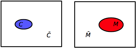
The Venn diagrams for our basic events and their complements would look like this:

In each case, the universal set is the full rectangle, the basic events are the colored ovals, and the complementary events are the white areas outside the ovals. I’ve made the sizes of the events somewhat indicative of their probabilities, but they aren’t to scale.
Because they’re mutually exclusive and collectively exhaustive, the probabilities of a set and its complement have a very simple relationship:
In our example, . From this we can calculate
Now let’s look at combinations of events. The combined event for which a patient both has cancer and had a positive mammogram is denoted by The two event symbols are put adjacent to one another and the order is unimportant, so
When speaking, the combined event is pronounced either “C and M” or “M and C.”
(Some people prefer to use the intersection symbol, , for this type of event combination. Thus, or . Either way is fine; I just prefer the shorter version.)
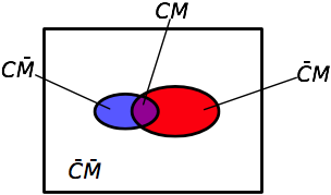
In set theory, these “and” combinations are called intersections. There are four intersections of interest in the example. We can see these by overlaying the two previous Venn diagrams.

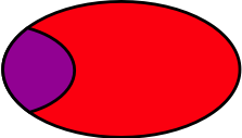
To determine the probabilities of the combined events, we need to introduce the notion of conditional probabilities, which are at the heart of Bayes’ Theorem. The notation for a conditional probability is and is defined as the probability of event C, given (or conditional upon) the occurrence of event M. In other words, we’re not considering the entire universe of possibilities, we’re restricting ourselves to just that subset in which occurs and taking the probability of within that subset. When read aloud, this is “the probability of C given M,” or, more explicitly, “the probability of breast cancer given a positive mammogram.” The portion of the Venn diagram being considered is the red oval () with the purple chunk () in it:

The probability of the intersection is
We can rearrange this to
If the Venn diagram is drawn to scale, this conditional probability can be thought of as the area of the purple chunk divided by the area of the oval.
Because the intersection can be written in either order, we could have just as easily done it this way:
What Thomas Bayes recognized is set these two expressions are equal to one another
and that this trivial algebraic manipulation
can be used to “invert” conditional probabilities. This equation is Bayes’ Theorem.
You may be wondering how such a simple equation—one multiplication and one division—could be so troubling. The reason, I think, is that it’s very easy to get confused about which numbers go into which slots. It’s the old “story problem” difficulty: the arithmetic is easy, it’s translating the story into arithmetic that’s hard.
In the our example, we’re given the following background information:
- The probability that any woman in a particular low-risk group has breast cancer is 0.008 (0.8%).
- Mammograms are not perfect. There are both false positives and false negatives.
- If a woman has breast cancer, the probability that her mammogram will be positive is 0.90 (90%).
- If a woman does not have breast cancer, the probability that her mammogram will be positive is 0.07 (7%).
Imagine a woman has just had a positive mammogram. What is the probability that she has breast cancer?
If we think clearly, we see that we’re being asked to calculate , the probability of cancer given a positive mammogram. Looking up at the Bayes’ theorem equation, we see that this is the term on the left side of the equation; we just need to fill in the terms on the right side and do the arithmetic.
Do we have ? Yes, we do; it’s 0.90. Do we have ? Yes, it’s 0.008. Do we have ? No, but with just a little thinking, we can get it.
Because and are mutually exclusive and collectively exhaustive, the probability of can be decomposed into the sum of two mutually exclusive intersections,
Referring back to our Venn diagram, this equation is equivalent to saying that area of the oval is the sum of the areas of the purple part and the red part. How is this helpful? It looks like we just turned one unknown probability into two. But we can use the conditional probabilities to figure out each of those intersection probabilities:
Yes, we’ve now turned two terms into four, but we know every right-hand side term.
And therefore
We now plug these numbers into the equation of Bayes’ Theorem. Notice that we’ve already calculated the numerator as part of the calculation of .
or a bit more than 9%, which is the (rounded) answer Strogatz gives. In other words, for this group of low-risk women, a positive mammogram is far more likely to be a false positive than a true positive.
How can this be? Why does the mammogram seem so untrustworthy? The reason is the false positive rate for the test is much higher than the breast cancer probability for the group, which causes the denominator to be dominated by the probability of a positive mammogram with no cancer, . This relatively large value drives down the quotient.
Looking back at the Venn diagram, the red part of the oval is much bigger than the purple part, so when we divide the purple area by the red area, we get a small number. And if I had drawn the diagram closer to scale—which I didn’t because some areas would have been so tiny they’d be hard to see—the size difference would be even more distinct.
Strogatz quotes research done by Gerd Gigerenzer from Berlin’s Max Planck Institute in which doctors in Germany and the US were given this same problem. They did miserably.
Gigerenzer describes the reaction of the first doctor he tested, a department chief at a university teaching hospital with more than 30 years of professional experience:
“[He] was visibly nervous while trying to figure out what he would tell the woman. After mulling the numbers over, he finally estimated the woman’s probability of having breast cancer, given that she has a positive mammogram, to be 90 percent. Nervously, he added, ‘Oh, what nonsense. I can’t do this. You should test my daughter; she is studying medicine.’ He knew that his estimate was wrong, but he did not know how to reason better. Despite the fact that he had spent 10 minutes wringing his mind for an answer, he could not figure out how to draw a sound inference from the probabilities.”
When Gigerenzer asked 24 other German doctors the same question, their estimates whipsawed from 1 percent to 90 percent. Eight of them thought the chances were 10 percent or less, 8 more said 90 percent, and the remaining 8 guessed somewhere between 50 and 80 percent. Imagine how upsetting it would be as a patient to hear such divergent opinions.
As for the American doctors, 95 out of 100 estimated the woman’s probability of having breast cancer to be somewhere around 75 percent.
Gigerenzer’s work indicates that people do better when presented the conditional probabilities as a set of integer counts. He gave the same problem to another set of doctors, but presented it this way:
Eight out of every 1,000 women have breast cancer. Of these 8 women with breast cancer, 7 will have a positive mammogram. Of the remaining 992 women who don’t have breast cancer, some 70 will still have a positive mammogram. Imagine a sample of women who have positive mammograms in screening. How many of these women actually have breast cancer?
Almost all the doctors got this problem right, or at least gave a close estimate. Does that mean that this is a better way of thinking about conditional probability. Strogatz and Gigerenzer think so, but I’m skeptical.
First, I would argue that one important reason the doctors did better when presented the second form of the problem is that in second presentation, much of the work was already done for them. In effect, all of the intersection probabilities have now been given as part of the problem statement, and the original word problem has been translated by the questioner into a set of numbers. Of course the doctors did better, but what does that prove? Who’s going to do the translating for them when they’re confronted with a similar problem in the real world?
Strogatz’s experience in the classroom is more interesting. He says that students who translate conditional probability problems into this frequency/count form are better at solving the problems than those who don’t. To me, a student who can make the leap from probabilities to frequency counts already has a good sense of how probability works, so it’s hardly surprising that such students do better. But it does suggest a way of teaching that may improve the understanding of the other students, and I believe Strogatz is working on methods to teach the other students how to make that leap.
As for me, I’m too old to learn new tricks. I’ll stick with the formula and the Venn diagrams.
