New Macs’ resolutions
October 27, 2010 at 12:00 PM by Dr. Drang
I went to my local Apple store yesterday to take a look at the new MacBook Airs and was struck by two things. First, it’s amazing how big the 13″ Air seems after you’ve been playing with the 11″ Air. And second, Apple really needs to do something about the resolution of its screens.
I’ve talked about this before. When the Mac first came out, one of its great WYSIWYG features was that a pixel on the screen was supposed to be equal in size to a printer’s point: 1/72″. It was hard to confirm that back in the days of curved CRT screens with thick glass fronts, but it was certainly very close.
Back then, onscreen rulers matched up quite well with physical rulers, and 12-point type on the screen looked to be the same size as 12-point type on the printed page. But those days are long gone.
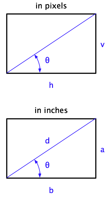
Using the figures on the Apple Tech Specs pages, here are the resolutions of all1 the current Mac models.2
| Model | Horiz | Vert | Diag | Resolution |
|---|---|---|---|---|
| 27″ iMac | 2560 | 1440 | 27.0 | 109 |
| 21.5″ iMac | 1920 | 1080 | 21.5 | 102 |
| 17″ MB Pro | 1920 | 1200 | 17.0 | 133 |
| 15″ MB Pro (std) | 1440 | 900 | 15.4 | 110 |
| 15″ MB Pro (opt) | 1680 | 1050 | 15.4 | 129 |
| 13″ MB Pro | 1280 | 800 | 13.3 | 113 |
| 13″ MB | 1280 | 800 | 13.3 | 113 |
| 13″ MB Air | 1440 | 900 | 13.3 | 128 |
| 11″ MB Air | 1366 | 768 | 11.6 | 135 |
This is a huge resolution range. On an 11″ MacBook Air, a 72-pixel line—which would measure 1 inch long against an onscreen ruler—is just 0.53 physical inches long. On a 21.5″ iMac, that same line is 0.70 inches long. User interface items, like buttons, menu items, and scroll bars are 30% bigger on the iMac than on the Air.
When the iPhone 4 came out, its Retinal Display had double the resolution of the previous iPhone screens, and Apple knew its interface elements couldn’t just shrink to half their previous size and still be usable. So it worked out a systemwide way to double the pixel size of everything. Text stayed smooth because it’s defined by mathematical curves; bitmapped graphics got chunky, at least until developers added higher resolution images to their apps. Regardless of the doubling technique, Apple recognized that the physical size of the interface elements was essential to the usability of the device.
The 135 dpi resolution of the 11″ Air brings the Mac to nearly double its original resolution, but Apple’s done nothing to address the physical shrinkage.3 Part of the reason, I’m sure, is that the shrinkage has occurred slowly over decades instead of in a single jump. And part of the reason is that because the pointer has been shrinking along with the buttons and menus and scroll bars, it’s about as easy to hit a button with the pointer as it’s always been.
Of course, that’s assuming you can read the button labels so you know which one to click. The lack of font scaling to match the increased screen resolution is a real problem, and not just for 0x32-year-olds like me. Twelve-point text on a UI element is now the same physical size as 6.5-point text was on the original Mac. Even 14-point text is down at the size of what used to be 7.5-point text. Yes, the sharper screens can make up for some of this reduction but not all of it. Size matters.
Microsoft has universal settings to change the size of UI elements. Even X Windows allows you to set a screen dpi for fonts. Apple has nothing. With screen resolutions increasing at an accelerating pace, this has to be addressed soon.
-
As commenters have pointed out, the original version of this table omitted the optional 1680×1050 screen available for the 15″ MacBook Pro. I missed it when first going through the Tech Specs pages. ↩
-
The formula for working out the resolution is simple; it’s derived at the bottom of the post. ↩
-
No George Costanza jokes, please. ↩

