The iPhone back-and-forth problem
January 24, 2011 at 8:00 AM by Dr. Drang
One of the most welcome features of iOS 4 was the merged email inbox. Before the merged inbox, checking new messages on multiple accounts was an exercise in tree traversal—down into the inbox of one account, read the messages there, back to the root, over to the other account, then down into its inbox. Repeat every time you get new messages. iOS 4 has eliminated all that by showing you all your inboxes in a single list of messages. But I wish Apple had addressed the general problem of tree traversal, because if it had it would have made other apps more efficient, too.
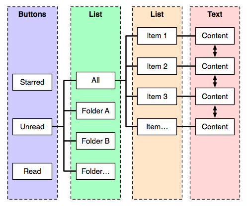
Take Reeder, for instance. It’s my favorite RSS reader, but there’s more back-and-forth than there ought to be. Here’s how Reeder’s tree of screens is organized, where for simplicity I’m showing the subtree of only one branch at each level.

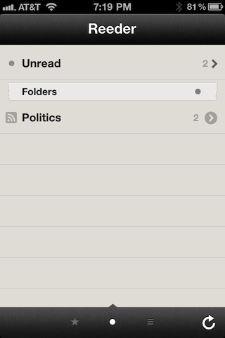
Reeder has a three-part root level: you can start by viewing Starred, Unread, or Read items. Switching between these three is done by tapping those absurdly small buttons at the bottom of the screen.

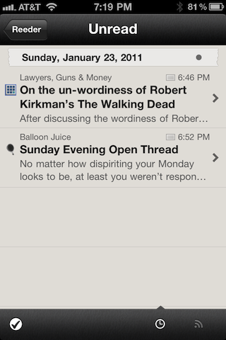
The root screens show the folders (one of which represents all the folders) you’ve set up in Google Reader to organize your feeds. Selecting one of them takes you to a list of the articles in that folder.

Selecting one of the articles takes you to the article itself, which you can then (finally) read.
When you’re all the way to the “right,” reading articles, you can move from one article to the next by tapping or down arrows, just like in Mail, or you can do that “elastic pull” thing that Tweetie pioneered. Either way, it’s better than having to go back left to the list, pick a new article, and slide back to the right to read it.
But there’s no such affordance when you want to refresh your feeds. You have to go all the way left to the root level to do the refresh, then go back to the right down the Unread branch to read the new articles.
I suppose I could blame Reeder’s developer for not providing a one-step way to snap back to the root screen, but I think the blame rests with Apple. This back-and-forth behavior is very common in iPhone apps, and Apple should have a single, standard, well-publicized way to snap back to the root screen in any app.
It would save us all a lot of tapping.
