Why Jumpcut is better than LaunchBar
March 24, 2011 at 4:14 PM by Dr. Drang
Don’t get me wrong: I like LaunchBar and have been using it daily for over two years. But its multiple clipboard system is cluttered and hard to use. I’m surprised that Justin Williams and Marco Arment are singing its praises.
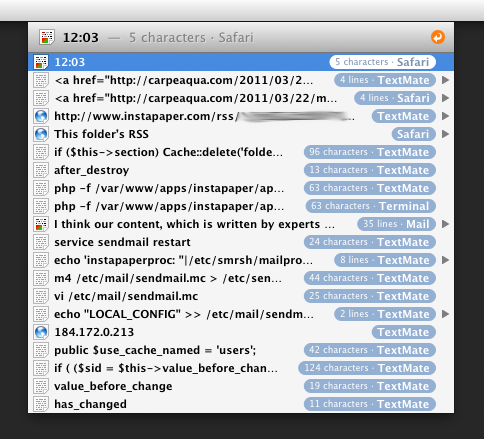
What’s wrong with LaunchBar’s multiple clipboard is that everything is jammed together into its popup menu paradigm. Here’s a screenshot lifted from Marco’s post:

Displaying all the saved clipboard items in a menu causes two problems:
- The items are clipped to fit in a single line. You don’t really know what you’re pasting because you can’t see it all. If you look at Marco’s second and third items, you’ll see that they start out the same and that they’re both four lines long. Are they the same throughout their lengths? LaunchBar can’t tell you.
- The items are crowded together, which makes them hard to pick out as you scan the list.
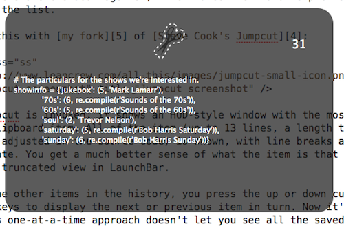
Compare this with my fork of Steve Cook’s Jumpcut:

When Jumpcut is invoked, it shows an HUD-style window with the most recent clipboard item. All of the item (up to 13 lines, a length that could be adjusted in the source code) is shown, with line breaks as appropriate. You get a much better sense of what the item is than with the severely truncated view in LaunchBar.
To see the other items in the history, you press the up or down cursor control keys to display the next or previous item in turn. Now it’s true that this one-at-a-time approach doesn’t let you see all the saved clipboard items, nor does it let you skip right to an item that’s buried five-deep in the history. But these apparent advantages of LaunchBar prove to be not nearly as useful in practice as they seem to be in theory. As I said, LaunchBar’s menu layout makes it hard to immediately locate the item you want. And unless you move your hand to the mouse—negating the basic idea of LaunchBar—you still have to use the cursor control keys to get to the item you want.
In their apps, Marco and Justin usually show a good understanding of the difference between apparent advantages—the kind of feature list bloat common in Windows software—and real advantages in everyday use. But they missed the boat here.
Update 3/26/11
Rather than continuing to answer comments in the comments, I’ll do all my answering here.
First, Alfred is obviously more popular than I thought. Since I’m pretty well invested in LaunchBar, I’m unlikely to switch to Alfred, but it’s certainly worth a look for anyone who hasn’t committed to one of these launcher/opener utilities.
Second, snc points out an error in my penultimate paragraph: you don’t have to use the mouse to select an item in the middle of the clipboard history; you can just type a few letters that are in that item to select it. This is, in fact, how LaunchBar works with all its lists and was a silly error for me to make.
Third, that LaunchBar allows you to see the entire item via QuickLook cuts no ice with me. That simply adds a step every time I need to recall text that’s more than a few words long.
Fourth, thanks to Ben Brooks for linking here, even if he thinks I’m off track.
Finally, some commenters agree with Mr. Brooks that LaunchBar’s clipboard history is faster than Jumpcut’s. I’ll start by pointing out that my argument is that Jumpcut is better, not that it’s faster. Speed is certainly one factor to consider, but it’s not the only one.
And I have a strong suspicion that those of you who think LaunchBar is faster are fooling yourselves. There’s a long history of user interface studies showing that people’s perception of how fast they’re working is at odds with actual timings. As Tog says in these links, “the more mentally engaging the task, the shorter the time appears.”
My dislike of LaunchBar stems from it being too mentally engaging; too much squinting and searching through the menu to find the item I want. Jumpcut’s approach of showing me one thing at a time and allowing me to tap my way through them—no, no, no, yes—is better because it takes less thinking for a task that shouldn’t require much thinking. I don’t really care if it’s a little slower, but I wouldn’t be surprised to find that real timings (not the user’s sense of speed) would show it to be faster.
