Calvetica v. Calendar
April 18, 2011 at 9:32 AM by Dr. Drang
I didn’t jump on the Calvetica bandwagon last year. Not because of any suspicions about the app, just general inertia and sloth. I finally got around to installing it a few days ago, putting it on my first iPhone screen. I figured I’d give it a good week’s workout as my only calendar app to see if it should take the place of the builtin Calendar, which I’ve relegated to a nether screen far down the stack. I’m committed to testing it for the full week, but I’ll be surprised if it wins me over.
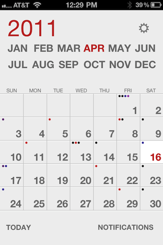
When Calvetica first came out, everyone commented on two things. The first was its look, and I have to say it’s a spectacular looking app.

There’s more to Calvetica’s look than just the font choice implied by its name. Every aspect of the app has embraced the cool, flat aesthetic of the International Style: the buttons, the labels, the arrows, everything. Whenever I open it, I feel like I should be sitting in a Barcelona chair.
The other big selling point of Calvetica was how fast one could enter new appointments. According to the web site
Add an event in just two quick taps. See how full your week or day is at a glance. It works with the built-in iPhone calendar but it’s faster.
I don’t disagree with this, either. Calvetica is faster at entering new events than the builtin calendar. And because its month view uses one dot for each event in a day—instead of one dot for all the events the way Calendar does—you can see at a glance roughly how busy a day is going to be.
But I’m pretty sure these advantages don’t address my primary use of my iPhone calendar, which is to check on upcoming appointments. For that, Calendar is superior.
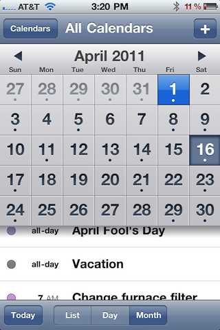
Let’s compare how the two apps use the screen to display a month. A month view consists of an array of nearly-square boxes, each representing one day. The array is seven boxes wide and five or six boxes high, so the month is nearly square. Because the iPhone in portrait mode (which is the most common way I access my calendar) is much taller than it is wide, there’s a lot of screen space above and/or below the month view that the app can use for other things.
As you can see in the screenshot above, Calvetica uses the space mostly for navigation. Tap a month to go immediately to it. Slide your finger across the year to go forward or backward in time.
Calendar, in contrast, uses the space to tell you the events on the currently selected day.

Navigating is clumsy—one month at a time using the little arrows on either side of the month name. But all the selected day’s events are there in the scrolling list below the month.
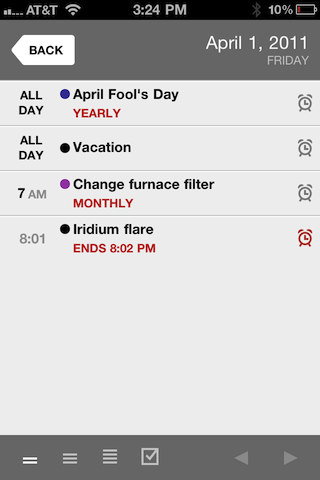
To get the details of a day’s events in Calvetica, you have to tap the day, which takes you to a day view.

This is the compressed version of the day view, where all the events are given as a list. There’s also a workday version, which shows all the times between 8:00 am and 6:00 pm, and an all-day version, which shows all the times from midnight to midnight. These latter two views are good—indeed, they’re necessary—for entering events, but they’re not as good for viewing events, because they often require scrolling to see everything.
I appreciate Calvetica’s use of multiple dots in the month view, but telling me how many appointments I have in a day isn’t the same as telling me what and when they are. When I’m checking my schedule, I need the details.
Calvetica does have a week view, which gives a nice combination of detail and overview. Unfortunately, the week view is available only in landscape orientation, a position I rarely hold my phone in.
In summary, then, Calvetica is designed for quick navigation to distant days and quick entry of new appointments. Calendar is designed for quick perusal of events in the near future. My sense is that I need the latter a lot more than I need the former, but we’ll see how the week pans out.
