Guidelines
April 11, 2011 at 9:19 AM by Dr. Drang
A couple of years ago, I tweeted this:1
For two days, a How To Fry An Egg tutorial has been on delicious.com/popular. This is why the middle-aged think young people are stupid.
One of the few pleasures of aging is being able to complain about the ignorance of those younger than you. It isn’t really fair—young people should know less about the world because they haven’t been in it as long—but if the world were fair I’d still have all my hair and the ability to remember the names of people I just met.
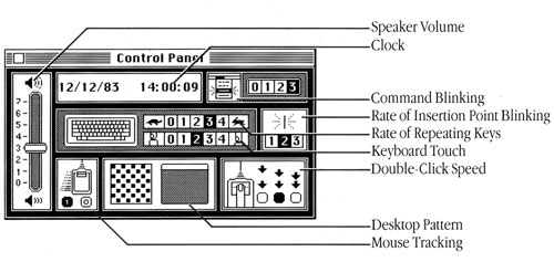
On the latest episode of Hypercritical, John Siracusa and Dan Benjamin displayed a small but surprising bit of ignorance that I suspect is associated with their age. They were talking about the original Macintosh Control Panel, designed by the wonderful Susan Kare,2 and seemed to think that its use of turtle and rabbit icons to indicate slow and fast (for the keyboard repeat rate) was something new and clever and special. They even named the episode “The Tortoise and the Hare.”

Image from Vectronic’s Apple World
I’m sure John and Dan don’t think of themselves as especially young, but they’re both, I think, a dozen or so years younger than me and spent their formative early teen years with personal computers around. It’s not surprising that their first encounter with tortoise and hare icons was on a computer.
I, on the other hand, am old enough to have lots of pre-computer memories, and one distinct memory was seeing the tortoise and hare icons by the throttle lever of my uncle’s Cub Cadet riding mower. This would have been back in the early ’70s, when US manufacturers were trying to be more “international” by using fewer English words and abbreviations in their products. The tortoise and hare were a natural for throttle positions, and I’ve seen it used in dozens of machines since then. When I got my first Mac in ’85, I knew instantly what that control meant: Susan Kare was brilliant and talented, but she wasn’t inventing anything new with those icons.
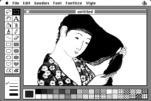
This is, in keeping with the theme of Hypercritical, just picking a nit. John’s main thesis in the episode—that Apple has repeatedly, and from the very beginning, violated the Human Interface Guidelines for the Mac—is absolutely right. An even more egregious example than the Control Panel was that signature Mac program of the early years, MacPaint.

Image from GRAHAMUK on Wikipedia
How did it violate the HIG? Let me count the ways:
- Was the content window moveable? No.
- Was the content window resizable? No.
- Given that the content could be larger than its window, did the window have scrollbars? No, you had to use the hand tool.
- Were any of the toolbars moveable? No.
- Did the user’s Desktop pattern show through between the windows? No, Bill Atkinson insisted on hiding the user’s Desktop pattern (which might be ugly) with the standard 50% gray dithered image. MacPaint was, as I recall, the only program that took over the screen completely.
There were probably more violations that I can’t remember now. Why can’t I remember them? See the above complaint about the unfairness of aging.
And as with the Control Panel, MacPaint’s violations of the HIG—which Atkinson took even further in HyperCard—didn’t make it hard to use. The hand tool became a standard in graphics programs. And its hogging of the entire screen with fixed positions for all the tools actually made it easier to use because you always knew where the tools were. This simplicity is something that Apple’s only recently returned to with iOS apps.
As John said very well at the end of the episode, the HIG isn’t an absolute inviolable code. It is, as it’s title says, a more what you’d call guidelines than actual rules.
Update 4/13/11
I just watched this talk by John Gruber at February’s Webstock thing in New Zealand, and I now realize that this episode of Hypercritical is Siracusa’s response to Gruber—a refutation of sorts. He uses the Control Panel as an example because Gruber did, and he emphasizes that Apple has always violated the HIG because Gruber’s main point is about Apple loosening up in the past ten years.
I call it a refutation of sorts, though, because their not really talking about the same thing. Siracusa’s point is that Apple has always violated the HIG and done custom UIs on their applications instead of sticking strictly with the standard UI elements. Perfectly true. But Gruber’s point isn’t that Apple has always adhered to the HIG; it’s that Apple has changed the standard elements at a much more rapid pace recently than in the early years of the Mac. That’s a slightly different matter, and it’s also perfectly true.
Anyway, this post would have been quite different had I known Siracusa’s subtext when I wrote it. I wonder why he didn’t just come out and say that it was a response to Gruber.
Update 4/16/11
Turns out my update was wrong. In followup portion of the next episode of Hypercritical, Siracusa says that he saw the video of Gruber’s talk just after recording the episode discussed above and felt bad that he and Gruber had covered many of the same topics and even used the same Control Panel example. So it wasn’t a response and refutation, just a coincidence.
-
I was able to find this old tweet thanks to Gina Trapani’s ThinkUp, which I installed a couple of weeks ago. It’s still pretty raw, but it’s considerably more polished than it was last fall, when I tried and failed to get it running. Once you get your tweets sucked into ThinkUp (sadly, Twitter allows only the last 3200 tweets to be downloaded, so my first thousand or so tweets are lost to me), searching is quite easy. You can even download all your tweets to your computer as a CSV file for importing into a spreadsheet or database. ↩
-
The only reason I don’t have one of these hanging in my office is that I can’t decide which one to get. ↩

