Agenda for iPhone
July 11, 2011 at 9:21 AM by Dr. Drang
I bought Agenda for the iPhone a few weeks ago after reading this complimentary review of it by Ben Brooks. I can’t say I bought it because of the review—Ben and I have different ideas about what makes a good calendar app, so I’m skeptical of his recommendations in this area—but it certainly got me interested in checking out the screenshots and video on the Savvy Apps website. They’re what made the sale.
And after nearly three weeks of continuous use, Agenda has replaced the builtin Calendar app on my home screen. Let me give you a tour so you can see why.
Agenda gives you five views of your calendar:
A six-month view.
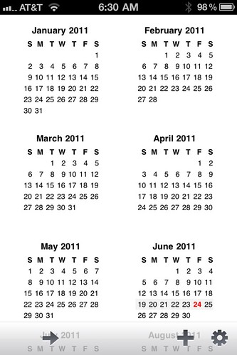
A one-month view.
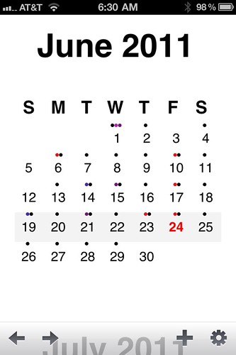
A “week” view. (This is what Savvy calls the view, even though it doesn’t really show you a week.)
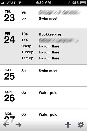
A day view.
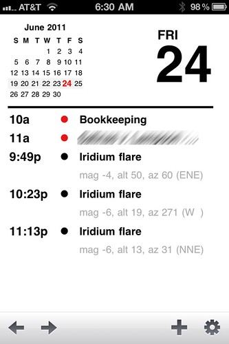
And, finally, an event view.
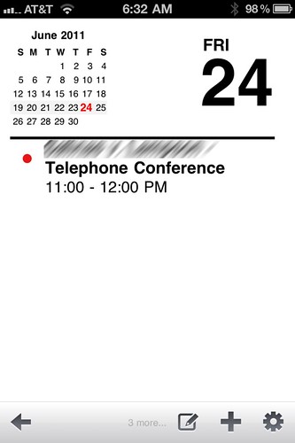
Conceptually, these views are laid out from left to right, and you go from one view to another by either swiping horizontally or by tapping the arrow buttons in the bottom toolbar.
Within a particular view, you move forward or backward in time by swiping up or down. Of the five views, four of them “snap” into discrete, fixed locations as you scroll through time. The year view always snaps to either a January-June or a July-December set of months. The month view always shows a whole month; it won’t show, for example, the last week of June and the first few weeks of July. Similarly, the day view shows exactly one calendar day, and the event view shows exactly one event.
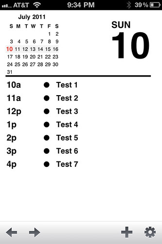
It’s the so-called week view that makes Agenda interesting. Unlike the other views, it scrolls continuously. In that way, it’s like the list view in the builtin Calendar app, except that it shows every day, not just the days that have events. I also think it looks better than the Calendar list view.
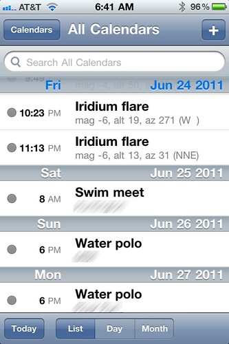
Putting the date off to the left makes Agenda less cluttered. This is not just an aesthetic preference. To me, the week view is Agenda’s main selling point, its killer feature. I like the way all its views look, but the week view puts a lot of information in a single screen in a way that’s easy to read with a single glance. I haven’t run across another calendar app that presents its information this cleanly, this usably.
Although swiping and arrow-tapping are the fundamental means of navigation, Agenda has other ways to move around that work pretty much as you’d expect.
- In the six-month view, tapping on any month takes you to that month.
- In the month view, tapping on any day, takes you the week view with that day at the top.
- In the week view, tapping on any day takes you to that day.
- In the day view, tapping on any event takes you to that event.
- In the six-month, month, week, and day views, a tap on the title bar at the top of the screen takes you immediately to “today” as that view defines it. (This feature was missing when Ben wrote his review and when I first bought the app. It was a significant omission, but it’s been corrected.)
Of these, the second one may seem a bit odd: why doesn’t tapping on a day take you directly to that day, bypassing the week view? I think it’s because Savvy believes strongly in it’s left-to-right conceptual layout and thinks it’s wrong to jump over one of the views to get to the next one. That’s why you can’t tap on a single event in the week view and go directly to that event—Agenda interprets a tap on an event in week view as a tap on the enclosing day.
I spend almost all my time in week view. It doesn’t give me all the information for upcoming events, but what it gives—event name and time—are usually all I need. If I need to see the location or notes for an event, I can get them with a tap or two.
You enter events in Agenda using exactly the same tools you use in Calendar. There’s no Calvetica-like fanciness to event creation. Since I spend much more time reviewing my schedule than editing it, this is fine with me.
If you’re worried about losing events by switching back and forth between calendars, don’t be. Agenda reads from and writes to the same database as the builtin Calendar. If you switch back to Calendar, all the events you entered in Agenda will be there. And they’ll sync with your computer calendar, too.
So what’s wrong with Agenda? A little bit with several things:
- The day badge you can put on the icon is so ugly I can’t bring myself to show you a screenshot of it. Fortunately, it can be turned off via a preference.
Unfortunately, the preferences screen is almost as ugly as the badge.
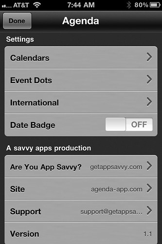
Who could think this gray backgound was an improvement on the standard white? Especially after seeing how the slider switch looks against it?
In the day and event views, the day number and day of week should be right justified. It looks stupid for them to be away from the right margin on single-digit days.
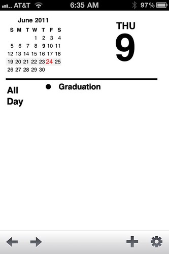
I think the day and date would look better if they were right-aligned in the week view, too, but the left alignment there doesn’t bother me nearly as much as it does in the day and event views.
- The little n more… notation at the bottom of the event view is something of a lie. It doesn’t mean there are n more events on that day; it means there are n more events on that day after the one you’re looking at. Why do the folks at Savvy think I care to know only how many events come after the one I’m looking at? Do they think I look at events only when I’m in the middle of one and therefore only need to know what’s coming up later that day? That’s not how I use a calendar, and I seriously doubt it’s how others do.
- If you have an alarm set on an event, when the notification appears on your iPhone it will be opened in the Calendar app rather than Agenda. This is a problem, but I suspect it’s a locked-in behavior that Savvy can’t do anything about. Calvetica works (or doesn’t work) the same way.
- The tap targets in day view are too restrictive. Many events are two lines long, and I should be able to tap anywhere within those two lines to see the details of that event. Instead, Agenda forces me to tap on the bold line only.
The day view doesn’t scroll if you have several events. Normally, the day view shows both the event name and location.

If you have more events in a day than can fit on the screen, Agenda saves space by hiding the locations, making the day view distinctly less useful.
I’ll end this list with something that isn’t really wrong, but is questionable. Is the day view really necessary? Given that
- I can see a thumbnail of my day’s schedule in the week view, and
- I need to go to the event view to see all of an event’s details
the day view seems superfluous. Wouldn’t it be more efficient to be able to tap on an event in the week view and go straight to the event view? Doesn’t the fact that the day and event views look almost identical indicate that they’re doing almost the same thing?
It’s funny. I didn’t realize I had so many complaints about Agenda until I started typing out this list. It’s a testament to how good the app is that I’m willing to put up with these annoyances to use it. That scrolling week view covers a multitude of (relatively minor) sins.
