More middle-aged bitching
December 13, 2011 at 9:35 PM by Dr. Drang
For a company that prides itself—rightly, for the most part—in making its product accessible, Apple is really screwing with its middle-aged and older users whose vision is deteriorating. I’ve complained before about the Mac’s incredible shrinking UI (due to increased pixel density) and the low-contrast day numbers in the new iCal. Today I found a new assault on my 51-year-old eyes.
Well, it’s not really new. It’s the same gray-text-on-white problem1 I have with iCal. I followed a link from Stephen Hackett (or maybe it was Justin Blanton—I can’t remember where I saw it first) that took me to Apple’s Mac App Store Preview site. Now, normally when I follow one of these links, I click to launch the MAS application right away, but today I decided to just stay in the browser and read the description of the app there.
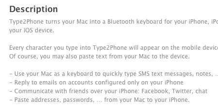
Here’s an excerpt of what I saw:
That’s 50% gray text (I checked it with the Color Picker in Acorn) on a white background for body copy. Jesus.
I have this vague memory of someone saying that design isn’t just what something looks like, it’s how it works. If only that person had some influence at Apple.
-
I’m sure Apple calls it a style. ↩

