Fuzzy pixels
March 20, 2012 at 10:15 PM by Dr. Drang
Everyone who has the new iPad says the same thing: images that haven’t been made specifically for the Retina display look fuzzy on the new iPad. Worse than they did on the earlier iPads. The same thing happened when people switched from the non-Retina displays of the first three iPhone iterations to the iPhone 4. I’ve been thinking about why that’s so.
Let me start with a disclaimer: I’m no expert on human vision or perception. The following is based entirely on what I know about the displays and some simple reasoning. If your are an expert on vision or perception, I’d love to hear what you have to say.
The most obvious explanation is psychological. Non-Retina graphics look fuzzy on a Retina display simply because the user is comparing them to higher-resolution images in Retina-optimized apps. While there’s probably something to this, it can’t be the full explanation because people who still have their older iPads say the lower-resolution images look better on the older iPad than on the new one. They’re comparing two renderings of the same low-res image, not a low-res with a high-res.
If the explanation isn’t psychological, it must be physical, so we have to look into what pixels are and how they’re rendered on the older and newer screens.
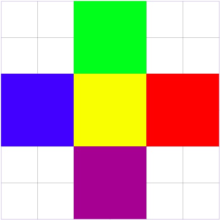
Our conceptual model of pixels is a set of solid squares of color that butt up against each other like this:
If this model were accurate, Apple’s pixel doubling—the replacement of each individual pixel with a 2×2 grid of pixels with half the side length—that occurs when a low-res image is displayed on a high-res screen wouldn’t change the look of the image.
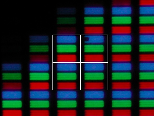
But as we saw in this post and in the Lukas Mathis post that inspired it, screen pixels aren’t solid blocks of color like this. Each pixel is made up of three adjacent elements: one red, one green, and one blue. Here’s a photomicrograph of the pixels in an original iPhone:
And here’s one at the same magnification of the pixels in an iPhone 4:
In each case, a single pixel consists of the three colored elements, the black areas between the three elements, and half of the black area surrounding the three elements.
Unlike our conceptual view of pixels, with physical pixels there are distinct differences between the 2×2 grid of the high-res display and the single pixel of the low-res display, namely
- There are four blocks each of red, green, and blue instead of one block each, and they are spread out over the grid.
- There are more black lines within the high-res 2×2 grid than within the single low-res pixel.
Both of these differences are too small for our eyes to resolve, but that doesn’t mean they don’t affect our perception of the image. If I had to guess, I’d say the internal black lines contribute most to the fuzziness of low-res images displayed on a high-res screen.
But that is, at best, a semi-educated guess.
Update 3/26/12
According to this article at Mashable
The iPad 3 applies an anti-aliasing filter to all low-resolution content, which blurs images ever so slightly.
There are no quotes around this statement, so I’m not sure of its source. It may be paraphrasing Zeke Koch of Condé Nast, who was interviewed for the article and was quoted in the same paragraph.
If this is true, it seems really dumb to me. The whole point of doubling the resolution, I thought, was to avoid the problems that necessarily arise when you change resolution by a non-integral amount. Why, after going to the trouble to avoid the requirement of anti-aliasing, would you then deliberately apply an anti-aliasing filter?


