Gnuplot details
May 28, 2012 at 10:26 PM by Dr. Drang
Yesterday’s post about accelerometers included two plots, both of which were made with Gnuplot. I thought I’d do a short explanation of the techniques I used and why I usually make my plots a different way.
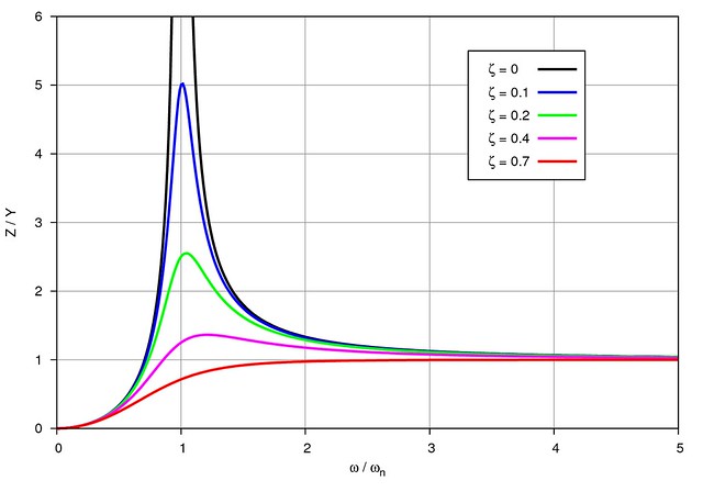
Except for the functions themselves and the ranges, the plots were made with the same set of commands, so we’ll just look at one of them. The plot was this:
And the Gnuplot commands that generated it were these:
 1:  set key at 4.25,5.5 box lw 1 height 1 spacing 3
 2:  set xrange[0:5]
 3:  set yrange[0:6]
 4:  set ylabel "Z / Y"
 5:  set xlabel "{/Symbol w} / {/Symbol w}_n"
 6:  set xtics out nomirror
 7:  set ytics out nomirror
 8:  set grid lt 1 lc 9 lw 1
 9:  set border lw 1
10:  set samples 400
11:
12:  set terminal postscript eps enhanced color solid font "Helvetica,14"
13:  set output
14:
15:  plot \
16:  x**2/sqrt((1-x**2)**2) with lines lw 5 lc 0 title "{/Symbol z} = 0&{.0}", \
17:  x**2/sqrt((1-x**2)**2 + (2*.1*x)**2) with lines lw 5 lc 3 title "{/Symbol z} = 0.1", \
18:  x**2/sqrt((1-x**2)**2 + (2*.2*x)**2) with lines lw 5 lc 2 title "{/Symbol z} = 0.2", \
19:  x**2/sqrt((1-x**2)**2 + (2*.4*x)**2) with lines lw 5 lc 4 title "{/Symbol z} = 0.4", \
20:  x**2/sqrt((1-x**2)**2 + (2*.7*x)**2) with lines lw 5 lc 1 title "{/Symbol z} = 0.7"
The default key was too squished vertically, so I added the height 1 and spacing 3 commands to Line 1 to spread things out. The key gets its label text from the title parameters in each part of the plot command in Lines 15-20. Because I needed the labels to include the Greek letter zeta (), each title included {/Symbol z} in the string. This is Gnuplot’s way to use characters from the PostScript Symbol font. The occupies the same spot in Symbol as z does in other fonts, which is why {/Symbol z} works. I should mention that this doesn’t work with every terminal type, but it does with the postscript terminal using the enhanced option (Line 12).
One more thing about the key: The labels are right-aligned, and to get the first one () lined up with the others, I added &{.0} to the end of it. This added whitespace equal to the width of “.0” to that label, making all the labels the same length. (Yes, I could have left-aligned the labels, but that leaves too much space between the label and the sample line.)
The xlabel, set in Line 5, uses the same /Symbol trick, this time to include the omegas (). It also includes a subscript through the _n at the end of the string.
By default, the tic marks point in from the border. Lines 6-7 make them point out and prevent a similar set of tics from pointing out from the top and right borders. The “mirror” tics aren’t necessary when the plot has a grid, which I include on Line 8. The grid lines are solid (lt 1), gray (lc 9), and one point thick (lt 1).
Functions in Gnuplot are normally plotted by sampling the function at 100 points. This wasn’t enough to smoothly display the function near the resonance peak. I chose 400 sample points (Line 10) after some experimentation.
You may be wondering why I chose a postscript terminal if the final output was going to be a bitmapped image. Two reasons:
- The Gnuplot I have installed on my computer, built for OS X by the Octave-Forge project and bundled with its version of Octave, has poor support for PNG output.
- I’ve been using the
postscriptterminal for years and feel more comfortable with it.
I got a bitmapped output file by piping the EPS created by Gnuplot through eps2png, a slightly edited version of ps2pdfwr, a script bundled with—and dependent on—Ghostscript. The Gnuplot commands were saved in a file called accelerometer-displ.gp, and the PNG output was generated through
gnuplot accelerometer-displ.gp | eps2png -r300 - "Accelerometer displacement.png"
I mentioned at the top that I usually make my plots a different way. Most of my plots are created for reports at work, and an obvious difference between them and this one is that they are converted from EPS to PDF to maintain smoothness at any magnification. But that’s a conversion detail. The more significant difference is in how I annotate my plots.
Typically, if I need to include text or equations in a graph, I make the graph in Gnuplot without those annotations, then import the graph into an OmniGraffle document and add the annotations there. Despite the addition of another program into the mix, it’s almost always faster to do it this way because OmniGraffle allows me to put the annotations exactly where I want them the first time. Doing annotations in Gnuplot is always iterative:
set key at 3, 4No, that’s way off.
set key at 4, 5Still not right.
set key at 4.5, 5.5Closer, but still not right.
set key at 4.25, 5.5There we go.
A better way to go is to let Gnuplot put the key in some blank part of the plot and copy it (by itself) to an OmniGraffle document. Then rerun Gnuplot to generate the plot without the key, copy that into the same OmniGraffle document, and place the key wherever it looks good.
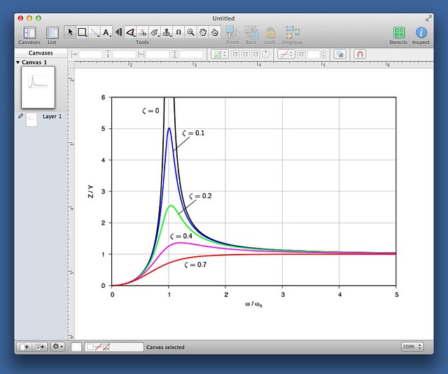
Sometimes I like to label the parts of the graph directly and avoid having a key entirely. This takes even more Gnuplot iterations than placing a key because you have to do trial and error with both the set label and the set arrow commands, and you have to do it for each label. It’s much easier to generate a set of labels and lines and move them around in OmniGraffle:
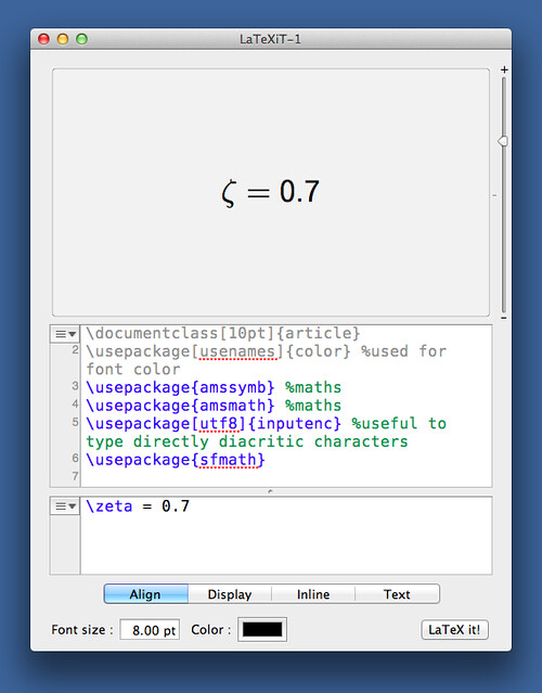
And if you need equations in your annotations, the best tool I know of is LaTeXiT, a great little free program from Pierre Chatelier that uses LaTeX to create PDF equations that can be pasted into almost any document.
So why did I do everything in Gnuplot for the accelerometer graphs? I wasn’t working under a deadline, and sometimes it’s a good idea play around with a deep, highly capable tool like Gnuplot to learn more about what it can do. You never know when that knowledge will come in handy.


