Why Downcast
June 29, 2012 at 3:14 PM by Dr. Drang
At some point in the 53 hours of podcasts Merlin Mann was on over the past week or so, he mentioned Downcast, the iOS podcast player/manager, and likened it to Emacs—powerful, but probably not appropriate for most people because of all its options. It’d be a shame if people pass up Downcast because of Merlin’s comment. Of the four podcast players I’ve tried out, Downcast was by far the simplest and easiest to use.
The dedicated podcast player is a phenomenon of iOS 5 and iCloud syncing. It’s not that there weren’t such apps before—I’ve been hearing Stitcher ads on podcasts for years—but the category exploded when we no longer had to connect our iOS devices to a computer and sync via iTunes. For many of us, podcast episodes were the only part of our iOS audio lineup that changed regularly; they were the last link with iTunes. Podcast players came in to break that last link. They allow you to download and play new episodes without being anywhere near the computer you sync with.
I confess I had a warm spot in my heart for Downcast even before I tried it. For several years, Laurie Taylor, host of Thinking Allowed, has been telling listeners they can “downcast our podload,” a bit of wordplay I never tire of. But I’ve given three others a fair hearing and genuinely believe Downcast is the best.
Instacast
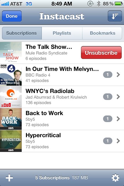
For a while, Instacast seemed to be everyone’s favorite, and many people still swear by it. I used it for a while but never liked it. I was continually baffled by its response to swiping, which was inconsistent. Swiping (in either direction) on a podcast would bring up the Unsubscribe button, as expected,
but swiping on an individual episode wouldn’t bring up a Delete button. Instead, it toggled either the played/unplayed status if you swiped one way or the starred/unstarred status if you swiped the other. This was not only inconsistent, but maddening. If I accidentally swiped on an episode, my instinctive response was to swipe in the other direction to undo. Not only would that not undo my accidental action, it would cause another action, leaving me with two things to undo.
Another thing I didn’t like about Instacast was that tapping on an episode in the episode list wouldn’t take you to the playing screen, but to an intermediate screen that described the episode and included a Play or Stream button in the upper right.
It’s only after tapping that button that you start playing. I suppose there’s some logic to showing you what the episode is about before playing it, but in practice I always just want to start listening.
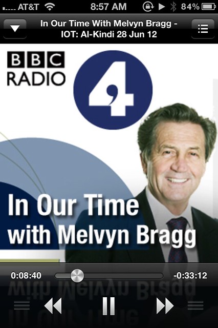
Finally, there’s the playing screen, which has no volume control and puts the position control where the Music app has the volume slider. Yes, I’ve fast-forwarded when all I wanted to do was make it a bit louder.
Instacast allows you to set bookmarks within a podcast, which is probably a nice feature, but I never used it. It can also export your subscriptions, either directly to another podcast app or as an OPML file. You can import an OPML file generated elsewhere (via iTunes on your computer, say) by emailing it to yourself and telling Mail to open the attachment in Instacast.
Update 6/29/12
Unsurprisingly, Instacast fans in the comments have pointed out some features that I missed. In particular, if you tap and hold on an episode, a menu comes up that allows you to start playing the episode without going to the intermediate screen first. That’s still more actions to start playing than it ought to be, but it’s not quite as slow as I thought.
iCatcher!
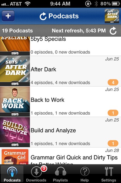
After dumping Instacast, I used iCatcher! for a few weeks. It’s main screen is a little cluttered but easily navigable.
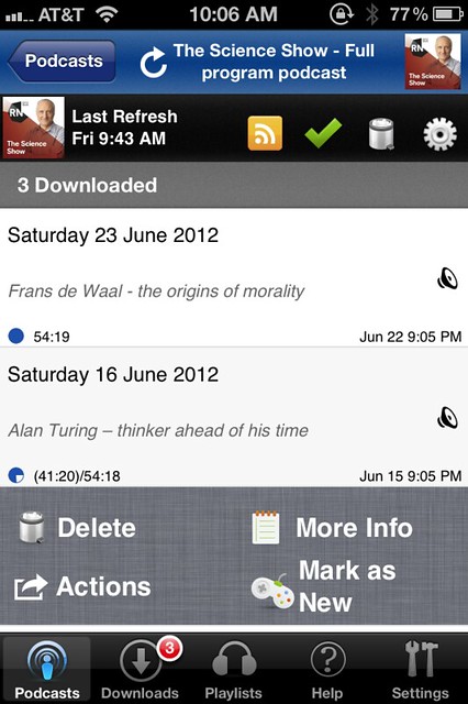
The same can be said for the podcast screen
and the playing screen.
Note that iCatcher (I’m dumping the ! for the duration) has both volume and position sliders in their standard places.
iCatcher has more options than I care to discuss, but its defaults make sense; I could use it immediately without feeling the need to dig into the settings to fix things. Swiping on an episode brings up a set of four buttons, including the expected Delete.1
In addition to using the 30-second jump buttons on the playing screen, you can also swipe left or right to jump back or forward a user-settable amount of time. I like having the left swipe jump back 10 seconds so I can relisten to something I didn’t catch the first time.
iCatcher exports OPML files and can import an OPML email attachment the same way Instacast does. As best I can tell, it doesn’t have a bookmarking feature.
I liked iCatcher much more than Instacast and would probably still be using it if I hadn’t tried Downcast.
Podcasts
Apple’s podcast-playing app is an abomination of which we really shouldn’t speak. I didn’t even like the idea of reinstalling it on my iPhone to get screenshots.
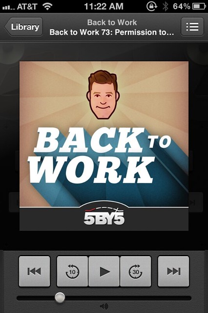
Let’s start with the controls on the player screen.
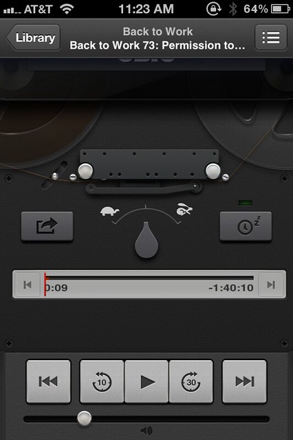
Where’s the position slider? I’m not sure how I discovered this, but to find it, you have to swipe up to “raise” the artwork up out of the way. Does this make the app easier to use? No, it just adds a level of complexity and user frustration with no payoff.
“Behind” the artwork are other controls (including the position slider) and a tape deck animation. The reels of the tape deck rotate during playback.
Let’s put aside the question of whether a tape deck is an appropriate analogy for podcast playback—even if it is inspired by Dieter Rams—and focus on the controls themselves. The position slider is fairly smooth when you’re making fine adjustments but terribly jumpy when you’re making a big move. And the thin red line doesn’t feel right as a control. At first, the rotating speed control seemed impossible to use; I could almost never grab and turn it. Then I learned through experimentation that sliding my finger through an arc—which is what the design of the control suggests—is unnecessary and counterproductive. Just sliding left and right moves the control perfectly.2
As I’ve said before, I’m not against skeuomorphism on principle, but when the digital control doesn’t work like the physical control it’s aping, the design should be scrapped.
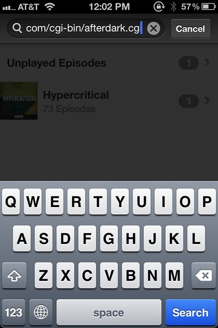
Navigation among the various screens is a little weird, even after you recognize that Catalog means “Apple’s list of available podcasts” and Library means “What’s on your device.” The search and discovery features for subscribing to new podcasts seem fine, but there’s no obvious way to enter a podcast’s feed URL directly. Fortunately, Don McAlister found a way:
Ah! You can subscribe to a non listed podcast by pasting the URL into the search field in your podcast list. Doesn’t support protected feeds
— Don McAllister (@donmcallister) Tue Jun 26 2012
Be careful here. Don is talking about the search field at the top of the podcast list in the Library, not the search field in the Catalog.
Basic functionality like this shouldn’t be treated like an Easter egg. I’d love to hear how Don found this out.
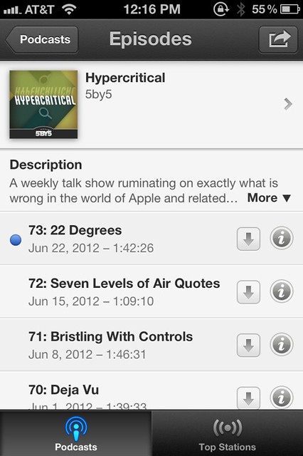
Finally, what I dislike the most about Podcasts is the inability to delete old, undownloaded episodes from a podcast’s episode list. As in iTunes on your computer, when you first subscribe to a podcast, the name and other metadata of every episode gets downloaded to your device and displayed in the podcast’s episode list.
This happens in Instacast and iCatcher, too, but the difference is that those apps let you delete the undownloaded episodes from the list. Podcasts apparently doesn’t. I’ve tried every gesture and setting I could think of and I’ve asked on Twitter—it seems like these episodes you don’t want are there forever. I’ll bet these episodes don’t even show up if you transfer your subscription list to Podcasts by syncing with iTunes, but since the whole point of the app is to avoid syncing with iTunes, there ought to be a way to delete them directly. Maybe if I’d played with Podcasts longer I would’ve discovered the secret, but I just couldn’t.
What makes this app so disappointing is not its lack of features—Apple’s applications, especially in their first iteration, often are light on features. But the features they have usually work well. Not so with Podcasts.
And the poor quality of the Podcasts app is even more disappointing when you consider Apple’s history in this area. When Apple added podcast subscriptions to iTunes in 2005 it blew every other podcasting program out of the water and mainstreamed the very idea of podcasting. Although Apple didn’t include every last bell and whistle in its iTunes offering, it included enough essentials and customizations to get new users going and to entice almost all the old hands away from the applications they had been using. It was an almost perfect blend of features and ease of use. The Podcasts app is a stain on Apple’s “design is how it works” ethic.
Downcast
Downcast is what Podcasts should have been. It’s interface is simple and obvious, its defaults are well-chosen, and it offers the kinds of customizations you see in iTunes.
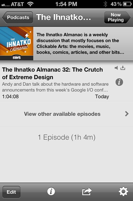
The first thing I liked about Downcast was how it handled episode lists of new subscriptions. By default, it downloads the most recent episode (which is what the others do, too) and hides the list of older episodes.
This is exactly right. Show what’s most likely to be of interest, and make the rest available through obvious means.
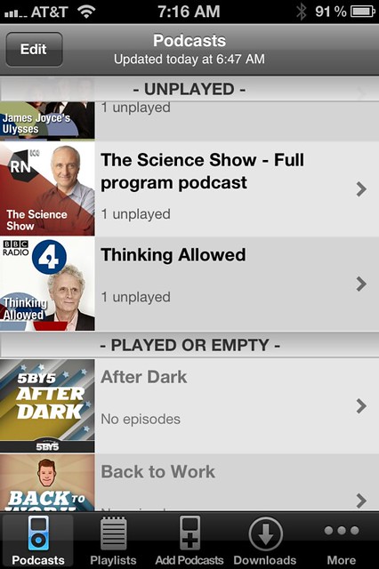
Adding new subscriptions is just as clear. When you’re looking at your list of podcasts, which puts them in alphabetical order after separating them into played and unplayed, the toolbar at the bottom has a nice Add Podcasts button.
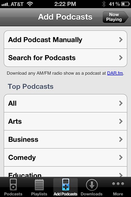
Tapping it takes to you a screen with a set of buttons. There’s not a lot of pizzazz here, but there’s no question what each button does.
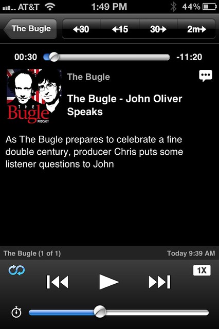
The player screen has no surprises, either. Everything you want where you expect it to be.
In addition to the jumps available through the buttons at the top of the screen, you can also set up gestures to have swipes jump forward and backward. My left-to-right swipe jump 30 seconds ahead, and my right-to-left swipe jumps 10 seconds backward.
I guess the complexity Merlin was talking about has to do with the settings for when to delete podcasts, how many to keep, and so on. There’s a general setting for these options, to which you can make per-podcast adjustments. I don’t see this as especially geeky because these are, as I said above, the same sorts of options you have in iTunes. There are lots of adjectives that could be applied to iTunes, but “geeky” isn’t one of them.
Like Instacast and iCatcher, Downcast imports and exports OPML files. It doesn’t have Instacast’s bookmarking, which is fine with me.
Summary
Apple’s Podcasts app is abysmal. I can’t imagine anyone liking it.
Instacast might be OK for you if you don’t get annoyed by the things that annoy me.
iCatcher is quite usable, but its user interface is a bit cluttered and frantic.
Downcast is what Podcasts should have been. It doesn’t have the whizbang UI that a developer like Tapbots would give it, but everything is straightforward and operates smoothly.
-
The animation as the buttons appear is a sort of flip-around like when you tap the “i” button in the Weather app, but it’s disconcertingly fast. I don’t understand why iCatcher’s programmers didn’t just match the animation speed of Weather. ↩
-
Or better yet, don’t even bother. There are only three speeds, and the differences between them are so great you’ll never want to listen at anything other than the center, normal position. ↩

