A Maps trial
October 8, 2012 at 10:43 PM by Dr. Drang
It’s tempting to say that my younger son and I spent the long weekend in the middle of nowhere, but that would be misleading. We were actually in one of the suburbs of nowhere, a few miles south of the middle, out where the cell coverage isn’t quite as good as it is in the middle. This gave me a chance to give the new iOS 6 Maps app a tryout.
Generally, it worked quite well. It found the addresses I asked it for, and it found nearby businesses, too. The most impressive part, though, was how quickly the maps loaded and could be zoomed and scrolled. It’s when your connection is poor that you really appreciate the bandwidth-stingy vector maps.1
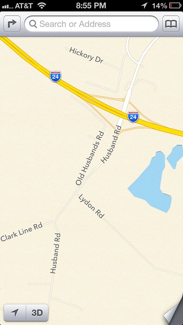
Not all was well in map-land, though. Roads were often labeled in a way that wasn’t particularly useful. Here’s one of the areas I drove through:
The exit from I-24 is given as “Husband Road” on the signs, so that label is fine, but the surface streets in this area are typically marked with their state or county route numbers, not their names. I’ve been driving on Lydon Road for nearly thirty years without ever knowing its name. I know it as 3075, because that’s what all the signs say.
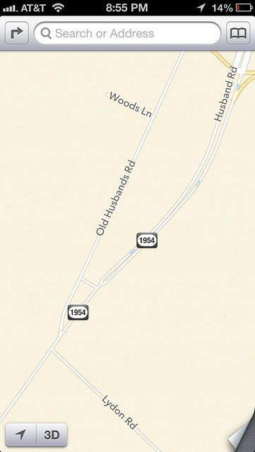
Apple Maps knows it as 3075, too, but it doesn’t always show it that way. If we zoom in a bit, we see that Husband Road is also 1954 (which is correct—street signs identify it both ways), but there’s still no indication that Lydon is 3075.
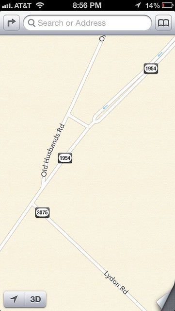
It’s only when we zoom in this far that we get Lydon’s number:
This is simply not helpful. There’s no indication that the route numbers will appear at some magic magnification, so there’s no incentive for the user to zoom in once the street name appears. And when the route numbers do appear, the map is at a scale that’s too large for driving. You can’t see what’s coming up without scrolling.
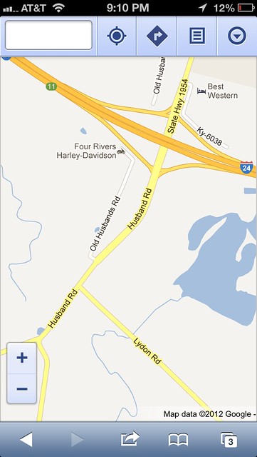
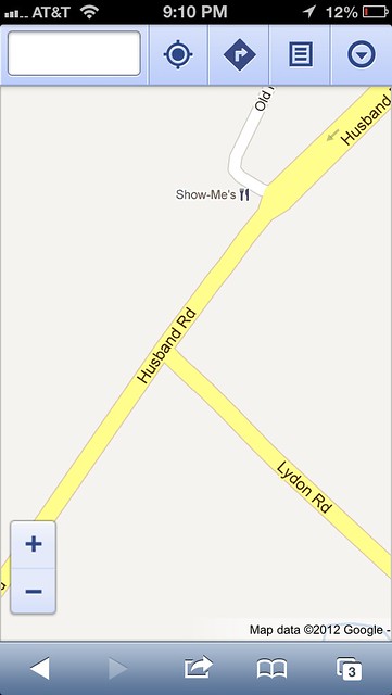
As I was outlining this post in my head, this was the point at which I was going to show that Google Maps was superior because it showed the route numbers at smaller scale. But when I opened Safari and used Google Maps to show this area, this is what I saw:
Much to my surprise, Google Maps never shows the route numbers, whatever the scale.
This may seem like a victory for Apple Maps, but it really isn’t. Yes, it has the route numbers while Google Maps doesn’t, but the user has no way of knowing the route numbers are there until the map is zoomed in past the point of functionality. Apple has the potential to be better than Google here because it has the data the user wants—it just needs to display it better. This is an interesting reversal of the usual case in which Google has the higher-quality data.
In a nutshell, then: a big thumbs-up for the vector maps, and a “no worse than before” on the map data. Overall, better than I was expecting.
-
It was only after reading several articles about the Mapocalypse that I learned that Android has had vector maps for a while. It’s odd that this advantage—rather than things like screen size, third-party on-screen keyboards, and “freedom”—wasn’t touted more highly by Android fans. It’s a big deal, and I don’t see any downside to it. ↩

