What’s wrong with the Safari omnibar
October 13, 2012 at 9:38 AM by Dr. Drang
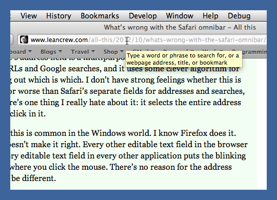
… is basically the same thing that’s wrong with Chrome’s omnibar. With Safari 6, Apple changed from separate address and search fields to a single field, which is fine with me. I don’t think it’s the huge improvement many do, but I have no objection to it. What I object to is the behavior of this field—specifically, what happens when you give it focus by clicking on it.
Two years ago, in a post explaining why I preferred Safari to Chrome, I said
Chrome’s address field is a multipurpose entry area. It’s for entering both URLs and Google searches, and it uses some clever algorithm for figuring out which is which. I don’t have strong feelings whether this is better or worse than Safari’s separate fields for addresses and searches, but there’s one thing I really hate about it: it selects the entire address when I click in it.
I know this is common in the Windows world. I know Firefox does it. That doesn’t make it right. Every other editable text field in the browser and every editable text field in every other application puts the blinking cursor where you click the mouse. There’s no reason for the address field to be different.
If I want to select the whole URL so I can type in a new one, I don’t click in the address field, I type ⌘L. But when I want to edit the URL that already there, my habit—built over 25 years of using GUIs that all work the same way—is to click where I want to make the edit and start typing. When the entire field is selected upon clicking, the first bit of typing I do deletes the whole URL. This is a profoundly stupid design decision.
The Safari team has apparently decided that profoundly stupid is the way to go.
The behavior of the address field certainly wasn’t the only thing keeping me a Safari user, but it was one of several little niceties that made Safari comfortable. Now that it’s gone, I’ll have to rethink my choice of everyday browser.

