Hendecaphilia
November 30, 2012 at 9:55 PM by Dr. Drang
One of the many reasons I’m not in the upper echelons of Apple punditry is that I don’t jump on new releases and review them the day they come out. (I am, for example, still thinking over my iPhone 5 review.) So I missed out on yesterday’s tsunami of critique regarding iTunes 11. Consider this a little backwash.
One of the things I learned in reading yesterday’s reviews of the new look and feel is that other people seem to do a lot more interaction with iTunes than I do. I can’t otherwise explain the outpouring of concern for the (initial) disappearance of the sidebar and the rearrangement of a few buttons. My direct interaction with iTunes is almost entirely limited to:
- Choosing a playlist.
- Closing the window.
After that, I use the function keys to pause, skip, and change volume. Now it’s true that I’m at something of an advantage here in that I’m satisfied with shuffling through a playlist instead of continually picking out individual songs. Also, I have a set of scripts that shows the currently playing track and its album cover art on my Desktop via GeekTool,1 so I don’t feel the need to keep any iTunes windows visible.
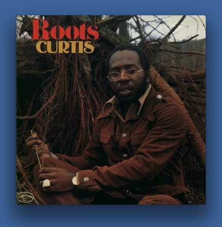
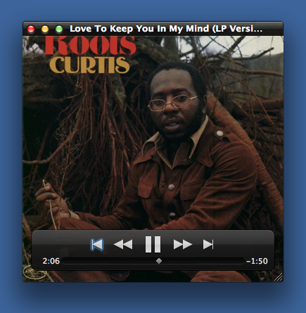
If you like the idea of having just that sort of information available, but you don’t want to go to the trouble of setting up GeekTool, you can just keep the iTunes Now Playing window visible and hide the main window. Normally, the Now Playing window has no decoration at all,
but it’ll show the track name and playback controls if you mouse over it.
And it’s resizable, as you can see by the set of lines in the lower right corner, so you can make it an unobtrusive size and tuck it in one corner of your screen.
I suspect there are other ways to get the Now Playing window to appear, but the only way I know of is to click on the cover art thumbnail in the title bar of the main window.
And while you’re looking at the new title bar design, here’s the best criticism I’ve seen of the new iTunes look:
The main thing that bugs me about iTunes 11’s UI is the thin strip of window frame above the status display. Looks breakable.
— Daniel Jalkut (@danielpunkass) Fri Nov 30 2012 4:42 PM CST
My biggest concern in upgrading to iTunes 11 was that some of my AppleScripts would break. Doug Adams started tweeting about commands that no longer work almost as soon as the upgrade became available. Luckily, none of the commands I use in my GeekTool scripts or in my BBC Radio 2 recording scripts (which record streaming shows through Audio Hijack Pro and then put them into a specific iTunes playlist) were affected.
The point of this post, assuming it has one, which isn’t a sure bet, is that I’m OK with iTunes 11. It still imports, organizes, and plays music, and it doesn’t get in my way. I know people love to complain about how overloaded with features iTunes has become because of its use as an iPod/iOS syncing tool, but it’s generally worked well for me in the past, and so far I see no reason for iTunes 11 to change that.
-
That link is to a post about showing the info via NerdTool, but I’ve recently switched back to GeekTool. The scripts and overall setup are basically the same for each. ↩


