Sans taste
December 20, 2012 at 12:49 AM by Dr. Drang
Today I noticed, with some regret, that my post on the lights from North Dakota’s oil shale fields was linked to from a blog on the American Enterprise Institute’s site. In case you don’t follow politics, the AEI is the premiere right-wing think tank, set up to provide a veneer of scholarship to policies born of greed and prejudice.
I must say, though, that the post with the link wasn’t political. Like my post from last week, it just pointed out that the fields were large enough and bright enough to be distinct features of the satellite photos. And like the commenter mysterian here, the author of the AEI post, Mark Perry, also noted the Eagle Ford shale fields in Texas.
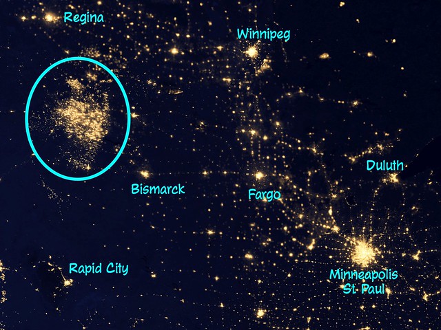
I did find it odd, though, that Perry felt it was necessary to further annotate my already-annotated excerpt of the NASA photo collage. Here’s my version,
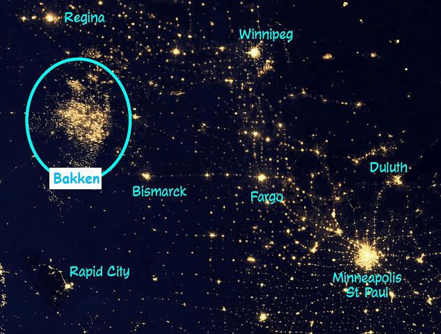
which I thought was pretty clear, what with the labeled cities and the big oval around the oil shale fields. That apparently wasn’t explicit enough for the AEI readership, though, so Perry decided to add a little:
I chose cyan for the text color because it shows up well against the dark background and is reasonably distinct even when surrounded by yellowish lights. I assume Perry stuck with cyan to match my color scheme, but then he made it less distinct by putting a white background behind it. Dumb.
Worse, though, was his font choice. I guess he noticed that the typeface I used was styled like comic book lettering and figured it must be Comic Sans, so that’s what he used in his addition. But it’s pretty clear, especially when the two are side-by-side, that I didn’t use Comic Sans. Every letter in “Bakken” can be found in my annotations, and it should be obvious to anyone with even the smallest iota of taste that the letterforms don’t match.
What I used was Face Front from Comicraft, purveyor of The World’s Greatest Comic Book Fonts. It’s a fun font with a flair that’s missing from Comic Sans. I’ve used it fairly regularly in the annotated images I post here.
If you followed the Face Front link, you may be wondering if I really paid $129 for a font to use occasionally on my blog. Fear not, True Believer; I bought it during Comicraft’s annual sale a few years ago. You’ve heard of this sale if you follow Andy Ihnatko on Twitter or through his blog—he always makes sure to mention it. The sale runs for one day only on New Year’s Day, and every font Comicraft offers is on sale for a price, in pennies, equal to the year. This year, every font will cost $20.13.
So if you like the informality and fun of comic book fonts but don’t want to be stuck with Comic Sans, go over to Comicraft and look around. Note which fonts are well above $20.13 and make a shopping list for January 1.
And if you happen to work at AEI, give Mark Perry a heads-up on Comicraft. Maybe he’ll acquire some taste.


